Adding a toggled button/icon to App in flutter
Solution 1:
You can try using a custom widget like this one below:
toggle_button.dart
import 'package:flutter/material.dart';

class ToggleButton extends StatefulWidget {
  final double width;
  final double height;

  final String leftDescription;
  final String rightDescription;

  final Color toggleColor;
  final Color toggleBackgroundColor;
  final Color toggleBorderColor;

  final Color inactiveTextColor;
  final Color activeTextColor;

  final double _leftToggleAlign = -1;
  final double _rightToggleAlign = 1;

  final VoidCallback onLeftToggleActive;
  final VoidCallback onRightToggleActive;

  const ToggleButton(
      {Key? key,
      required this.width,
      required this.height,
      required this.toggleBackgroundColor,
      required this.toggleBorderColor,
      required this.toggleColor,
      required this.activeTextColor,
      required this.inactiveTextColor,
      required this.leftDescription,
      required this.rightDescription,
      required this.onLeftToggleActive,
      required this.onRightToggleActive})
      : super(key: key);

  @override
  _ToggleButtonState createState() => _ToggleButtonState();
}

class _ToggleButtonState extends State<ToggleButton> {
  double _toggleXAlign = -1;

  late Color _leftDescriptionColor;
  late Color _rightDescriptionColor;

  @override
  void initState() {
    super.initState();

    _leftDescriptionColor = widget.activeTextColor;
    _rightDescriptionColor = widget.inactiveTextColor;
  }

  @override
  Widget build(BuildContext context) {
    return Container(
      width: widget.width,
      height: widget.height,
      decoration: BoxDecoration(
        color: widget.toggleBackgroundColor,
        borderRadius: BorderRadius.all(
          Radius.circular(50.0),
        ),
        border: Border.all(color: widget.toggleBorderColor),
      ),
      child: Stack(
        children: [
          AnimatedAlign(
            alignment: Alignment(_toggleXAlign, 0),
            duration: Duration(milliseconds: 300),
            child: Container(
              width: widget.width * 0.5,
              height: widget.height,
              decoration: BoxDecoration(
                color: widget.toggleColor,
                borderRadius: BorderRadius.all(
                  Radius.circular(50.0),
                ),
              ),
            ),
          ),
          GestureDetector(
            onTap: () {
              setState(
                () {
                  _toggleXAlign = widget._rightToggleAlign;

                  _leftDescriptionColor = widget.inactiveTextColor;
                  _rightDescriptionColor = widget.activeTextColor;
                },
              );

              widget.onRightToggleActive();
            },
            child: Align(
              alignment: Alignment(-1, 0),
              child: Container(
                width: widget.width * 0.5,
                color: Colors.transparent,
                alignment: Alignment.center,
                child: Text(
                  widget.leftDescription,
                  style: TextStyle(
                      color: _leftDescriptionColor,
                      fontWeight: FontWeight.bold),
                ),
              ),
            ),
          ),
          GestureDetector(
            onTap: () {
              setState(
                () {
                  _toggleXAlign = widget._leftToggleAlign;

                  _leftDescriptionColor = widget.activeTextColor;
                  _rightDescriptionColor = widget.inactiveTextColor;
                },
              );

              widget.onLeftToggleActive();
            },
            child: Align(
              alignment: Alignment(1, 0),
              child: Container(
                width: widget.width * 0.5,
                color: Colors.transparent,
                alignment: Alignment.center,
                child: Text(
                  widget.rightDescription,
                  style: TextStyle(
                      color: _rightDescriptionColor,
                      fontWeight: FontWeight.bold),
                ),
              ),
            ),
          ),
        ],
      ),
    );
  }
}
main.dart
import 'package:flutter/material.dart';
import 'package:stackovfl_70777885/toggle_button.dart';

void main() {
  runApp(const MyApp());
}

class MyApp extends StatelessWidget {
  const MyApp({Key? key}) : super(key: key);

  // This widget is the root of your application.
  @override
  Widget build(BuildContext context) {
    return MaterialApp(
      title: 'Flutter Demo',
      theme: ThemeData(
        primarySwatch: Colors.blue,
      ),
      home: const MyHomePage(title: 'Flutter Demo Home Page'),
    );
  }
}

class MyHomePage extends StatefulWidget {
  const MyHomePage({Key? key, required this.title}) : super(key: key);

  final String title;

  @override
  State<MyHomePage> createState() => _MyHomePageState();
}

class _MyHomePageState extends State<MyHomePage> {
  @override
  Widget build(BuildContext context) {
    return Scaffold(
      appBar: AppBar(
        title: Text(widget.title),
      ),
      body: Container(
        padding: EdgeInsets.all(10.0),
        child: ToggleButton(
          width: 300.0,
          height: 60.0,
          toggleBackgroundColor: Colors.white,
          toggleBorderColor: (Colors.grey[350])!,
          toggleColor: (Colors.indigo[900])!,
          activeTextColor: Colors.white,
          inactiveTextColor: Colors.grey,
          leftDescription: 'FAVORITES',
          rightDescription: 'HISTORY',
          onLeftToggleActive: () {
            print('left toggle activated');
          },
          onRightToggleActive: () {
            print('right toggle activated');
          },
        ),
      ),
    );
  }
}
This should result in the following:
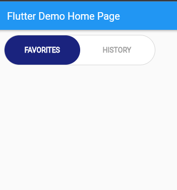
The onLeftToggleActive(): () {} and onRightToggleActive() {} in main are triggered depending on where the slider moves.