How to set the divider between Tabs in TabLayout of design support library?
I am using the new android.support.design.widget.TabLayout of v7-appcompat library, and found a problem, there is no way to set the divider between the tabs, dont know if there is.
I have successfully configured the pager adapter and the tabs are looking good but cant set the divider between the tabs.
I want this type of tabs
Tab1 | Tab2 | Tab3
but currently its showing
Tab1 Tab2 Tab3
My xml is
<android.support.design.widget.CoordinatorLayout xmlns:android="http://schemas.android.com/apk/res/android"
    xmlns:app="http://schemas.android.com/apk/res-auto"
    android:layout_width="match_parent"
    android:layout_height="match_parent" >

    <android.support.design.widget.AppBarLayout
        android:layout_width="match_parent"
        android:layout_height="wrap_content"
        android:theme="@style/ThemeOverlay.AppCompat.Dark.ActionBar" >

        <include layout="@layout/toolbar" />

        <android.support.design.widget.TabLayout
            android:id="@+id/tablayout"
            android:layout_width="match_parent"
            android:layout_height="wrap_content"
            android:background="@drawable/shape_tabbar_background"
            app:tabIndicatorColor="@android:color/white"
            app:tabIndicatorHeight="4dp" />
    </android.support.design.widget.AppBarLayout>

    <android.support.v4.view.ViewPager
        android:id="@+id/viewpager"
        android:layout_width="match_parent"
        android:layout_height="match_parent"
        app:layout_behavior="@string/appbar_scrolling_view_behavior" />

</android.support.design.widget.CoordinatorLayout>
I am adding tabs by this
viewPager = (ViewPager) findViewById(R.id.viewpager);
    viewPager.setOffscreenPageLimit(2);
    adapter = new TabAdapterLoginActivity(getSupportFragmentManager(),
            titles);
    viewPager.setAdapter(adapter);
    tabLayout = (TabLayout) findViewById(R.id.tablayout);
    tabLayout.setupWithViewPager(viewPager);
Solution 1:
TabLayout is actually HorizontalScrollView and it's first child is LinearLayout.
So just use below code to add dividers
    View root = tabLayout.getChildAt(0);
    if (root instanceof LinearLayout) {
        ((LinearLayout) root).setShowDividers(LinearLayout.SHOW_DIVIDER_MIDDLE);
        GradientDrawable drawable = new GradientDrawable();
        drawable.setColor(getResources().getColor(R.color.separator));
        drawable.setSize(2, 1);
        ((LinearLayout) root).setDividerPadding(10);
        ((LinearLayout) root).setDividerDrawable(drawable);
    }
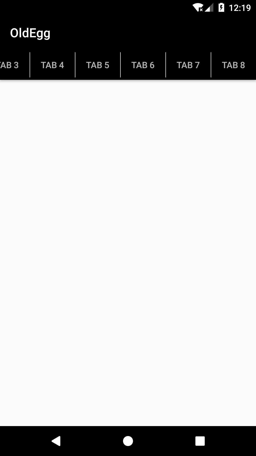
Below is the sample screen shot
Screen 1

Screen 2
Solution 2:
There is a way to add divider by using Tab setCustomView method:
TabLayout tabLayout = (TabLayout) findViewById(R.id.tablayout);
tabLayout.setupWithViewPager(viewPager);

for (int i = 0; i < tabLayout.getTabCount(); i++) {
      TabLayout.Tab tab = tabLayout.getTabAt(i);
      RelativeLayout relativeLayout = (RelativeLayout)
            LayoutInflater.from(this).inflate(R.layout.tab_layout, tabLayout, false);

      TextView tabTextView = (TextView) relativeLayout.findViewById(R.id.tab_title);
      tabTextView.setText(tab.getText());
      tab.setCustomView(relativeLayout);
      tab.select();
}
Tab custom layout with divider (tab_layout.xml):
<?xml version="1.0" encoding="utf-8"?>
<RelativeLayout
    xmlns:android="http://schemas.android.com/apk/res/android"
    android:layout_width="match_parent"
    android:layout_height="match_parent" >

<!-- Tab title -->
<TextView
    android:id="@+id/tab_title"
    android:layout_width="match_parent"
    android:layout_height="match_parent"
    android:gravity="center"
    android:textColor="@drawable/tab_item_selector"/>

<!-- Tab divider -->
<View
    android:layout_width="1dp"
    android:layout_height="match_parent"
    android:layout_alignParentLeft="true"
    android:background="@android:color/black" />
</RelativeLayout>
Set TabLayout tab horizontal padding to 0dp:
<android.support.design.widget.TabLayout
        android:id="@+id/tablayout"
        android:layout_width="match_parent"
        android:layout_height="wrap_content"
        android:background="@drawable/shape_tabbar_background"
        app:tabIndicatorColor="@android:color/white"
        app:tabIndicatorHeight="4dp"

        app:tabPaddingStart="0dp"
        app:tabPaddingEnd="0dp" />
And a selector for tab title text color when it's selected (tab_item_selector.xml):
<?xml version="1.0" encoding="utf-8"?>
<selector xmlns:android="http://schemas.android.com/apk/res/android">
    <item android:state_selected="true" android:color="@color/abc_primary_text_material_dark" />
    <item android:state_focused="true" android:color="@color/abc_primary_text_material_dark" />
    <item android:state_pressed="true" android:color="@color/abc_primary_text_material_dark" />
    <item android:color="@color/abc_secondary_text_material_dark" />
</selector>