Is it possible to create an angled corner in CSS?
It's a little difficult keeping the border, but I managed to achieve a close effect using :before and :after elements with a parent container (:before and :after don't work on an img tag)
Add a border to the container
Add a before to block out a corner and offset by -1 to cover the border
Add an after that's slightly offset from the before to create the line inside the cut off
As you can see, the thickness of the 45deg line is a bit of an issue:
.cutCorner {
    position:relative; background-color:blue;
    border:1px solid silver; display: inline-block;
}

.cutCorner img {
    display:block;
}

.cutCorner:before {
    position:absolute; left:-1px; top:-1px; content:'';
    border-top: 70px solid silver;
    border-right: 70px solid transparent;
}

.cutCorner:after {
    position:absolute; left:-2px; top:-2px; content:'';
    border-top: 70px solid white;
    border-right: 70px solid transparent;
}
<div class="cutCorner">
<img class="" src="https://www.google.co.uk/logos/doodles/2013/william-john-swainsons-224th-birthday-5655612935372800-hp.jpg" />
</div>JSFiddle
SEE THE DEMO
You can do this by using pseudo, along with border-width and border-color see the below code to see how it can be done.
HTML
<div class="cut"></div>
CSS
.cut {
    position:relative;
    width:500px;
    height: 200px;
    padding:20px;
    color:#000;
    background:#ccc;
}

.cut:before {
    content:"";
    position:absolute;
    top:0;
    left:0;
    border-width:30px 30px 0px 0px;
    border-style:solid;
    border-color:#fff transparent transparent #fff ;
}
Another Solution using this jQuery script for cross browser support. --> http://jquery.malsup.com/corner/
SEE THE DEMO HERE
HTML
<div class="cut"></div>
CSS
.cut {
    position:relative;
    width:500px;
    height: 200px;
    padding:20px;
    color:#000;
    background:#ccc;
}
JS
$(".cut").corner("bevel tl 50px");
Using CSS:
The exact shape can be achieved using CSS. The idea is to have an element with a border-radius for the top-left corner, skew it along the Y axis and then position it just before the rectangle. Doing these would make it look as though the rectangular element has a triangular cut at the top with one curved edge.
If the inside part of the shape has only a color (solid or transparent) then it can be achieved using only one element. However, if an image needs to be added inside the shape (like mentioned in question), then we need more than one element because we have to reverse the skew effect on the image and this cannot be done without a child element.
.shape,
.shape-image {
  position: relative;
  height: 150px;
  width: 400px;
  border-bottom: 2px solid crimson;
  overflow: hidden;
}
.shape:before,
.shape:after,
.shape-image:after {
  position: absolute;
  content: '';
  top: 0px;
  height: 100%;
  z-index: -1;
}
.shape:before,
.shape-image .before {
  left: 0px;
  top: -2px;
  width: 50px;
  border: 2px solid crimson;
  border-width: 3px 0px 0px 2px;
  border-top-left-radius: 8px;
  transform-origin: right bottom;
  transform: skewY(-45deg);
}
.shape:after,
.shape-image:after {
  left: 52px;
  width: calc(100% - 54px);
  border: 2px solid crimson;
  border-left: none;
}
.shape:after,
.shape:before {
  background: aliceblue;
}
.shape.semi-transparent:after,
.shape.semi-transparent:before {
  background: rgba(150, 150, 150, 0.5);
}
.shape-image .before {
  position: absolute;
  top: 0px;
  height: 100%;
  overflow: hidden;
}
.shape-image .before .img {
  height: 100%;
  width: 100%;
  border-top-left-radius: 8px;
  background: url(http://lorempixel.com/400/150);
  transform-origin: right bottom;
  transform: skewY(45deg);
}
.shape-image:after {
  background: url(http://lorempixel.com/400/150);
  background-position: -50px 0px;
}

/* Just for demo */

body{
  background-image: radial-gradient(circle, #3F9CBA 0%, #153346 100%);
}
.shape{
  margin: 10px;
}
<script src="https://cdnjs.cloudflare.com/ajax/libs/prefixfree/1.0.7/prefixfree.min.js"></script>
<div class="shape"></div>
<div class="shape semi-transparent"></div>
<div class="shape-image">
<div class="before">
<div class="img"></div>
</div>
</div>Using SVG:
Alternately the same can be achieved in a more hassle free way with SVG like in the below snippet.
.vector {
  height: 150px;
  width: 410px;
  padding-left
}
svg {
  height: 100%;
  width: 100%;
}
path {
  stroke: crimson;
  stroke-width: 2;
  fill: none;
}
polygon {
  fill: url(#bg);
}

/* Just for demo */

body {
  background-image: radial-gradient(circle, #3F9CBA 0%, #153346 100%);
}
<script src="https://cdnjs.cloudflare.com/ajax/libs/prefixfree/1.0.7/prefixfree.min.js"></script>
<div class='vector'>
<svg viewBox='0 0 400 150' preserveAspectRatio='none'>
<defs>
<path d='M50,2 h 342 v144 h-390 v-90 a6,12 0 0,1 3,-9 z' id='p' />
<clipPath id='clipper'>
<use xlink:href='#p' />
</clipPath>
<pattern id='bg' width='400' height='150' patternUnits='userSpaceOnUse'>
<image xlink:href='http://lorempixel.com/400/150' height='150' width='400' />
</pattern>
</defs>
<polygon points='2,2 392,2 392,148 2,148' clip-path='url(#clipper)' />
<use xlink:href='#p' />
</svg>
</div>
<h3>Original Image</h3>
<img src='http://lorempixel.com/400/150' />Screenshot:

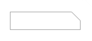
It is possible to do this, but it is a CSS3 solution so won't work on older browsers I don't think.
What I've done is, I've created two divs, one has a border all around, and the other has a border only on the bottom. Using translate I've then rotated that div 45 degrees to mask the corner of the other div, giving the desired effect.
HTML
<div class="holder">
    <div class="main"></div>
    <div class="corner"></div>
</div>
CSS
.holder {
    position:relative;
    width: 180px;
    margin:30px
}

.main {
    width: 160px;
    height: 40px;
    border: 1px solid grey;
    position:absolute;
    left:0;
    z-index: 1;
}
.corner {
    border-bottom: 1px solid grey;
    width:30px;
    height: 41px;
    position:absolute;
    top:-25px;
    right:0;
    z-index:2;
    background:#fff;

    /* Safari */
    -webkit-transform: rotate(45deg);
    /* Firefox */
    -moz-transform: rotate(45deg);
    /* IE */
    -ms-transform: rotate(45deg);
    /* Opera */
    -o-transform: rotate(45deg);
}
Output
See Fiddle