Input group - two inputs close to each other
How can I make input group involves two inputs?
<div class="input-group">
    <input type="text" class="form-control" placeholder="MinVal">
    <input type="text" class="form-control" placeholder="MaxVal">
</div>
This doesn't work, they are horizontal instead of inline
working workaround:
<div class="input-group">
    <input type="text" class="form-control input-sm" value="test1" />
    <span class="input-group-btn" style="width:0px;"></span>
    <input type="text" class="form-control input-sm" value="test2" />
</div>
downside: no border-collapse between the two text-fields, but they keep next to each other
http://jsfiddle.net/EfC26/
Update
thanks to Stalinko
This technique allows to glue more than 2 inputs.
Border-collapsing is achieved using "margin-left: -1px" (-2px for the 3rd input and so on)
<div class="input-group">
  <input type="text" class="form-control input-sm" value="test1" />
  <span class="input-group-btn" style="width:0px;"></span>
  <input type="text" class="form-control input-sm" value="test2" style="margin-left:-1px" />
  <span class="input-group-btn" style="width:0px;"></span>
  <input type="text" class="form-control input-sm" value="test2" style="margin-left:-2px" />
</div>
http://jsfiddle.net/yLvk5mn1/1/
It almost never makes intuitive sense to have two inputs next to each other without labels. Here is a solution with labels mixed in, which also works quite well with just a minor modification to existing Bootstrap styles.
Preview:

HTML:
<div class="input-group">
  <span class="input-group-addon">Between</span>
  <input type="text" class="form-control" placeholder="Type something..." />
  <span class="input-group-addon" style="border-left: 0; border-right: 0;">and</span>
  <input type="text" class="form-control" placeholder="Type something..." />
</div>
CSS:
.input-group-addon {
  border-left-width: 0;
  border-right-width: 0;
}
.input-group-addon:first-child {
  border-left-width: 1px;
}
.input-group-addon:last-child {
  border-right-width: 1px;
}
JSFiddle: http://jsfiddle.net/yLvk5mn1/31/
Assuming you want them next to each other:
<form action="" class="form-inline">
    <div class="form-group">
        <input type="text" class="form-control" placeholder="MinVal">
    </div>
    <div class="form-group">
         <input type="text" class="form-control" placeholder="MaxVal">
    </div>
</form>
JSFiddle
Update Nr.1: Should you want to use .input-group with this example:
<form action="" class="form-inline">
    <div class="form-group">
        <div class="input-group">
          <span class="input-group-addon">@</span>
          <input type="text" class="form-control" placeholder="Username">
        </div>
    </div>
    <div class="form-group">
        <div class="input-group">
          <input type="text" class="form-control">
          <span class="input-group-addon">.00</span>
        </div>
    </div>
</form>
JSFiddle
The class .input-group is there to extend inputs with buttons and such (directly attached). Checkboxes or radio buttons are possible as well. I don't think it works with two input fields though.
Update Nr. 2: With .form-horizontal the .form-group tag basically becomes a .row tag so you can use the column classes such as .col-sm-8:
<form action="" class="form-horizontal">
    <div class="form-group">
        <div class="col-sm-8">
            <input type="text" class="form-control" placeholder="MinVal">
        </div>
        <div class="col-sm-4">
            <input type="text" class="form-control" placeholder="MaxVal">
        </div>
    </div>
</form>
Updated JSFiddle with all three examples
To show more than one inputs inline without using "form-inline" class you can use the next code:
<div class="input-group">
    <input type="text" class="form-control" value="First input" />
    <span class="input-group-btn"></span>
    <input type="text" class="form-control" value="Second input" />
</div>
Then using CSS selectors:
/* To remove space between text inputs */
.input-group > .input-group-btn:empty {
    width: 0px;
}
Basically you have to insert an empty span tag with "input-group-btn" class between input tags.
If you want to see more examples of input groups and bootstrap-select groups take a look at this URL: http://jsfiddle.net/vkhusnulina/gze0Lcm0
If you want to include a "Title" field within it that can be selected with the <select> HTML element, that too is possible
PREVIEW
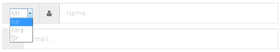
CODE SNIPPET
<div class="form-group">
  <div class="input-group input-group-lg">
    <div class="input-group-addon">
      <select>
        <option>Mr.</option>
        <option>Mrs.</option>
        <option>Dr</option>
      </select>
    </div>
    <div class="input-group-addon">
      <span class="fa fa-user"></span>
    </div>
    <input type="text" class="form-control" placeholder="Name...">
  </div>
</div>