How to center and crop an image to always appear in square shape with CSS?
jsFiddle Demo
div {
    width: 250px;
    height: 250px;
    overflow: hidden;
    margin: 10px;
    position: relative;
}
img {
    position: absolute;
    left: -1000%;
    right: -1000%;
    top: -1000%;
    bottom: -1000%;
    margin: auto;
    min-height: 100%;
    min-width: 100%;
}
<div>
<img src="https://i.postimg.cc/TwFrQXrP/plus-2.jpg" />
</div>A note regarding sizes
As Salman A mentioned in the comments, we need to set the img's position coordinates (top, left, bottom, right) to work with percents higher than the image's actual dimensions. I use 1000% in the above example, but of course you can adjust it according to your needs.
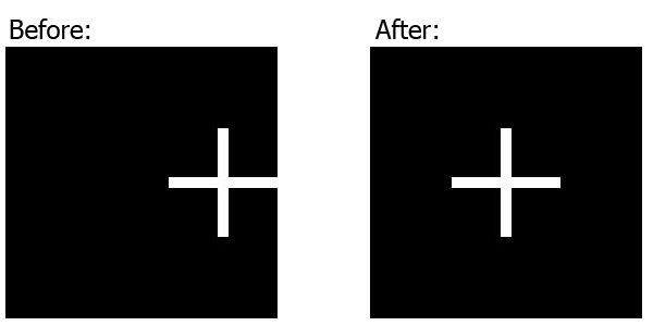
* Further explanation: When we set the img's left and right (or: top and bottom) coordinates to be -100% (of the containing div), the overall allowed width (or: height) of the img, can be at most 300% of the containing div's width (or: height), because it's the sum of the div's width (or: height) and the left and right (or: top and bottom) coordinates.
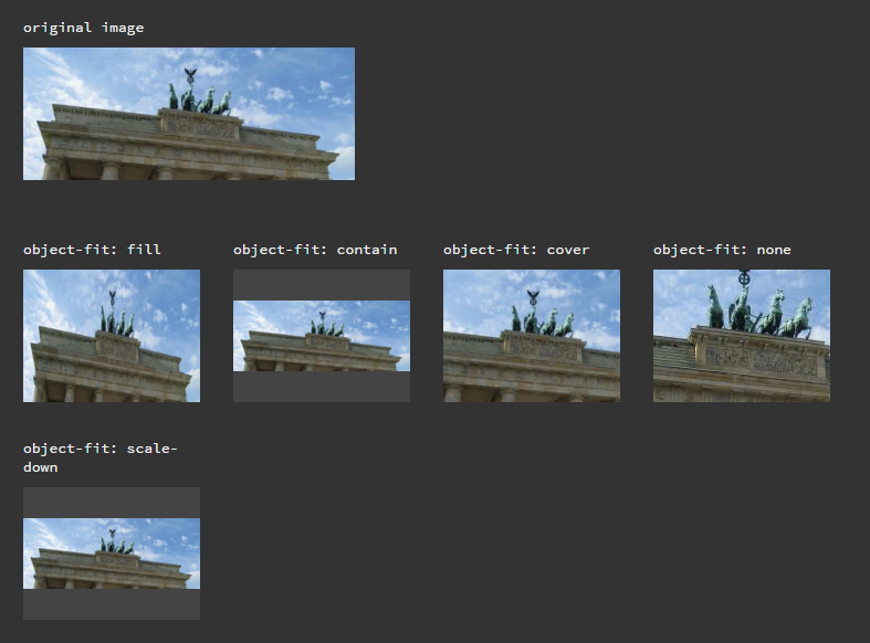
object-fit property does the magic. On JsFiddle.
CSS
.image {
  width: 160px;
  height: 160px;
}

.object-fit_fill {
  object-fit: fill
}

.object-fit_contain {
  object-fit: contain
}

.object-fit_cover {
  object-fit: cover
}

.object-fit_none {
  object-fit: none
}

.object-fit_scale-down {
  object-fit: scale-down
}
HTML
<div class="original-image">
  <p>original image</p>
  <img src="http://lorempixel.com/500/200">
</div>

<div class="image">
  <p>object-fit: fill</p>
  <img class="object-fit_fill" src="http://lorempixel.com/500/200">
</div>

<div class="image">
  <p>object-fit: contain</p>
  <img class="object-fit_contain" src="http://lorempixel.com/500/200">
</div>

<div class="image">
  <p>object-fit: cover</p>
  <img class="object-fit_cover" src="http://lorempixel.com/500/200">
</div>

<div class="image">
  <p>object-fit: none</p>
  <img class="object-fit_none" src="http://lorempixel.com/500/200">
</div>

<div class="image">
  <p>object-fit: scale-down</p>
  <img class="object-fit_scale-down" src="http://lorempixel.com/500/200">
</div>
Result
<div>
    <img class="crop" src="http://lorempixel.com/500/200"/>
</div>

<img src="http://lorempixel.com/500/200"/>


div {
    width: 200px;
    height: 200px;
    overflow: hidden;
    margin: 10px;
    position: relative;
}
.crop {
    position: absolute;
    left: -100%;
    right: -100%;
    top: -100%;
    bottom: -100%;
    margin: auto;
    height: auto;
    width: auto;
}
http://jsfiddle.net/J7a5R/56/
With the caveat of it not working in IE and some older mobile browsers, a simple object-fit: cover; is often the best option.
.cropper {
  position: relative;
  width: 100px;
  height: 100px;
  overflow: hidden;
}
.cropper img {
  position: absolute;
  width: 100%;
  height: 100%;
  object-fit: cover;
}
Without the object-fit: cover support, the image will be stretched oddly to fit the box so, if support for IE is needed, I'd recommend using one of the other answers' approach with -100% top, left, right and bottom values as a fallback.
http://caniuse.com/#feat=object-fit