How to add Margin in Jetpack Compose?
How exactly can you add Margin in Jetpack Compose?
I can see that there is a Modifier for padding with Modifier.padding(...) but I can't seem to find one for margins or am I blind?
Someone guide me please.
Thank you very much.
You can consider padding and margin as the same thing (imagine it as "spacing"). A padding can be applied twice (or more) in the same composable and achieve the similar behavior you would get with margin+padding. For example:
val shape = CircleShape
Text(
    text = "Text 1",
    style = TextStyle(
        color = Color.White,
        fontWeight = FontWeight.Bold,
        textAlign = TextAlign.Center),
    modifier = Modifier.fillMaxWidth()
        .padding(16.dp)
        .border(2.dp, MaterialTheme.colors.secondary, shape)
        .background(MaterialTheme.colors.primary, shape)
        .padding(16.dp)
)
Will result on this:
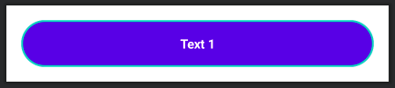
As you can see, the first padding is adding a space between the component and its border. Then the background and border are defined. Finally, a new padding is set to add space between the border and the text.
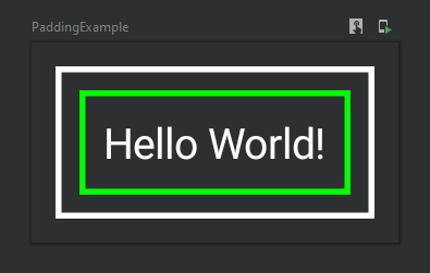
Thinking in terms of padding and margin you refer to the so-called box model that we are used to. There's no a box model in Compose but a sequence of modifiers which is applied to a given composable. The trick is that you can apply the same modifier like padding or border multiple times and the order of these matters, for example:
@Composable
fun PaddingExample() {
    Text(
        text = "Hello World!",
        color = Color.White,
        modifier = Modifier
            .padding(8.dp) // margin
            .border(2.dp, Color.White) // outer border
            .padding(8.dp) // space between the borders
            .border(2.dp, Color.Green) // inner border
            .padding(8.dp) // padding
    )
}
As the result you'll get this composable:
This design is well explained in the Modifiers documentation:
Note: The explicit order helps you to reason about how different modifiers will interact. Compare this to the view-based system where you had to learn the box model, that margins applied "outside" the element but padding "inside" it, and a background element would be sized accordingly. The modifier design makes this kind of behavior explicit and predictable, and gives you more control to achieve the exact behavior you want.
The margin is different than padding, margin is the space outside the widget, where padding is the distance inside the widget, in old XML you could have decided explicitly which one to use, however the new compose way is different.
How compose treat paddings and margins?
There is an object which can be set as Parameter to the composable called Modifier, you can use this to do both margins and paddings.
Example of Padding:
    Text(
    text = "Test",
    modifier = Modifier
        .padding(16.dp)
        .clickable { }
)
Example of Margin
    Text(
    text = "Test",
    modifier = Modifier
        .clickable { }
        .padding(16.dp)
)
As you can see the order makes a difference here in compose, all the modifiers are implemented by order.