align divs to the bottom of their container
Solution 1:
Why can't you use absolute positioning? Vertical-align does not work (except for tables). Make your container's position: relative. Then absolutely position the internal divs using bottom: 0; Should work like a charm.
EDIT By zoidberg (i will update the answer instead)
<div style="position:relative; border: 1px solid red;width: 40px; height: 40px;">
   <div style="border:1px solid green;position: absolute; bottom: 0; left: 0; width: 20px; height: 20px;"></div>
   <div style="border:1px solid blue;position: absolute; bottom: 0; left: 20px; width: 20px height: 20px;"></div>
</div>
Solution 2:
The modern way to do this is with flexbox, adding align-items: flex-end; on the container.
With this content:
<div class="Container">
  <div>one</div>
  <div>two</div>
</div>
Use this style:
.Container {
  display: flex;
  align-items: flex-end;
}
https://codepen.io/rds/pen/gGMBbg
Solution 3:
The way I solved this was using flexbox. By using flexbox to layout the contents of your container div, you can have flexbox automatically distribute free space to an item above the one you want to have "stick to the bottom".
For example, say this is your container div with some other block elements inside it, and that the blue box (third one down) is a paragraph and the purple box (last one) is the one you want to have "stick to the bottom".
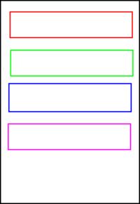
By setting this layout up with flexbox, you can set flex-grow: 1; on just the paragraph (blue box) and, if it is the only thing with flex-grow: 1;, it will be allocated ALL of the remaining space, pushing the element(s) after it to the bottom of the container like this:
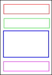
(apologies for the terrible, quick-and-dirty graphics)
Solution 4:
I don't like absolute positioning, either, because there is almost always some collateral damage, i.e. unintended side effects. Especially when you are working with a responsive design. There seems to be an alternative - the sandbag technique. By inserting a "helper" element, either in the markup of via CSS, we can push elements down to the bottom of the container. See http://community.sitepoint.com/t/css-floating-divs-to-the-bottom-inside-a-div/20932 for examples.
Solution 5:
I came here looking, forgetting that I already knew the answer to this - and it's super-simple: display: flex and margin-top: auto.
All you need to do is give your container a display of flex and your items you want at the bottom a top margin of auto:
.container {
  display: flex;
}

.box {
  margin-top: auto;
}
<div class="container" style="border:1px solid red; height: 150px;">
<div class="box" style="border:1px solid green; width:20px; height:20px;"></div>
<div class="box" style="border:1px solid blue; width:20px; height:30px;"></div>
</div>No need for floats or clears either.