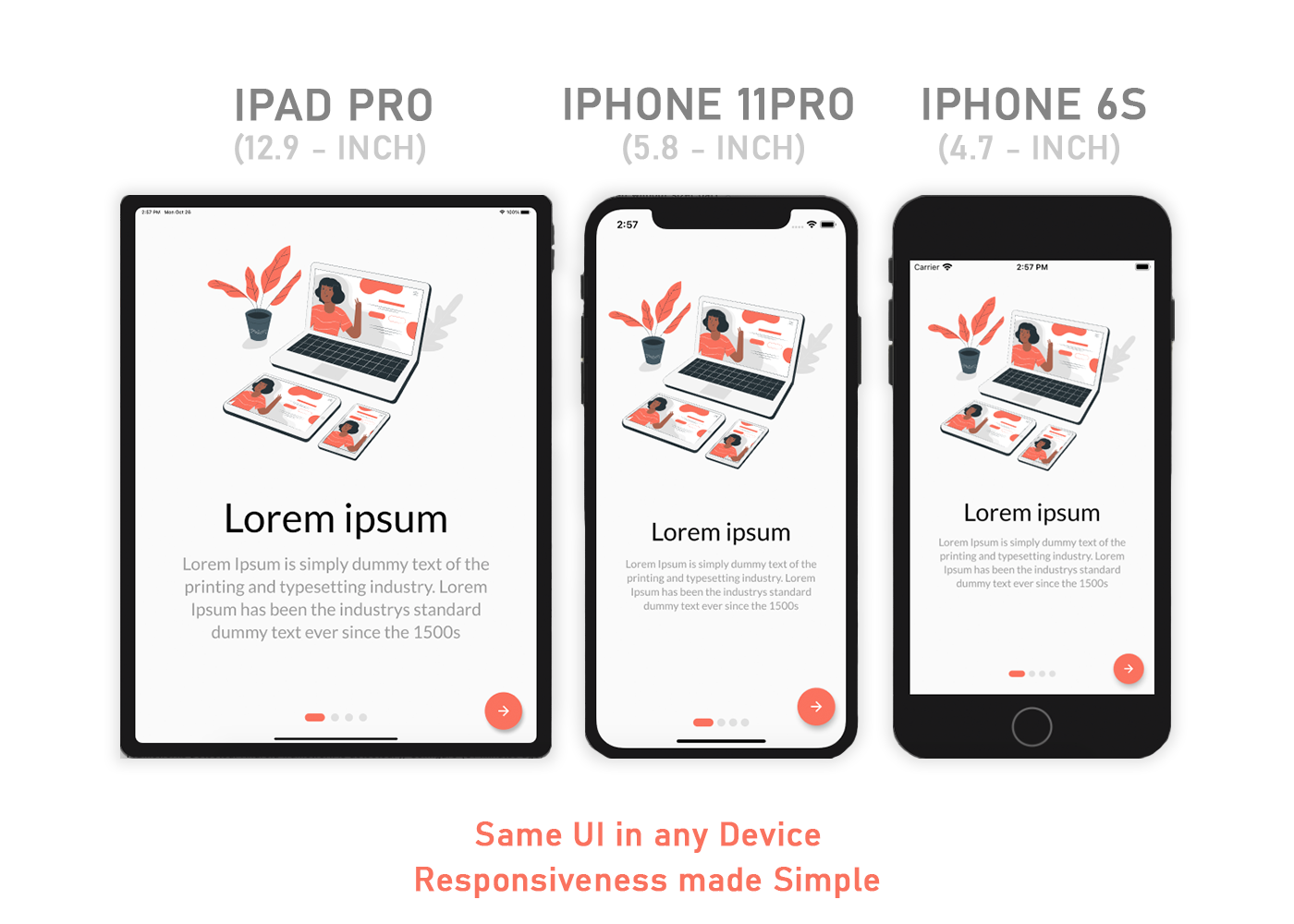
How to make flutter app responsive according to different screen size?
Solution 1:
Using MediaQuery class:
MediaQueryData queryData;
queryData = MediaQuery.of(context);
MediaQuery: Establishes a subtree in which media queries resolve to the given data.
MediaQueryData: Information about a piece of media (e.g., a window).
To get Device Pixel Ratio:
queryData.devicePixelRatio
To get width and height of the device screen:
queryData.size.width
queryData.size.height
To get text scale factor:
queryData.textScaleFactor
Using AspectRatio class:
From doc:
A widget that attempts to size the child to a specific aspect ratio.
The widget first tries the largest width permitted by the layout constraints. The height of the widget is determined by applying the given aspect ratio to the width, expressed as a ratio of width to height.
For example, a 16:9 width:height aspect ratio would have a value of 16.0/9.0. If the maximum width is infinite, the initial width is determined by applying the aspect ratio to the maximum height.
Now consider a second example, this time with an aspect ratio of 2.0 and layout constraints that require the width to be between 0.0 and 100.0 and the height to be between 0.0 and 100.0. We'll select a width of 100.0 (the biggest allowed) and a height of 50.0 (to match the aspect ratio).
//example
new Center(
 child: new AspectRatio(
  aspectRatio: 100 / 100,
  child: new Container(
    decoration: new BoxDecoration(
      shape: BoxShape.rectangle,
      color: Colors.orange,
      )
    ),
  ),
),
Also you can use:
- LayoutBuilder
- FittedBox
- CustomMultiChildLayout
Solution 2:
This class will help and then initialize the class with the init method.
import 'package:flutter/widgets.dart';

class SizeConfig {
  static MediaQueryData _mediaQueryData;
  static double screenWidth;
  static double screenHeight;
  static double blockSizeHorizontal;
  static double blockSizeVertical;
  static double _safeAreaHorizontal;
  static double _safeAreaVertical;
  static double safeBlockHorizontal;
  static double safeBlockVertical;

  void init(BuildContext context){
    _mediaQueryData = MediaQuery.of(context);
    screenWidth = _mediaQueryData.size.width;
    screenHeight = _mediaQueryData.size.height;
    blockSizeHorizontal = screenWidth/100;
    blockSizeVertical = screenHeight/100;
    _safeAreaHorizontal = _mediaQueryData.padding.left +
        _mediaQueryData.padding.right;
    _safeAreaVertical = _mediaQueryData.padding.top +
        _mediaQueryData.padding.bottom;
    safeBlockHorizontal = (screenWidth - _safeAreaHorizontal)/100;
    safeBlockVertical = (screenHeight - _safeAreaVertical)/100;
  }
}
then in your widgets dimension do this
Widget build(BuildContext context) {
    SizeConfig().init(context);
    return Container(
    height: SizeConfig.safeBlockVertical * 10, //10 for example
    width: SizeConfig.safeBlockHorizontal * 10, //10 for example
    );}
All the credits to this post author: https://medium.com/flutter-community/flutter-effectively-scale-ui-according-to-different-screen-sizes-2cb7c115ea0a
Solution 3:
Easiest way to make responsive UI for different screen size is Sizer plugin.

Make responsive UI in any screen size device also tablet. Check it this plugin ⬇️
https://pub.dev/packages/sizer
.h  - for widget height
.w  - for widget width
.sp - for font size
Use .h, .w, .sp after value like this ⬇️
Example:
Container(
  height: 10.0.h,  //10% of screen height
  width: 80.0.w,   //80% of screen width
  child: Text('Sizer', style: TextStyle(fontSize: 12.0.sp)),
);
I have build many responsive App with this plugin.
Solution 4:
What i do is to take screen width and height and calculate a grid of 100*100 out of it to position and scale things and save it as static variables that can be reused. Works quite good in most cases. Like this:
AppConfig.width = MediaQuery.of(context).size.width;
AppConfig.height = MediaQuery.of(context).size.height;
AppConfig.blockSize = AppConfig.width / 100;
AppConfig.blockSizeVertical = AppConfig.height / 100;
Then i scale everything according to these values, like this:
double elementWidth = AppConfig.blockSize * 10.0; // 10% of the screen width
or
double fontSize = AppConfig.blockSize * 1.2;
Sometimes the safe area (notch, etc) kills a layout, so you can consider this, too:
AppConfig.safeAreaHorizontal = MediaQuery.of(context).padding.left +
    MediaQuery.of(context).padding.right;

double screenWidthWithoutSafeArea = AppConfig.width - AppConfig.safeAreaHorizontal;
This worked great on some recent projects.