Material-ui adding Link component from react-router
I'm struggling to add <Link/> component to my material-ui AppBar
This is my navigation class:
class Navigation extends Component {
  constructor(props) {
    super(props)
  }

  render() {
    var styles = {
      appBar: {
        flexWrap: 'wrap'
      },
      tabs: {
        width: '100%'
      }
    }

    return (
      <AppBar showMenuIconButton={false} style={styles.appBar}>
        <Tabs style={styles.tabs}>
          <Tab label='Most popular ideas'/>
          <Tab label='Latest ideas' />
          <Tab label='My ideas' />
        </Tabs>
      </AppBar>
    )
  }
}
Which looks okay:
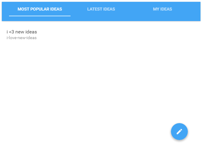
Tabs are clickable, have fluid animations, that's cool. But how do I wire them up together with react-router and its' <Link/> component?
I've tried adding onChange listener like that:
<Tab
  label='My ideas'
  onChange={<Link to='/myPath'></Link>}
/>
However I'm getting following error:
Uncaught Invariant Violation: Expected onChange listener to be a function, instead got type object
If I try to wrap <Tab/> component into <Link/> component, I'm getting error that <Tabs/> component accepts only <Tab/> component.
This doesn't work either (no error is being produced, but clicking on Tab does not bring me to the path):
<Tab label='Most popular ideas'>
  <Link to='/popular'/>
</Tab>
How do I make <Link/> component work together with <Tabs> and <AppBar>? If that's not possible, I can use any other component from material-ui library to form a proper menu.
Solution 1:
For Material UI 1.0 with Typescript: see this post by @ogglas below.
For Material-UI 1.0 with plain JS:
<Tabs value={value} onChange={this.handleChange}>
  {
    this.props.tabs.map(
      ({label, path})=><Tab key={label}
                            label={label}
                            className={classes.tabLink}
                            component={Link}
                            to={path} />
    )
  }
</Tabs>
And classes.tabLink is defined as:
tabLink : {
    display:"flex",
    alignItems:"center",
    justifyContent:"center"
}
How this works?
All the mui 1.0 components inheriting from ButtonBase, support a component prop, see ButtonBase. The idea is to allow you to control what the component renders as its wrapper/root element. Tab also has this feature although at the time of writing this answer this prop is not documented explicitly, but as Tab inherits from ButtonBase, all its props carry over (and the documentation does cover this).
Another feature of ButtonBase is that all the extra props, not in use by ButtonBase or inherited component, are spread over the specified component. We have used this behavior to send the to prop used by Link by giving it to Tab control. You can send any additional props in the same way. Note that this is documented explicitly for both ButtonBase and Tab.
Thanks @josh-l for asking this to be added.
Solution 2:
here's how you can do it now:
<Tabs onChange={this.changeTab} value={value}>
   <Tab value={0} label="first" containerElement={<Link to="/first"/>} />
   <Tab value={1} label="second" containerElement={<Link to="/second"/>}/>
   <Tab value={2} label="third" containerElement={<Link to="/third"/>} />
 </Tabs>
Solution 3:
You can try this simple method
<Tab label='Most popular ideas' to='/myPath' component={Link} />