Every item to have the same width as the widest element
I want to create this layout:
When an item doesn't fit in the container, we can move to the next line:

When the container is tiny than the wider item, we can wrap the content in multilines

It's very easy with Javascript, here is the example https://jsfiddle.net/oucxsep4/.
var choices = document.querySelectorAll('li');
var maxWidth = 0;
// read
for (i = 0; i < choices.length; ++i) {
    maxWidth = Math.max(maxWidth, choices[i].offsetWidth)
};

// write
for (i = 0; i < choices.length; ++i) {
    choices[i].style.width = maxWidth + "px";
};
ul{
margin: 0;
padding: 0;
list-style: none;
}
li{
background: red;
float: left;
margin: 5px;
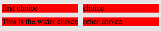
}<ul>
<li>first choice</li>
<li>choice</li>
<li>This is the wider choice</li>
<li>other choice</li>
</ul>Is it possible to do it without using Javascript, only CSS? I have tried with flexbox without success.
It is possible using simple css:
.list-container {
  display: inline-flex;
  flex-direction: row;
  justify-content: center;
}

.list {
  display: flex;
  flex-direction: column;
}

.list-item {
  text-transform: capitalize;
  background-color: rgb(200, 30, 40);
  font-size: 1.3em;
  text-align: left;
  padding: 10px;
  margin: 1px;
  display: flex;
  flex-direction: row;
  flex-wrap: wrap;
  justify-content: flex-start;
}
<!DOCTYPE html>
<div class="list-container">
<div class="list">
<div class="list-item">fresh figs</div>
<div class="list-item">pine nuts</div>
<div class="list-item">honey</div>
<div class="list-item">balsamic vinegar</div>
</div>
</div>
<div class="list-container">
<div class="list">
<div class="list-item">fresh figs</div>
<div class="list-item">pine nuts</div>
<div class="list-item">honey</div>
<div class="list-item">balsamic vinegar</div>
</div>
</div>It is not yet possible with CSS alone to match all sibling elements widths to the widest one. However, you can achieve most of your desired layout with CSS by giving your list items a width of 50% to create the two column structure (width: calc(50% - 10px /* subtracts margins */);) and then also give them a minimum width (min-width:153px; in this example).
If you are not able to manually set a minimum width in the CSS then you will likely have to supplement your CSS with some javascript to set the minimum width for those sibling elements similar to your example.
ul{
    margin: 0;
    padding: 5px;
    list-style: none;
    width:50%;
    background-color: #eee;
}

ul::after {
    clear: both;
    content: "";
    display: block;
}

li {
    background: red none repeat scroll 0 0;
    display: block;
    float: left;
    margin: 5px;
    min-width: 153px;
    width: calc(50% - 10px);
}
<ul>
<li>first choice</li>
<li>choice</li>
<li>This is the wider choice</li>
<li>other choice</li>
</ul>I have an ugly solution
https://jsfiddle.net/y5x3znqo/2/
body {
  background: #ccc
}

ul {
  margin: 0;
  padding: 0;
  list-style: none;
}

li {
  background: red;
  float: left;
  margin: 5px;
}

.label {
  position: absolute;
}

.hide {
  visibility: hidden;
}
<ul>
<li>
<span class="label">first choice</span>
<span class="hide">This is the wider choice</span>
</li>
<li>
<span class="label">choice</span>
<span class="hide">This is the wider choice</span>
</li>
<li>
<span>This is the wider choice</span>
</li>
<li>
<span class="label">other choice</span>
<span class="hide">This is the wider choice</span>
</li>
</ul>The idea is put the widest item in every choice with visibility:hidden. This requires to precalculate the widest item, for example in the backend.