responsive images srcset not working
You have it correct.
The thing is, that once your browser has the higher resolution picture (loaded, in cache), there is no point for it to download lower quality one, even when you make your window smaller (the point of this is to save traffic).
So if you want to test this, just make your window smaller and THEN load the page (after clearing the cache / or use incognito mode). You will get the mobile or tablet version. Then by making the window bigger, you'll at some point see your browser switching to higher resolution picture.
Update 2022; Simply use Ctrl + Shift + R shortcut (for Mac: Cmd + Shift + R) after resize, instead of clearing cache, so that the browser will reload, and ignore cache for current tab till done (In other words, full-reload without losing entire cache).
When used in an img tag, the srcset attribute leaves the decisions up to the browser in terms of which image to load as mentioned by TondaCZE. If you want to force browsers to load images at specified viewports, you want to use the picture element.
<picture>
  <source srcset="large.jpg" media="(min-width: 1200px)" />
  <source srcset="medium.jpg" media="(min-width: 800px)" />
  <img src="small.jpg" />
</picture>
I have just noticed that your demo page (http://www.darrencousins.com/lab/resp-img-srcset/) was never displaying the mobile version (even when resizing the browser or using the DevTools - Device mode) on Google Chrome (version 48).
Changing the device pixel ratio to 1 seems to load the correct image.
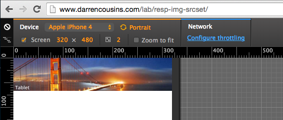
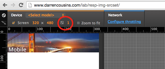
I don't know why, I am wondering if the w descriptors take the device pixels ratio into consideration
We faced the same issue while working with srcsets for the first time in our project. After investing some time, one of our team members was finally able to crack the issue. The reason why your code doesn't work is because of the mismatch of the sizes in srcset and sizes attribute. You have to provide double the width in the srcset for the browser to be able to match it with the width in sizes. For example,
 <img
        srcSet="image1920w.png 1920w,image720w.png 720w"
        sizes="(min-width: 960px) 960px,
        360px"
        src="www.image1920w.com"
         alt="Sample"
     />
Here's a sample working code for you to try out.
Make sure you open it in incognito (since once the browser loads higher resolution image, it will not go back lower resolution image) and run the code first in browser size less than 1920px to see the smaller resolution image(sunset) and once you start increasing the browser size, you will be able to see the larger image (flower).