How can I scale an image in a CSS sprite
2021 Update: Background size is supported by most major browser but if your mobile browsers doesn't support it use zoom.
You could use background-size, as its supported by most browsers (but not all http://caniuse.com/#search=background-size)
background-size : 150% 150%;
Or
You can use a combo of zoom for webkit/blink/ie and transform:scale for Mozilla(-moz-) and old Opera(-o-) for cross-browser desktop & mobile
[class^="icon-"]{
    display: inline-block;
    background: url('../img/icons/icons.png') no-repeat;
    width: 64px;
    height: 51px;
    overflow: hidden;
    zoom:0.5;
    /* Mozilla support */
    -moz-transform:scale(0.5);
    -moz-transform-origin: 0 0;
}

.icon-big{
    zoom:0.60;
    /* Mozilla support */
    -moz-transform:scale(0.60);
    -moz-transform-origin: 0 0;
}

.icon-small{
    zoom:0.29;
    /*  Mozilla support */
    -moz-transform:scale(0.29);
    -moz-transform-origin: 0 0;
}
When you use sprites, you are limited to the dimensions of the image in the sprite. The background-size CSS property, mentioned by Stephen, isn't widely supported yet and might cause problems with browsers like IE8 and below - and given their market share, this isn't a viable option.
Another way to solve the problem is to use two elements and scale the sprite by using it with an img tag, like this:
<div class="sprite-image"
     style="width:20px; height:20px; overflow:hidden; position:relative">
    <!-- set width/height proportionally, to scale the sprite image -->
    <img src="sprite.png" alt="icon"
         width="20" height="80"
         style="position:absolute; top: -20px; left: 0;" />
</div>
This way, the outer element (div.sprite-image) is cropping a 20x20px image from the img tag, which acts like a scaled background-image.
Try this: Stretchy Sprites - Cross-browser, responsive resizing/stretching of CSS sprite images
This method scales sprites 'responsively' so that the width/height adjust according to your browser window size. It doesn't use background-size as support for this in older browsers is non-existent.
CSS
.stretchy {display:block; float:left; position:relative; overflow:hidden; max-width:160px;}
.stretchy .spacer {width: 100%; height: auto;}
.stretchy .sprite {position:absolute; top:0; left:0; max-width:none; max-height:100%;}
.stretchy .sprite.s2 {left:-100%;}
.stretchy .sprite.s3 {left:-200%;}
HTML
<a class="stretchy" href="#">
  <img class="spacer" alt="" src="spacer.png">
  <img class="sprite" alt="icon" src="sprite_800x160.jpg">
</a>
<a class="stretchy s2" href="#">
  <img class="spacer" alt="" src="spacer.png">
  <img class="sprite" alt="icon" src="sprite_800x160.jpg">
</a>
<a class="stretchy s3" href="#">
  <img class="spacer" alt="" src="spacer.png">
  <img class="sprite" alt="icon" src="sprite_800x160.jpg">
</a>
transform: scale(); will make original element preserve its size.
I found the best option is to use vw.
It's working like a charm:
https://jsfiddle.net/tomekmularczyk/6ebv9Lxw/1/
#div1,
#div2,
#div3 {
  background:url('//www.google.pl/images/branding/googlelogo/2x/googlelogo_color_272x92dp.png') no-repeat;
  background-size: 50vw;
  border: 1px solid black;
  margin-bottom: 40px;
}

#div1 {
  background-position: 0 0;
  width: 12.5vw;
  height: 13vw;
}
#div2 {
  background-position: -13vw -4vw;
  width: 17.5vw;
  height: 9vw;
  transform: scale(1.8);
}
#div3 {
  background-position: -30.5vw 0;
  width: 19.5vw;
  height: 17vw;
}
<div id="div1">
</div>
<div id="div2">
</div>
<div id="div3">
</div>This seems to work for me.
If the sprites are in grid, set the background-size to 100% number of sprites across and 100% number of sprites down. Then use background-position -<x*100>% -<y*100>% where x and y are the zero based sprite
In other words if you want the 3rd sprite from the left and 2nd row that's 2 over and 1 down so
background-position: -200% -100%;
For example here's a sprite sheet 4x2 sprites

And here's an example
div {
  margin: 3px;
  display: inline-block;
}
.sprite {
  background-image: url('https://i.stack.imgur.com/AEYNC.png');
  background-size: 400% 200%;  /* 4x2 sprites so 400% 200% */
}
.s0x0 { background-position:    -0%   -0%; }
.s1x0 { background-position:  -100%   -0%; }
.s2x0 { background-position:  -200%   -0%; }
.s3x0 { background-position:  -300%   -0%; }
.s0x1 { background-position:    -0%  -100%; }
.s1x1 { background-position:  -100%  -100%; }
.s2x1 { background-position:  -200%  -100%; }
.s3x1 { background-position:  -300%  -100%; }
<div class="sprite s3x1" style="width: 45px; height:20px"></div>
<div class="sprite s3x1" style="width: 128px; height:30px"></div>
<div class="sprite s3x1" style="width: 64px; height:56px"></div>
<div class="sprite s2x1" style="width: 57px; height:60px"></div>
<div class="sprite s3x0" style="width: 45px; height:45px"></div>
<div class="sprite s0x1" style="width: 12px; height:100px"></div>
<br/>
<div class="sprite s0x0" style="width: 45px; height:20px"></div>
<div class="sprite s1x0" style="width: 128px; height:45px"></div>
<div class="sprite s2x0" style="width: 64px; height:56px"></div>
<div class="sprite s3x0" style="width: 57px; height:60px"></div>
<br/>
<div class="sprite s0x1" style="width: 45px; height:45px"></div>
<div class="sprite s1x1" style="width: 12px; height:50px"></div>
<div class="sprite s2x1" style="width: 12px; height:50px"></div>
<div class="sprite s3x1" style="width: 12px; height:50px"></div>If the sprites are different sizes you'd need to set the background-size for each sprite to the a percent such that that sprite's width becomes 100%
In other words if image is 640px wide and the sprite inside that image is 45px wide then to get that 45px to be 640px
xScale = imageWidth / spriteWidth
xScale = 640 / 45
xScale = 14.2222222222
xPercent = xScale * 100
xPercent = 1422.22222222%
Then you need to set the offset. The complication of the offset is that 0% is aligned left and 100% is aligned right.
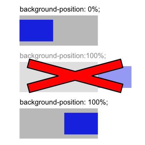
As a graphics programmer, I'd expect an offset of 100% to move the background 100% across the element, in other words entirely off the right side but that's not what 100% means when used with backgrouhnd-position. background-position: 100%; means right aligned. So, the forumla for taking that into account after scaling is
xOffsetScale = 1 + 1 / (xScale - 1)
xOffset = offsetX * offsetScale / imageWidth
Assume the offset is 31px
xOffsetScale = 1 + 1 / (14.222222222 - 1)
xOffsetScale = 1.0756302521021115
xOffset = offsetX * xOffsetScale / imageWidth
xOffset = 31 * 1.0756302521021115 / 640
xOffset = 0.05210084033619603
xOffsetPercent = 5.210084033619603
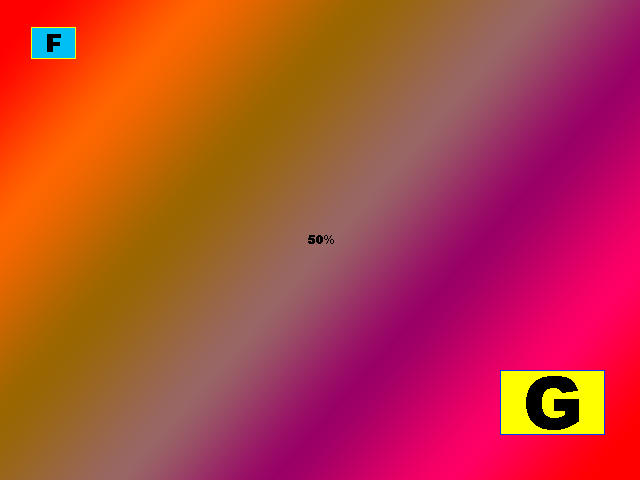
Here's a 640x480 image with 2 sprites.
- at 31x 27y size 45w 32h
- at 500x 370y size 105w 65h
Following the math above for sprite 1
xScale = imageWidth / spriteWidth
xScale = 640 / 45
xScale = 14.2222222222
xPercent = xScale * 100
xPercent = 1422.22222222%

xOffsetScale = 1 + 1 / (14.222222222 - 1)
xOffsetScale = 1.0756302521021115
xOffset = offsetX * xOffsetScale / imageWidth
xOffset = 31 * 1.0756302521021115 / 640
xOffset = 0.05210084033619603
xOffsetPercent = 5.210084033619603

yScale = imageHeight / spriteHEight
yScale = 480 / 32
yScale = 15
yPercent = yScale * 100
yPercent = 1500%

yOffsetScale = 1 + 1 / (15 - 1)
yOffsetScale = 1.0714285714285714
yOffset = offsetY * yOffsetScale / imageHeight
yOffset = 27 * 1.0714285714285714 / 480
yOffset = 0.06026785714285714
yOffsetPercent = 6.026785714285714
div {
  margin: 3px;
  display: inline-block;
}
.sprite {
  background-image: url('https://i.stack.imgur.com/mv9lJ.png');
}
.s1 {
  background-size:      1422.2222% 1500%;
  background-position:  5.210084033619603% 6.026785714285714%;
}
.s2 {
  background-size:      609.5238095238095% 738.4615384615385%;
  background-position:  93.45794392523367% 89.1566265060241%;
}
<div class="sprite s1" style="width: 45px; height:20px"></div>
<div class="sprite s1" style="width: 128px; height:30px"></div>
<div class="sprite s1" style="width: 64px; height:56px"></div>
<div class="sprite s1" style="width: 57px; height:60px"></div>
<div class="sprite s1" style="width: 45px; height:45px"></div>
<div class="sprite s1" style="width: 12px; height:50px"></div>
<div class="sprite s1" style="width: 50px; height:40px"></div>
<hr/>
<div class="sprite s2" style="width: 45px; height:20px"></div>
<div class="sprite s2" style="width: 128px; height:30px"></div>
<div class="sprite s2" style="width: 64px; height:56px"></div>
<div class="sprite s2" style="width: 57px; height:60px"></div>
<div class="sprite s2" style="width: 45px; height:45px"></div>
<div class="sprite s2" style="width: 12px; height:50px"></div>
<div class="sprite s2" style="width: 50px; height:40px"></div>