Center a large image of unknown size inside a smaller div with overflow hidden
I would like to center an img inside a div without javascript and without background-images.
Here is some example code
<div>
    <img src="/happy_cat.png"/>
</div>
- I don't know the size of the img and it should be able to exceed the width of the parent
- I don't know the width of the parent div (it is 100%)
- The parent div has a fixed height
- The image is larger than the parent and the parent has overflow:hidden
- Only need to support modern browsers
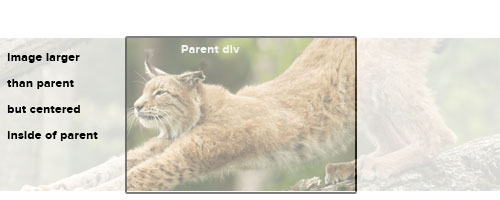
Desired result. (Ignore opacities etc, just note the positioning).
I know this can be done easily with background images but that isn't an option for me. I could also use javascript but it seems like a very heavy handed way to achieve this.
Thanks!
Jack
Solution 1:
What about this:
.img {
   position: absolute;
   left: 50%;
   top: 50%;
   -webkit-transform: translateY(-50%) translateX(-50%);
}
This assumes that the parent div is positioned relatively. I think this works if you want the .img relatively positioned rather than absolutely. Just remove the position: absolute and change top/left to margin-top and margin-left.
You'll probably want to add browser support with transform, -moz-transform etc.
Solution 2:
Old question, new answer:
When the image is larger than the wrapping div, a text-align:center or margin:auto is not going to work. But if the image is smaller, then solutions with absolute positioning or a negative left margin are going to produce weird effects.
So when the image size is actually not known in advance (like on a CSM) and it might be larger or smaller than the wrapping div, there is an elegant CSS3 solution that serves all purposes:
div {
    display: flex;
    justify-content: center;
    height: 400px; /* or other desired height */
    overflow: hidden;
}
img {
    flex: none; /* keep aspect ratio */
}
Note that depending on other rules in your stylesheet, you might need to append width:auto and/or max-width:none to the img.
Solution 3:
This is always a bit tricky and there are many solutions out there. I find the best solution to be the following. This centers it both vertically and horizontally.
CSS
#container {
    height: 400px;
    width: 400px;
}
.image {
    background: white;
    width: 100%;
    height: 100%;
    position: relative;
    overflow: hidden;
}

.left {
    width: 100px;
    height: 100%;
    z-index: 2;
    background: white;
    top: 0px;
    position: absolute;
    left: 0px;
}
.right {
    width: 100px;
    height: 100%;
    z-index: 2;
    position: absolute;
    background: white;
    top: 0px;
    right: 0px;
}
.image img {
    margin: auto;
    display: block;
}
HTML
    <div id="container">
<div class="image">
    <div class="left"></div>
    <div class="right"></div>
    <img width="500" src="https://www.google.com.au/images/srpr/logo11w.png" />
</div>
See fiddle
slightly different technique: Fiddle
Solution 4:
Thanks everyone for your help. I'm going to consider this unachievable in CSS only.
I will move to a jQuery solution. Here is some [pseudo]code for those interested.
I was going to give up on a CSS solution but looks like it can be done (see accepted answer). Here is the JS solution I was going to go with.
var $img = $('img'),
    w = $img.width();

$img.css({marginLeft: -w});
And the accompanying css
img{
  position:absolute;
  left:50%;
}
Solution 5:
I know this is old but I also came up with a pure css solution very similar to the above.
.parent {
    float: left;
    position: relative;
    width: 14.529%; // Adjust to your needs
}

.parent img {
    margin: auto;
    max-width: none; // this was needed for my particular instance
    position: absolute;
    top: 11px; right: -50%; bottom: 0; left: -50%;
    z-index: 0;
}