Bootstrap Fluid grid system with different height
I am new in Bootstrap. I want to use the fluid grid system grid with different height and same width like the following image 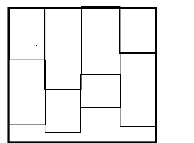 .
.
How can i implement the same? Please help me.
The only way to do this with Bootstrap "out-of-the-box" would be to use 4 columns and stack the items in each. This isn't ideal for dynamic content when you don't know how many items you'll have in each column. Also the items order top-to-bottom, and not left-to-right.
<div class="container-fluid">
    <div class="row">
        <div class="col-md-3">
        <!--item1-->
        <!--item2-->
        <!--item3-->
        <!--item4-->
        </div>
        <div class="col-md-3">
        <!--item5-->
        <!--item6-->
        <!--item7-->
        <!--item8-->
        </div>
        <div class="col-md-3">
        <!--item-->
        <!--item-->
        <!--item-->
        </div>
        <div class="col-md-3">
        <!--item-->
        <!--item-->
        <!--item-->
        <!--item-->
        <!--item-->
        </div>
      </div>
</div>
Otherwise, you have to use a jQuery plugin like Masonry or Isotope, or using CSS3 multi-columns.
Jquery plugin method
Bootstrap Masonry Demo
Bootstrap Masonry Demo 2
CSS3 columns method (Masonry-like CSS solution)..
This is not native to Bootstrap 3, but another approach using CSS multi-columns. One downside to this approach is the column order is top-to-bottom instead of left-to-right.
CSS3 multi-columns Demo
There is also more detailed info in this answer to a similar question.
Update 2018
Bootstrap 4 includes a Masonry-like solution using CSS3 multi-columns: Masonry cards Demo
Bootstrap v4.0.0-beta.2 Card columns
<link rel="stylesheet" href="https://maxcdn.bootstrapcdn.com/bootstrap/4.0.0-beta.2/css/bootstrap.min.css" integrity="sha384-PsH8R72JQ3SOdhVi3uxftmaW6Vc51MKb0q5P2rRUpPvrszuE4W1povHYgTpBfshb" crossorigin="anonymous">

<div class="card-columns">
  <div class="card">
    <img class="card-img-top" src="..." alt="Card image cap">
    <div class="card-body">
      <h4 class="card-title">Card title that wraps to a new line</h4>
      <p class="card-text">This is a longer card with supporting text below as a natural lead-in to additional content. This content is a little bit longer.</p>
    </div>
  </div>
  <div class="card p-3">
    <blockquote class="blockquote mb-0 card-body">
      <p>Lorem ipsum dolor sit amet, consectetur adipiscing elit. Integer posuere erat a ante.</p>
      <footer class="blockquote-footer">
        <small class="text-muted">
          Someone famous in <cite title="Source Title">Source Title</cite>
        </small>
      </footer>
    </blockquote>
  </div>
  <div class="card">
    <img class="card-img-top" src="..." alt="Card image cap">
    <div class="card-body">
      <h4 class="card-title">Card title</h4>
      <p class="card-text">This card has supporting text below as a natural lead-in to additional content.</p>
      <p class="card-text"><small class="text-muted">Last updated 3 mins ago</small></p>
    </div>
  </div>
  <div class="card bg-primary text-white text-center p-3">
    <blockquote class="blockquote mb-0">
      <p>Lorem ipsum dolor sit amet, consectetur adipiscing elit. Integer posuere erat.</p>
      <footer class="blockquote-footer">
        <small>
          Someone famous in <cite title="Source Title">Source Title</cite>
        </small>
      </footer>
    </blockquote>
  </div>
  <div class="card text-center">
    <div class="card-body">
      <h4 class="card-title">Card title</h4>
      <p class="card-text">This card has supporting text below as a natural lead-in to additional content.</p>
      <p class="card-text"><small class="text-muted">Last updated 3 mins ago</small></p>
    </div>
  </div>
  <div class="card">
    <img class="card-img" src="..." alt="Card image">
  </div>
  <div class="card p-3 text-right">
    <blockquote class="blockquote mb-0">
      <p>Lorem ipsum dolor sit amet, consectetur adipiscing elit. Integer posuere erat a ante.</p>
      <footer class="blockquote-footer">
        <small class="text-muted">
          Someone famous in <cite title="Source Title">Source Title</cite>
        </small>
      </footer>
    </blockquote>
  </div>
  <div class="card">
    <div class="card-body">
      <h4 class="card-title">Card title</h4>
      <p class="card-text">This is a wider card with supporting text below as a natural lead-in to additional content. This card has even longer content than the first to show that equal height action.</p>
      <p class="card-text"><small class="text-muted">Last updated 3 mins ago</small></p>
    </div>
  </div>
</div>
You can learn more about it https://getbootstrap.com/docs/4.0/components/card/