Select arrow style change
I'm trying to replace the arrow of a select with a picture of my own. I'm including the select in a div with the same size, I set the background of the select as transparent and I'm including a picture(with the same size as the arrow) in the right top corner of the div as background.
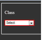
It only works in Chrome.
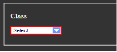
How can I make it work in Firefox and IE9 where I'm getting this:
.styled-select {
  width: 100px;
  height: 17px;
  overflow: hidden;
  overflow: -moz-hidden-unscrollable;
  background: url(images/downarrow_blue.png) no-repeat right white;
  border: 2px double red;
  display: inline-block;
  position: relative;
}

.styled-select select {
  background: transparent;
  -webkit-appearance: none;
  width: 100px;
  font-size: 11px;
  border: 0;
  height: 17px;
  position: absolute;
  left: 0;
  top: 0;
}

body {
  background-color: #333333;
  color: #FFFFFF;
}

.block label {
  color: white;
}
<HTML>
<HEAD>
</HEAD>
<BODY>
<p/>
<form action="/prepareUpdateCategoryList.do?forwardto=search">
<fieldset class="block" id="searchBlock">
<p>
<label style="width:80px">Class</label>
<div class="styled-select">
<select property="voucherCategoryClass">
<option value="0">Select </option>
<option value="7382">steam </option>
</select>
</div>
</p>
</fieldset>
</form>
</BODY>
</HTML>Have you tried something like this:
.styled-select select {
    -moz-appearance:none; /* Firefox */
    -webkit-appearance:none; /* Safari and Chrome */
    appearance:none;
}
Haven't tested, but should work.
EDIT: It looks like Firefox doesn't support this feature up until version 35 (read more here)
There is a workaround here, take a look at jsfiddle on that post.
I have set up a select with a custom arrow similar to Julio's answer, however it doesn't have a set width and uses an svg as a background image. (arrow_drop_down from material-ui icons)
select {
  -webkit-appearance: none;
  -moz-appearance: none;
  background: transparent;
  background-image: url("data:image/svg+xml;utf8,<svg fill='black' height='24' viewBox='0 0 24 24' width='24' xmlns='http://www.w3.org/2000/svg'><path d='M7 10l5 5 5-5z'/><path d='M0 0h24v24H0z' fill='none'/></svg>");
  background-repeat: no-repeat;
  background-position-x: 100%;
  background-position-y: 5px;
  border: 1px solid #dfdfdf;
  border-radius: 2px;
  margin-right: 2rem;
  padding: 1rem;
  padding-right: 2rem;
}

If you need it to also work in IE update the svg arrow to base64 and add the following:
select::-ms-expand { display: none; }

background-image: url(data:image/svg+xml;base64,PHN2ZyBmaWxsPSdibGFjaycgaGVpZ2h0PScyNCcgdmlld0JveD0nMCAwIDI0IDI0JyB3aWR0aD0nMjQnIHhtbG5zPSdodHRwOi8vd3d3LnczLm9yZy8yMDAwL3N2Zyc+PHBhdGggZD0nTTcgMTBsNSA1IDUtNXonLz48cGF0aCBkPSdNMCAwaDI0djI0SDB6JyBmaWxsPSdub25lJy8+PC9zdmc+);
To make it easier to size and space the arrow, use this svg:
url("data:image/svg+xml,<svg width='24' height='24' xmlns='http://www.w3.org/2000/svg'><path d='m0,6l12,12l12,-12l-24,0z'/><path fill='none' d='m0,0l24,0l0,24l-24,0l0,-24z'/></svg>");
It doesn't have any spacing on the arrow's sides.
Working with just one class:
select {
    width: 268px;
    padding: 5px;
    font-size: 16px;
    line-height: 1;
    border: 0;
    border-radius: 5px;
    height: 34px;
    background: url(http://cdn1.iconfinder.com/data/icons/cc_mono_icon_set/blacks/16x16/br_down.png) no-repeat right #ddd;
    -webkit-appearance: none;
    background-position-x: 244px;
}
http://jsfiddle.net/qhCsJ/4120/
Here is an elegant fix that uses a span to show the value.
Layout is like this:
<div class="selectDiv">
   <span class="selectDefault"></span>
   <select name="txtCountry" class="selectBox">
      <option class="defualt-text">-- Select Country --</option>
      <option value="1">Abkhazia</option>
      <option value="2">Afghanistan</option>
   </select>
</div>
JsFiddle
This would work well especially for those using Bootstrap, tested in latest browser versions:
select {
  -webkit-appearance: none;
  -moz-appearance: none;
  appearance: none;
  /* Some browsers will not display the caret when using calc, so we put the fallback first */
  background: url("http://cdn1.iconfinder.com/data/icons/cc_mono_icon_set/blacks/16x16/br_down.png") white no-repeat 98.5% !important; /* !important used for overriding all other customisations */
  background: url("http://cdn1.iconfinder.com/data/icons/cc_mono_icon_set/blacks/16x16/br_down.png") white no-repeat calc(100% - 10px) !important; /* Better placement regardless of input width */
}
/*For IE*/
select::-ms-expand { display: none; }
<link href="https://cdnjs.cloudflare.com/ajax/libs/twitter-bootstrap/3.3.7/css/bootstrap.css" rel="stylesheet"/>
<div class="container">
<div class="row">
<div class="col-xs-6">
<select class="form-control">
<option>Option 1</option>
<option>Option 2</option>
<option>Option 3</option>
</select>
</div>
</div>
</div>