How do I achieve equal height divs (positioned side by side) with HTML / CSS ?
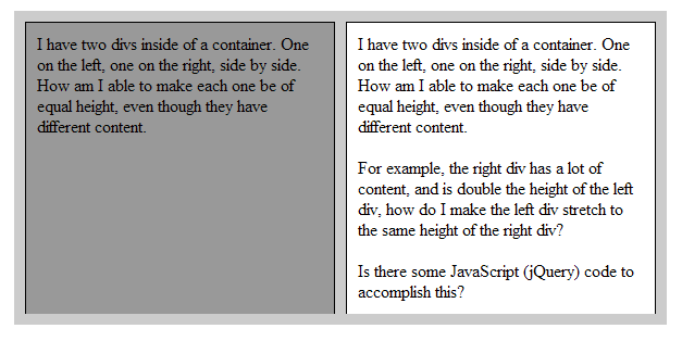
I have two divs inside of a container. One on the left, one on the right, side by side. How am I able to make each one be of equal height, even though they have different content.
For example, the right div has a lot of content, and is double the height of the left div, how do I make the left div stretch to the same height of the right div?
Is there some JavaScript (jQuery) code to accomplish this?
You could use jQuery, but there are better ways to do this.
This sort of question comes up a lot and there are generally 3 answers...
1. Use CSS
This is the 'best' way to do it, as it is the most semantically pure approach (without resorting to JS, which has its own problems). The best way is to use the display: table-cell and related values. You could also try using the faux background technique (which you can do with CSS3 gradients).
2. Use Tables
This seems to work great, but at the expense of having an unsemantic layout. You'll also cause a stir with purists. I have all but avoided using tables, and you should too.
3. Use jQuery / JavaScript
This benefits in having the most semantic markup, except with JS disabled, you will not get the effect you desire.
Here's a way to do it with pure CSS, however, as you'll notice in the example (which works in IE 7 and Firefox), borders can be difficult - but they aren't impossible, so it all depends what you want to do. This example assumes a rather common CSS structure of body > wrapper > content container > column 1 and column 2.
The key is the bottom margin and its canceling padding.
<!DOCTYPE html PUBLIC "-//W3C//DTD XHTML 1.0 Transitional//EN" "http://www.w3.org/TR/xhtml1/DTD/xhtml1-transitional.dtd">
<html xmlns="http://www.w3.org/1999/xhtml">
<head>
<meta http-equiv="Content-Type" content="text/html; charset=utf-8" />
<title>Equal Height Columns</title>
<style type="text/css">
<!--
* { padding: 0; margin: 0; }
#wrapper { margin: 10px auto; width: 600px; }
#wrapper #main_container { width: 590px; padding: 10px 0px 10px 10px; background: #CCC; overflow: hidden; border-bottom: 10px solid #CCC; }
#wrapper #main_container div { float: left; width: 263px; background: #999; padding: 10px; margin-right: 10px; border: 1px solid #000; margin-bottom: -1000px; padding-bottom: 1000px; }
#wrapper #main_container #right_column { background: #FFF; }
-->
</style>
</head>
<body>
<div id="wrapper">
<div id="main_container">
<div id="left_column">
<p>I have two divs inside of a container. One on the left, one on the right, side by side. How am I able to make each one be of equal height, even though they have different content.</p>
</div><!-- LEFT COLUMN -->
<div id="right_column">
<p>I have two divs inside of a container. One on the left, one on the right, side by side. How am I able to make each one be of equal height, even though they have different content.</p>
<p> </p>
<p>For example, the right div has a lot of content, and is double the height of the left div, how do I make the left div stretch to the same height of the right div?</p>
<p> </p>
<p>Is there some JavaScript (jQuery) code to accomplish this?</p>
</div><!-- RIGHT COLUMN -->
</div><!-- MAIN CONTAINER -->
</div><!-- WRAPPER -->
</body>
</html>
This is what it looks like:
you can get it working with js:
<script>
    $(document).ready(function() {
        var height = Math.max($("#left").height(), $("#right").height());
        $("#left").height(height);
        $("#right").height(height);
    });
</script>
I've seen many attempts to do this, though none met my OCD needs. You might need to dedicate a second to get your head around this, though it is better than using JavaScript.
Known downsides:
- Does not support multiple element rows in case of a container with dynamic width.
- Does not work in IE6.
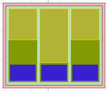
The base:
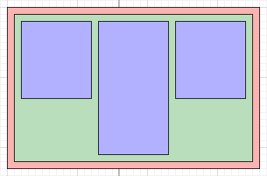
- red is (auxiliary) container that you would use to set margin to the content.
-
green is
position: relative; overflow: hiddenand (optionally, if you want columns to be centered)text-align: center; font-size: 0; line-height: 0; -
blue
display: block; float: left;or (optionally, if you want columns to be centered)display: inline-block; vertical-align: top;
So far nothing out of ordinary. Whatever content that blue element has, you need to add an absolutely positioned element (yellow; note that the z-index of this element must be lower than the actual content of the blue box) with this element and set top: 0; bottom: 0; (don't set left or right position).
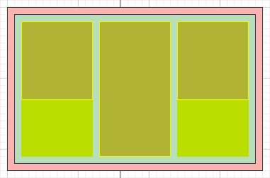
All your elements now have equal height. For most of the layouts, this is already sufficient. My scenario required to have dynamic content followed by a static content, where static content must be on the same line.

To achieve this, you need to add padding-bottom (dark green) eq to the fixed height content to the blue elements.
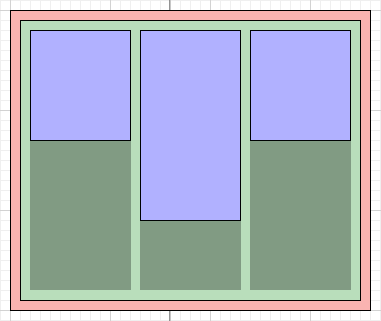
Then within the yellow elements create another absolutely positioned (left: 0; bottom: 0;) element (dark blue).
Supposedly, if these boxes (yellow) had to be active hyperlinks and you had any style that you wanted to apply to the original blue boxes, you'd use adjacent sibling selector:
yellow:hover + blue {}
Here is a the code and demo:
HTML:
<div id="products">
    <ul>
        <li class="product a">
            <a href="">
                <p class="name">Ordinary product description.</p>
                <div class="icon-product"></div>
            </a>
            <p class="name">Ordinary product description.</p>
        </li>
        <li class="product b">
            <a href="">
                <p class="name">That lenghty product description or whatever else that does not allow you have fixed height for these elements.</p>
                <div class="icon-product"></div>
            </a>
            <p class="name">That lenghty product description or whatever else that does not allow you have fixed height for these elements.</p>
        </li>
        <li class="product c">
            <a href="">
                <p class="name">Another ordinary product description.</p>
                <div class="icon-product"></div>
            </a>
            <p class="name">Another ordinary product description.</p>
        </li>
    </ul>
</div>
SCSS/LESS:
#products {
    ul { position: relative; overflow: hidden; text-align: center; font-size: 0; line-height: 0;  padding: 0; margin: 0;
        li { display: inline-block; vertical-align: top; width: 130px; padding: 0 0 130px 0; margin: 0; }
    }

    li {
        a { display: block; position: absolute; width: 130px; background: rgba(255,0,0,.5); z-index: 3; top: 0; bottom: 0;
            .icon-product { background: #ccc; width: 90px; height: 90px; position: absolute; left: 20px; bottom: 20px; }
            .name { opacity: 1; }
        }

        .name { position: relative; margin: 20px 10px 0; font-size: 14px; line-height: 18px; opacity: 0; }

        a:hover {
            background: #ddd; text-decoration: none;

            .icon-product { background: #333; }
        }
    }
}
Note, that the demo is using a workaround that involves data-duplication to fix z-index. Alternatively, you could use pointer-events: none and whatever solution for IE.