Align labels in form next to input
I have very basic and known scenario of form where I need to align labels next to inputs correctly. However I don't know how to do it.
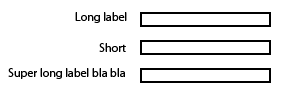
My goal would be that labels are aligned next to inputs to the right side. Here is picture example of desired result.
I have made a fiddle for your convenience and to clarify what I have now - http://jsfiddle.net/WX58z/
Snippet:
<div class="block">
    <label>Simple label</label>
    <input type="text" />
</div>
<div class="block">
    <label>Label with more text</label>
    <input type="text" />
</div>
<div class="block">
    <label>Short</label>
    <input type="text" />
</div>
Solution 1:
WARNING: OUTDATED ANSWER
Nowadays you should definitely avoid using fixed widths. You could use flexbox or CSS grid to come up with a responsive solution. See the other answers.
One possible solution:
- Give the labels
display: inline-block; - Give them a fixed width
- Align text to the right
That is:
label {
display: inline-block;
width: 140px;
text-align: right;
}<div class="block">
<label>Simple label</label>
<input type="text" />
</div>
<div class="block">
<label>Label with more text</label>
<input type="text" />
</div>
<div class="block">
<label>Short</label>
<input type="text" />
</div>JSFiddle
Solution 2:
While the solutions here are workable, more recent technology has made for what I think is a better solution. CSS Grid Layout allows us to structure a more elegant solution.
The CSS below provides a 2-column "settings" structure, where the first column is expected to be a right-aligned label, followed by some content in the second column. More complicated content can be presented in the second column by wrapping it in a <div>.
[As a side-note: I use CSS to add the ':' that trails each label, as this is a stylistic element - my preference.]
/* CSS */

div.settings {
    display:grid;
    grid-template-columns: max-content max-content;
    grid-gap:5px;
}
div.settings label       { text-align:right; }
div.settings label:after { content: ":"; }
<!-- HTML -->
<div class="settings">
<label>Label #1</label>
<input type="text" />
<label>Long Label #2</label>
<span>Display content</span>
<label>Label #3</label>
<input type="text" />
</div>Solution 3:
Answered a question such as this before, you can take a look at the results here:
Creating form to have fields and text next to each other - what is the semantic way to do it?
So to apply the same rules to your fiddle you can use display:inline-block to display your label and input groups side by side, like so:
CSS
input {
    margin-top: 5px;
    margin-bottom: 5px;
    display:inline-block;
    *display: inline;     /* for IE7*/
    zoom:1;              /* for IE7*/
    vertical-align:middle;
    margin-left:20px
}

label {
    display:inline-block;
    *display: inline;     /* for IE7*/
    zoom:1;              /* for IE7*/
    float: left;
    padding-top: 5px;
    text-align: right;
    width: 140px;
}
updated fiddle
Solution 4:
I use something similar to this:
<div class="form-element">
  <label for="foo">Long Label</label>
  <input type="text" name="foo" id="foo" />
</div>
Style:
.form-element label {
    display: inline-block;
    width: 150px;
}
Solution 5:
You can also try using flex-box
<head><style>
body {
    color:white;
    font-family:arial;
    font-size:1.2em;
}
form {
    margin:0 auto;
    padding:20px;
    background:#444;
}
.input-group {
    margin-top:10px;
    width:60%;
    display:flex;
    justify-content:space-between;
    flex-wrap:wrap;
}
label, input {
    flex-basis:100px;
}
</style></head>
<body>

<form>
    <div class="wrapper">
        <div class="input-group">
            <label for="user_name">name:</label>
            <input type="text" id="user_name">
        </div>
        <div class="input-group">
            <label for="user_pass">Password:</label>
            <input type="password" id="user_pass">
        </div>
    </div>
</form>

</body>
</html>