Text on a ProgressBar in WPF
Solution 1:
Both of the prior responses (creating a new CustomControl or an Adorner) are better practices, but if you just want quick and dirty (or to understand visually how to do it) then this code would work:
<Grid Width="300" Height="50">
   <ProgressBar Value="50" />
   <TextBlock HorizontalAlignment="Center" VerticalAlignment="Center">
      My Text
   </TextBlock>
</Grid>
Just keep in mind that the z-index is such that the last item listed will be on top.
Also, if you don't have Kaxaml yet, be sure to pick it up - it is great for playing with XAML when you're trying to figure things out.
Solution 2:
This can be very simple (unless there are alot of ways getting this to work).
You could use Style to get this done or you just overlay a TextBlock and a ProgressBar.
I personally use this to show the percentage of the progress when waiting for completion.
To keep it very simple I only wanted to have one
Bindingonly, so I attached theTextBock.Textto theProgressBar.Value.
Then just copy the Code to get it done.
<Grid>
   <ProgressBar Minimum="0"
                Maximum="100"
                Value="{Binding InsertBindingHere}"
                Name="pbStatus" />
   <TextBlock Text="{Binding ElementName=pbStatus, Path=Value, StringFormat={}{0:0}%}"
           HorizontalAlignment="Center"
           VerticalAlignment="Center" />
</Grid>
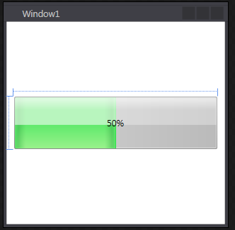
Here is how this could look like:
Check out WPF Tutorial for the full post.
Solution 3:
If you are needing to have a reusable method for adding text, you can create a new Style/ControlTemplate that has an additional TextBlock to display the text. You can hijack the TextSearch.Text attached property to set the text on a progress bar.
If it doesn't need to be reusable, simply put the progress bar in a Grid and add a TextBlock to the grid. Since WPF can compose elements together, this will work nicely.
If you want, you can create a UserControl that exposes the ProgressBar and TextBlock as public properties, so it would be less work than creating a custom ControlTemplate.
Solution 4:
You could use an Adorner to display text over top of it.
See MSDN article on Adorners
You would create a class that inherits from the Adorner class. Override the OnRender method to draw the text that you want. If you want you could create a dependency property for your custom Adorner that contains the text that you want to display. Then use the example in the link I mentioned to add this Adorner to your progress bar's adorner layer.
Solution 5:
ProgressBar with Text and Binding from 2 Properties ( Value/Maximum value ):
<Grid>
    <ProgressBar Name="pbUsrLvl"
                 Minimum="1"
                 Maximum="99"
                 Value="59"
                 Margin="5"
                 Height="24"  Foreground="#FF62FF7F"/>
    <TextBlock HorizontalAlignment="Center" VerticalAlignment="Center">
        <TextBlock.Text>
            <MultiBinding StringFormat="{}UserLvl:{0}/{1}">
                <Binding Path="Value" ElementName="pbUsrLvl" />
                <Binding Path="Maximum" ElementName="pbUsrLvl" />
            </MultiBinding>
        </TextBlock.Text>
    </TextBlock>
</Grid>
Rezult:

The same but with % of progress :
<Grid>
    <ProgressBar Name="pbLifePassed"
                 Minimum="0"
                 Value="59"
                 Maximum="100"
                 Margin="5" Height="24" Foreground="#FF62FF7F"/>
    <TextBlock Text="{Binding ElementName=pbLifePassed, Path=Value, StringFormat={}{0:0}%}"
           HorizontalAlignment="Center" VerticalAlignment="Center" />
</Grid>