html/css hexagon with image inside
With CSS3 almost everything is possible: http://jsfiddle.net/kizu/bhGn4/
There I used different rotations with overflow: hidden, so you can get a cross-browser (well, modern cross-broser) masks that even can be coverable and clickable on the masked area.
The most flexible way of achieving a hexagon with an image is to use an inline SVG :
svg{
  width:30%;
}
<svg viewBox="0 0 100 100" version="1.1" xmlns="http://www.w3.org/2000/svg">
<defs>
<pattern id="img" patternUnits="userSpaceOnUse" width="100" height="100">
<image xlink:href="https://farm9.staticflickr.com/8461/8048823381_0fbc2d8efb.jpg" x="-25" width="150" height="100" />
</pattern>
</defs>
<polygon points="50 1 95 25 95 75 50 99 5 75 5 25" fill="url(#img)"/>
</svg>There are at least two ways of achieving the hexagonal image with SVG :
- making an hexagonal polygon and filling the polygon with an image and the
patternelement (approach I use in the previous snippet) - clipping the image with an hexagonal polygon (see next snippet)
svg{width:30%}<svg viewbox="0 0 100 100" version="1.1" xmlns="http://www.w3.org/2000/svg">
<defs>
<clipPath id="hexClip">
<polygon points="50 1 99 25 99 75 50 99 1 75 1 25"/>
</clipPath>
</defs>
<image xlink:href="https://farm4.staticflickr.com/3165/5733278274_2626612c70.jpg" x="-25" width="150" height="100" clip-path="url(#hexClip)"/>
</svg>The SVG approach allows control over many aspects of the hexagon shape and image. And they can be styled with CSS. Here is an example :
svg{
  width:30%;
  margin:0 auto;
}
#hex{
  stroke-width:2;
  stroke: teal;
  fill-opacity:0.6;
  transition:fill-opacity .8s;
}
svg:hover #hex {
  fill-opacity:1;
}
#text{
  stroke-width:0.5;
  stroke:teal;
  fill-opacity:0.4;
  fill:teal;
  transition:fill-opacity .8s;
}
svg:hover #text{
  fill-opacity:1;
}
<svg viewbox="0 0 100 100" version="1.1" xmlns="http://www.w3.org/2000/svg">
<defs>
<pattern id="img" patternUnits="userSpaceOnUse" width="100" height="100">
<image xlink:href="https://farm9.staticflickr.com/8461/8048823381_0fbc2d8efb.jpg" x="-25" width="150" height="100" />
</pattern>
</defs>
<polygon id="hex" points="50 1 95 25 95 75 50 99 5 75 5 25" fill="url(#img)"/>
<text id="text" font-size="20" x="50" y="50" text-anchor="middle">Some text</text>
</svg>For another approach to make hexagons with an image inside check this question : Responsive grid of hexagons
A new and easy approach would be to use css3 clip-path property.
From Documentation:
The clip-path CSS property prevents a portion of an element from getting displayed by defining a clipping region to be displayed i.e, only a specific region of the element is displayed.
Following css will show a rectangular element in hexagon shape:
div.hexagon {
  clip-path: polygon(50% 0, 100% 25%, 100% 75%, 50% 100%, 0 75%, 0 25%);
}
Output Image:
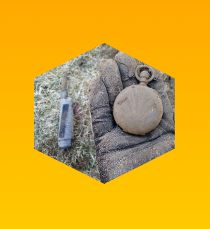
body {
  background: linear-gradient(orange, yellow);
  min-height: 100vh;
  margin: 0;
}
.hexagon {
  clip-path: polygon(50% 0, 100% 25%, 100% 75%, 50% 100%, 0 75%, 0 25%);
  background: url("https://i.imgur.com/waDgcnc.jpg") no-repeat;
  background-size: cover;
  margin: 10px auto;
  height: 200px;
  width: 200px;
}
<div class="hexagon">
</div>We can use this property to draw any shapes that we want. Below are a couple of examples:
div.pentagon {
  clip-path: polygon(50% 0, 100% 45%, 80% 100%, 20% 100%, 0 45%);
}
div.octagon {
  clip-path: polygon(33.33% 0%, 66.66% 0%, 100% 33.33%, 100% 66.66%, 66.66% 100%, 33.33% 100%, 0 66.66%, 0 33.33%);
}
Output Image:

body {
  background: linear-gradient(orange, yellow);
  min-height: 100vh;
  margin: 0;
}
div {
  background: url("https://i.imgur.com/waDgcnc.jpg") no-repeat;
  background-size: cover;
  margin: 10px 20px;
  height: 170px;
  width: 170px;
  float: left;
}

.pentagon {
  clip-path: polygon(50% 0, 100% 45%, 80% 100%, 20% 100%, 0 45%);
}

.octagon {
  clip-path: polygon(33.33% 0%, 66.66% 0%, 100% 33.33%, 100% 66.66%, 66.66% 100%, 33.33% 100%, 0 66.66%, 0 33.33%);
}
<div class="pentagon">
</div>
<div class="octagon">
</div>Note:
clip-pathcss property is not supported in IE and Edge. However future versions of Edge are expected to have support for this property.
You can do it by overlaying corners like this:
http://jsfiddle.net/Eric/kGSCA/3/
HTML:
<div class="hexagon pic">
    <span class="top"></span>
    <span class="bottom"></span>
</div>
CSS:
.hexagon {
    background: url(http://placekitten.com/400/400/);
    width: 400px;
    height: 346px;
    position: relative;
}

.hexagon span {
    position: absolute;
    display: block;
    border-left: 100px solid red;
    border-right: 100px solid red;
    width: 200px;
}

.top {
    top: 0;
    border-bottom: 173px solid transparent;
}

.bottom {
    bottom: 0;
    border-top: 173px solid transparent;
}
here is a simple way if you need only one pic to place.
<style>
.hex{
    width:80px;
    height:80px;
    background-image: url(http://placekitten.com/400/400/);
    background-size: cover;
    position:relative;
    margin:10px;
}
.hex:before, .hex:after{
    content:"";
    position:absolute;
    top:0px;height:40px;width:0px; /* 40 = height/2 */
    z-index:1;
    border:20px solid #FFF; /*change #FFF to your bg color*/
}
.hex:before{
    left:-20px; /* -1*borderWidth */
    border-right:40px solid transparent;/* width/2 */
}
.hex:after{
    left:40px; /* width/2 */
    border-left:40px solid transparent;/* width/2 */
}
</style>
<div class="hex"></div>
need a border ? a background img will be easier & faster.
<div class="hex">
    <div style="position:absolute;top:-20px;left:-20px;bottom:-20px;right:-20px;
        z-index:2;background-image:url(/images/hexagon.png);">
    </div>
</div>