Ellipsis for overflow text in dropdown boxes
I'm fixing the width of one of my dropdown boxes (yes I know there are cross-browser issues with doing this).
Is there a non-js way to cut off overflowing text and append ellipses? text-overflow:ellipsis doesn't work for <select> elements (at least in Chrome).
select, div {
    width:100px;
    overflow:hidden;
    white-space:nowrap;
    text-overflow:ellipsis;
}
<!--works for a div-->
<div>
A long option that gets cut off
</div>
<!--but not for a select-->
<select>
<option>One - A long option that gets cut off</option>
<option>Two - A long option that gets cut off</option>
</select>Example here: http://jsfiddle.net/t5eUe/
Solution 1:
If you are finding this question because you have a custom arrow on your select box and the text is going over your arrow, I found a solution that works in some browsers. Just add some padding, to the select, on the right side.
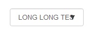
Before:
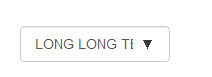
After:
CSS:
select {
    padding:0 30px 0 10px !important;
    -webkit-padding-end: 30px !important;
    -webkit-padding-start: 10px !important;
}
iOS ignores the padding properties but uses the -webkit- properties instead.
http://jsfiddle.net/T7ST2/4/
Solution 2:
NOTE: As of July 2020, text-overflow: ellipsis works for <select> on Chrome
HTML is limited in what it specifies for form controls. That leaves room for operating system and browser makers to do what they think is appropriate on that platform (like the iPhone’s modal select which, when open, looks totally different from the traditional pop-up menu).
If it bugs you, you can use a customizable replacement, like Chosen, which looks distinct from the native select.
Or, file a bug against a major operating system or browser. For all we know, the way text is cut off in selects might be the result of a years-old oversight that everyone copied, and it might be time for a change.