set css border to end in a 90 instead of a 45 degree angle
I have a div with different colors for both the border-bottom and border-right properties. So they are separated via a line leaving the box in a 45 degree angle.
How can I make the bottom-border shorter so that the right border goes all the way to the bottom of the element which would yield a 90 degree angle separator-line?
Solution 1:
You can do this with box-shadow.
Demo: 
Output:
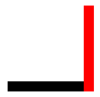
CSS:
#borders {
    border-bottom: 20px solid black;
    box-shadow: 20px 0 0 0 red;
    height: 150px;
    margin: 30px;
    width: 150px;
}
HTML:
<div id="borders"></div>
Solution 2:
I solved this issue using border-width. You simply reduce the width of the border at the edges you don't want to see.
If we don't want the border on the upper edge, we can put border-width to 0.
border-width: 0px 5px 5px 5px;
border-color:#ddd #000 #000 #000;
Solution 3:
Sad fact: Border corners are mitered. Always. (It's only visible if using different colors.)
In order to simulate a butt joint, you can stack two divs to get a simulated result:
div {
  position: absolute;
  left: 0;
  top: 0;
  height: 100px;
  width: 100px;
}
<div style="border-left: 2px solid #ff0000; border-bottom: 2px solid #ff0000;">
</div>
<div style="border-right: 2px solid #00ff00; border-top: 2px solid #00ff00;">
</div>Stack more or control the top and bottom differently for better control over the appearance of the joint.
Solution 4:
For the top border and the bottom border, you can use box-shadow:
.box {
border: 10px solid #ddd;
border-top: 0;
border-bottom: 0;
box-shadow: 0 10px 0 #D03FBE, 0px -10px 0 #D03FBE;
float: left;
width: 100px;
height: 100px;
}
<div class="box"></div>