Possible to use border-radius together with a border-image which has a gradient?
I'm styling an input field which has a rounded border (border-radius), and attempting to add a gradient to said border. I can successfully make the gradient and the rounded border, however neither work together. It's either rounded with no gradient, or a border with a gradient, but no rounded corners.
-webkit-border-radius: 5px;
-webkit-border-image: -webkit-gradient(linear, 0 0, 0 100%, from(#b0bbc4), to(#ced9de)) 1 100%;
Is there anyway to have both CSS properties work together, or is this not possible?
Solution 1:
This is possible, and it does not require extra markup, but uses an ::after pseudo-element.
It involves putting a pseudo-element with a gradient background below and clipping that. This works in all current browsers without vendor prefixes or hacks (even IE), but if you want to support vintage versions of IE, you should either consider solid color fallbacks, javascript, and/or custom MSIE CSS extensions (i.e., filter, CSSPie-like vector trickery, etc).
Here's a live example (jsfiddle version):
@import url('//raw.githubusercontent.com/necolas/normalize.css/master/normalize.css');
html {
/* just for showing that background doesn't need to be solid */
background: linear-gradient(to right, #DDD 0%, #FFF 50%, #DDD 100%);
padding: 10px;
}
.grounded-radiants {
position: relative;
border: 4px solid transparent;
border-radius: 16px;
background: linear-gradient(orange, violet);
background-clip: padding-box;
padding: 10px;
/* just to show box-shadow still works fine */
box-shadow: 0 3px 9px black, inset 0 0 9px white;
}
.grounded-radiants::after {
position: absolute;
top: -4px; bottom: -4px;
left: -4px; right: -4px;
background: linear-gradient(red, blue);
content: '';
z-index: -1;
border-radius: 16px;
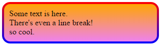
}<p class="grounded-radiants">
Some text is here.<br/>
There's even a line break!<br/>
so cool.
</p>The extra styling above is to show:
- This works with any background
- It works just fine with
box-shadow,insetor not - Does not require you to add the shadow to the pseudo-element
Again, this works with IE, Firefox and Webkit/Blink browsers.
Solution 2:
Working on this same problem. Came across a non-svg solution which is more succinct than others here:
div{
  width: 300px;
  height: 80px;
  border: double 1em transparent;
  border-radius: 30px;
  background-image: linear-gradient(white, white),
                    linear-gradient(to right, green, gold);
  background-origin: border-box;
  background-clip: content-box, border-box;
}<div></div>This is not my own solution and has been taken from here: https://gist.github.com/stereokai/36dc0095b9d24ce93b045e2ddc60d7a0
Solution 3:
Probably not possible, as per the W3C spec:
A box's backgrounds, but not its border-image, are clipped to the appropriate curve (as determined by ‘background-clip’). Other effects that clip to the border or padding edge (such as ‘overflow’ other than ‘visible’) also must clip to the curve. The content of replaced elements is always trimmed to the content edge curve. Also, the area outside the curve of the border edge does not accept mouse events on behalf of the element.
This is likely because border-image can take some potentially complicated patterns. If you want a rounded, image border, you'll need to create one yourself.