Validator error message changes TextFormField's height
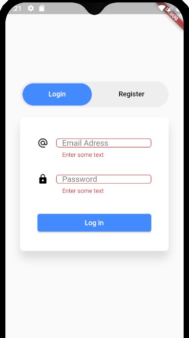
When the error message shows up, it reduces the height of the TextFormField. If I understood correctly, that's because the height of the error message is taking into account in the height specified.
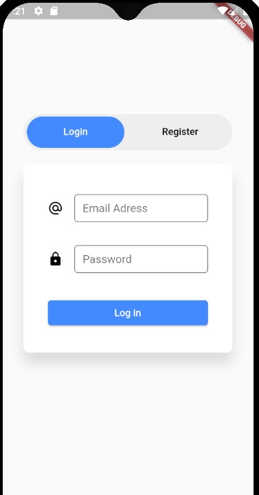
Here's a screen before :
and after :
Tried to put conterText: ' ' to the BoxDecoration (as I've seen on another topic) but it didn't help.
An idea ?
EDIT : OMG completly forgot to put the code, here it is :
 return Form(
      key: _formKey,
      child: Column(
        crossAxisAlignment: CrossAxisAlignment.center,
        mainAxisAlignment: MainAxisAlignment.spaceEvenly,
        children: <Widget>[
          Container(
            height: 40.0,
            child: _createTextFormField(loginEmailController, Icons.alternate_email, "Email Adress", false, TextInputType.emailAddress),
          ),
          Container(
            height: 40.0,
            child: _createTextFormField(loginPasswordController, Icons.lock, "Password", true, TextInputType.text),
          ),

          SizedBox(
            width: double.infinity,
            child: loginButton
          )
        ],
      ),
    );

  }

  Widget _createTextFormField(TextEditingController controller, IconData icon, String hintText, bool obscureText, TextInputType inputType){
      return TextFormField(
        keyboardType: inputType,
        controller: controller,
        obscureText: obscureText,
        /* style: TextStyle(
          fontSize: 15.0,
        ), */
        decoration: InputDecoration(
         /*  contentPadding:
              EdgeInsets.symmetric(vertical: 5.0, horizontal: 8.0), */
          border: OutlineInputBorder(borderRadius: BorderRadius.circular(5.0)),
          icon: Icon(
            icon,
            color: Colors.black,
            size: 22.0,
          ),
          //hintText: hintText,
          labelText: hintText,
        ),
        validator: (value) {
          if (value.isEmpty) {
            return 'Enter some text';
          }
          return null;
        },
      );
    }
In your Code - you need to comment out the 40 height given to each container.
Container(
             // height: 40.0,
              child: _createTextFormField(
                  loginEmailController,
                  Icons.alternate_email,
                  "Email Adress",
                  false,
                  TextInputType.emailAddress),
            ),
            Container(
            //  height: 40.0,
              child: _createTextFormField(loginPasswordController, Icons.lock,
                  "Password", true, TextInputType.text),
            ),
and then in your - TextFormField in InputDecoration, you can alter these value as per your liking.
  contentPadding:
      EdgeInsets.symmetric(vertical: 10.0, horizontal: 10.0),
The problem is that we are not able to see your code so it might be challenging to assist you but I will do everything from scratch. You can firstly create the authentication class in one dart file
class AuthBloc{
   StreamController _passController = new StreamController();
   Stream get passStream => _passController.stream;
   bool isValid(String pass){
       _passController.sink.add("");
       if(pass == null || pass.length < 6){
         _passController.sink.addError("Password is too short");
         return false;
       }
       else{
         return true;
       }
    }

    void dispose(){
      _passController.close();
     }
}
And then insert the following code in another dart file...
class LoginPage extends StatefulWidget{
  @override
  _LoginPageState createState() => _LoginPageState();
}
class _LoginPageState extends State<LoginPage>{
   AuthBloc authBloc = new AuthBloc();
   @override
   void dispose(){
     authBloc.dispose();
   }
   @override
   Widget build(BuildContext context){
     return Scaffold(
       body: Container(
         padding: EdgeInsets.fromLTRB(30, 0, 30, 0),
         constraints: BoxConstraints.expand(),
         children: <Widget>[
           Padding(
            padding: const EdgeInsets.fromLTRB(0, 40, 0, 20),
            child: StreamBuilder(
                stream: authBloc.passStream,
                builder: (context, snapshot) => TextField(
                  controller: _passController,
                  style: TextStyle(fontSize: 18, color: Colors.black),
                  decoration: InputDecoration(
                      errorText: snapshot.hasError ? snapshot.error:null,
                      labelText: "Password",
                      prefixIcon: Container(
                        width: 50,
                        child: Icon(Icons.lock),
                      ),
                      border: OutlineInputBorder(
                          borderSide: BorderSide(color: Color(0xffCED802), width: 1),
                          borderRadius: BorderRadius.all(Radius.circular(6))
                      )
                  ),
                ),
            )
          ),
          Padding(
            padding: const EdgeInsets.fromLTRB(0, 30, 0, 40),
            child: SizedBox(
              width: double.infinity,
              height: 52,
              child: RaisedButton(
                onPressed: _onLoginClicked,
                child: Text(
                  "Login",
                  style: TextStyle(fontSize: 18, color: Colors.white),
                ),
                color: Color(0xff327708),
                shape: RoundedRectangleBorder(
                    borderRadius: BorderRadius.all(Radius.circular(6))
                ),
              ),
            ),
          ),
         ]
       )
     )
   }
   _onLoginClicked(){
     var isValid = authBloc.isValid(_passController.text);
     if(isValid){
       //insert your action
     }
   }
}
I hope it works :)
Above solutions did not work for me however I have figured out a very simple solution to avoid the above issue
TextFormField(
    decoration: InputDecoration(
      **errorStyle: const TextStyle(fontSize: 0.01),**
      errorBorder: OutlineInputBorder(
        borderRadius: BorderRadius.circular(borderRadius),
        borderSide: const BorderSide(
          color: AppColor.neonRed,
          width: LayoutConstants.dimen_1,
          style: BorderStyle.solid,
        ),
      ),
   );
Catch in the above solution is that we are setting the size of the error message to 0.01 so as a result it don't show up.
Additionally we can have custom border for the error.
Note : Setting the Text size to 0 is not working as it don't consider the text size and textFormField widget gets shrinked.