CSS button transition linear-gradient background into transparent background
Use a pseudo element for the background and you can easily do this:
body {
  background-color: darkblue;
}

.button {
  border: solid orange 2px;
  border-radius: 10px;
  color: white;
  padding: 15px 25px;
  text-align: center;
  text-decoration: none;
  display: inline-block;
  font-size: 24px;
  position: relative;
  overflow: hidden;
  z-index:0;
  background:transparent;
}

.button::before {
  content: "";
  position: absolute;
  z-index:-1;
  top: 0;
  left: 0;
  right: 0;
  bottom: 0;
  background-image: linear-gradient(red, yellow);
  transition:1s;
}
.button:hover::before {
  opacity:0;
}
<button class="button">Submit</button>Here is another idea without the use of pseudo element where you can rely on changing the background-color and background-size. The trick is to keep one of the gradient color transparent so we can see the background-color (you can have transition on this one to transparent). Then you increase the background-size to hide the bottom color and we only see the transparent.
body {
  background-color: darkblue;
}

.button {
  border: solid orange 2px;
  background-image: linear-gradient(transparent, yellow);
  background-size:100% 100%;
  background-color:red;
  border-radius: 10px;
  color: white;
  padding: 15px 25px;
  text-align: center;
  text-decoration: none;
  display: inline-block;
  font-size: 24px;
  transition:1s;
}

.button:hover {
  background-color:transparent;
  background-size:100% 500%;
}
<button class="button">Submit</button>Or consider adjusting background-size to have another kind of transition:
body {
  background-color: darkblue;
}

.button {
  border: solid orange 2px;
  background:
    linear-gradient(red, yellow),
    transparent;
  background-size:100% 100%;
  background-position:left; /*change this to change the way the transtion happen*/
  background-repeat:no-repeat;
  border-radius: 10px;
  color: white;
  padding: 15px 25px;
  text-align: center;
  text-decoration: none;
  display: inline-block;
  font-size: 24px;
  transition:1s;
}

.button:hover {
  background-size:0% 100%;
}
<button class="button">Submit</button>In Chrome with Experimental Web Platform features enabled (see) we can use:
CSS.registerProperty({
  name: '--alpha',
  syntax: '<number>',
  initialValue: 1,
  inherits: true,
})
body {
background-color: darkblue;
}
.button {
--alpha: 1;
background: linear-gradient(rgba(255,0,0,var(--alpha)), rgba(255,255,0,var(--alpha))) transparent;
border: solid orange 2px;
border-radius: 10px;
color: white;
padding: 15px 25px;
text-align: center;
text-decoration: none;
display: inline-block;
font-size: 24px;
transition: --alpha 1s linear;
}
.button:hover {
--alpha: 0;
}<button class="button">Submit</button>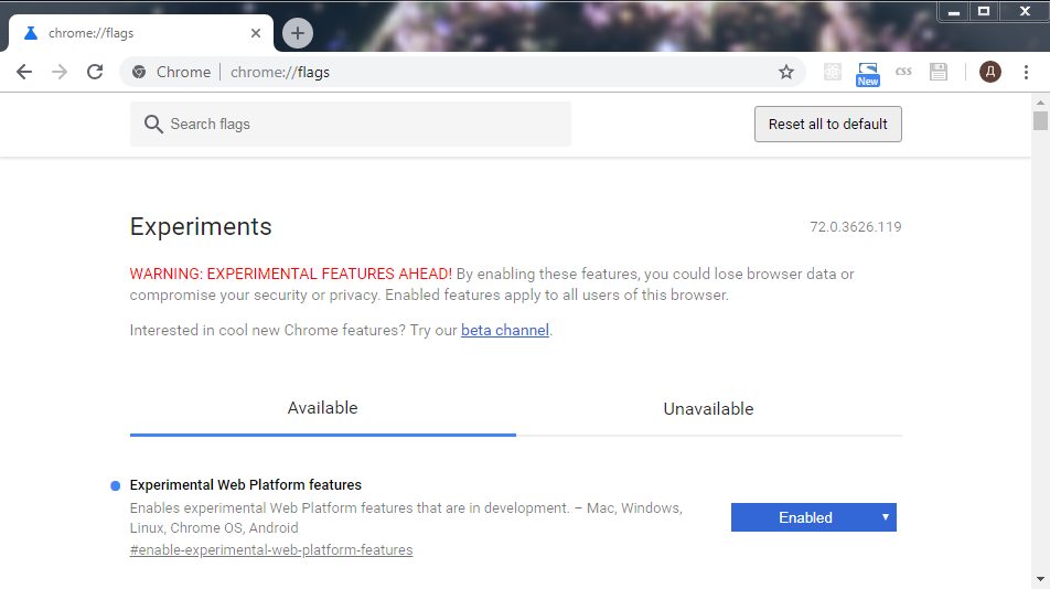

Now we can use new @property. See the support table.
@property --alpha {
  syntax: '<number>';
  inherits: false;
  initial-value: 1;
}

body {
  background-color: darkblue;
}

.button {
  background-image: linear-gradient(rgba(255, 0, 0, var(--alpha)), rgba(255, 255, 0, var(--alpha)));
  transition: --alpha 1s;
  background-color: transparent;
  border: solid orange 2px;
  border-radius: 10px;
  color: white;
  padding: 15px 25px;
  text-align: center;
  text-decoration: none;
  display: inline-block;
  font-size: 24px;
}

.button:hover {
  --alpha: 0;
}
<button class="button">Submit</button>