override css for html5 form validation/required popup
It's impossible to change the validation style with only HTML5/CSS3.
It's part of the browser. The only attribute I figured out to change is the error message by using this example:
document.getElementById("name").setCustomValidity("Lorum Ipsum");
But, as shown in this example : http://jsfiddle.net/trixta/qTV3g/, you can override the panel style by using jQuery. This is not a plugin, it's a core functionality, uses a DOM lib called Webshims and, of course, some CSS to style the popups.
I found that very useful example in this bug post titled Improve form validation error panel UI.
I think this is the best solution you can find and only way to override the basic (ugly) error panel.
Regards.
I'm not sure why, but ::-webkit-validation-bubble-message { display: none; } wouldn't work for me.
I was able to get the desired result (tested in FF 19, Chrome Version 29.0.1547.76 m) by preventing the default behavior of the invalid event, which does not bubble.
  document.addEventListener('invalid', (function(){
      return function(e){
          //prevent the browser from showing default error bubble/ hint
          e.preventDefault();
          // optionally fire off some custom validation handler
          // myvalidationfunction();
      };
  })(), true);
Hope that helps others - I looked everywhere for this.
For webkit, you can use ::-webkit-validation-bubble-message. For example to hide it:
::-webkit-validation-bubble-message { display: none; }
There are also:
::-webkit-validation-bubble-arrow-clipper{}
::-webkit-validation-bubble-arrow{}
::-webkit-validation-bubble{}
::-webkit-validation-bubble-top-outer-arrow{}
::-webkit-validation-bubble-top-inner-arrow{}
::-webkit-validation-bubble-message{}
Update: Chrome does not allow styling form validation bubbles anymore: https://code.google.com/p/chromium/issues/detail?id=259050
For firefox you can experiment with :-moz-placeholder {}.
The current default email validation is currently one of the ugliest things I have ever seen Google design!
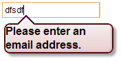
However it seems to be contained in a standard div so you can make some changes to it, if you remember to then reset these values.
I've found you can alter the background, font size and colour, border and shadow, like so
div {
    background: rgba(0,0,0,0.8);
    color: #333;
    font-size: 11px;
    border: 0;
    box-shadow: none;
}
If you then overwrite these for divs inside the html tag, then only the validation is ultimately affected.
html div {
    background: rgba(0,0,0,1);
    color: #000;
    font-size: 12px;
}
Unfortunately some of the key attributes that you'd want to change, such as margin and font-weight, cannot be altered.
NB. This technique currently only works for Chrome (12), i.e. not work for Firefox 4, Opera 11 or Safari (Win 7).
Appended a class to the input type. and displayed message there .Hope that helps after little customization. working codepen:
document.querySelector('#frm').addEventListener('submit', e => {
  e.preventDefault();
  e.currentTarget.classList.add('submitted');
});
body {
font-family: Helvetica, sans-serif;
display: -webkit-box;
display: -webkit-flex;
display: -ms-flexbox;
display: flex;
-webkit-box-orient: vertical;
-webkit-box-direction: normal;
-webkit-flex-direction: column;
-ms-flex-direction: column;
flex-direction: column;
-webkit-box-align: center;
-webkit-align-items: center;
-ms-flex-align: center;
align-items: center;
-webkit-box-pack: center;
-webkit-justify-content: center;
-ms-flex-pack: center;
justify-content: center;
overflow: hidden;
width: 100%;
height: 100vh;
background: #ffa500;
}
form > div {
position: relative;
margin-bottom: 10px;
}
.theTooltip {
-webkit-backface-visibility: hidden;
backface-visibility: hidden;
will-change: opacity, visibility;
max-width: 250px;
border-radius: 5px;
background-color: rgba(0,0,0,0.7);
padding: 15px;
color: #fff;
box-sizing: border-box;
display: inline-block;
position: absolute;
-webkit-transform-style: preserve-3d;
transform-style: preserve-3d;
-webkit-transform: translate(15%, -50%);
transform: translate(15%, -50%);
top: 50%;
left: auto;
right: auto;
bottom: auto;
visibility: hidden;
margin: 0;
opacity: 0;
-webkit-transition: opacity 0.3s ease-out;
transition: opacity 0.3s ease-out;
z-index: 100;
}
.theTooltip:after {
content: '';
position: absolute;
width: 0;
height: 0;
top: 50%;
margin-top: -10px;
left: -10px;
border-top: 10px solid transparent;
border-bottom: 10px solid transparent;
border-right: 10px solid rgba(0,0,0,0.7);
}
label {
display: inline-block;
vertical-align: center;
}
input {
background: #fff;
border: 1px solid transparent;
cursor: pointer;
display: inline-block;
overflow: visible;
margin: 0;
outline: 0;
vertical-align: center;
text-decoration: none;
width: auto;
border-radius: 3px;
cursor: text;
padding: 7px;
}
input:focus,
input:active {
outline: none;
}
.submitted input:invalid {
border: 1px solid #f00;
}
.submitted input:invalid ~ .theTooltip {
visibility: visible;
opacity: 1;
}
.submitted input:valid ~ .theTooltip {
-webkit-transition: opacity 0.3s, visibility 0s 0.3s;
transition: opacity 0.3s, visibility 0s 0.3s;
}<form id="frm" action="action">
<div>
<label>Email</label>
<input type="email" required="required"/><span class="theTooltip">Invalid email</span>
</div>
<div>
<button formnovalidate="formnovalidate">OK</button>
</div>
</form>