How to make an AlertDialog in Flutter?
I am learning to build apps in Flutter. Now I have come to alert dialogs. I have done them before in Android and iOS, but how do I make an alert in Flutter?
Here are some related SO questions:
- How to style AlertDialog Actions in Flutter
- adding dropdown menu in alert dialog box in flutter
- Show alert dialog on app main screen load automatically
- how to refresh alertdialog in flutter
- Alert Dialog with Rounded corners in flutter
I'd like to make a more general canonical Q&A so my answer is below.
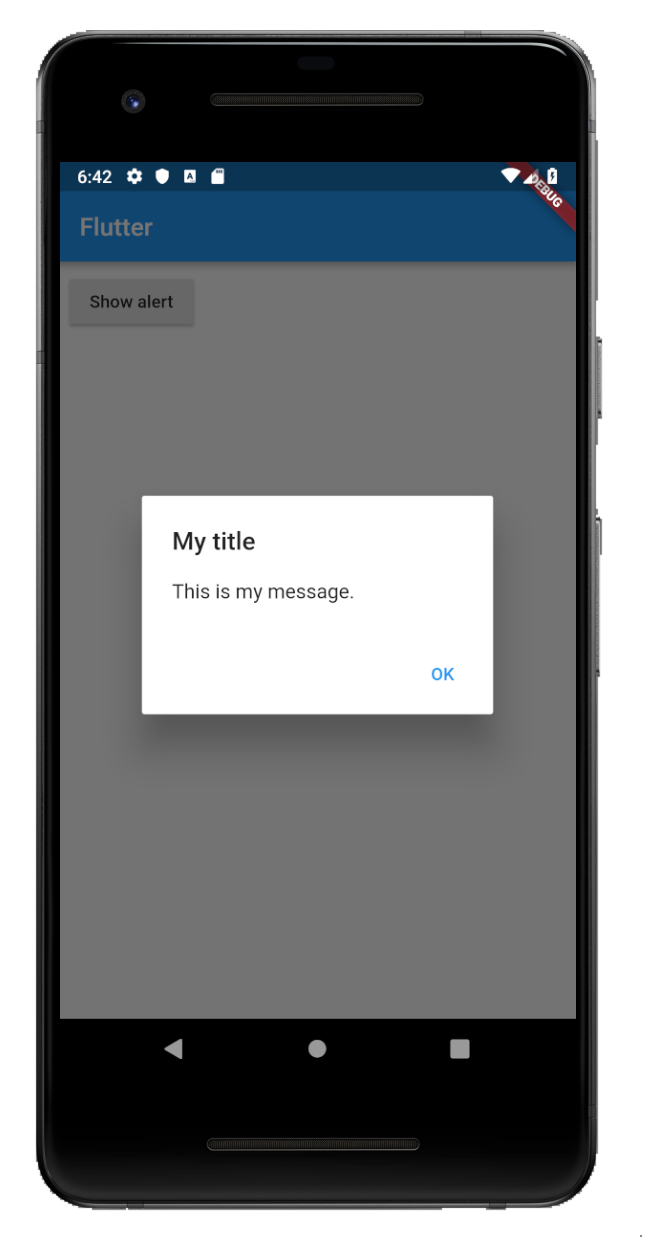
One Button
showAlertDialog(BuildContext context) {

  // set up the button
  Widget okButton = TextButton(
    child: Text("OK"),
    onPressed: () { },
  );

  // set up the AlertDialog
  AlertDialog alert = AlertDialog(
    title: Text("My title"),
    content: Text("This is my message."),
    actions: [
      okButton,
    ],
  );

  // show the dialog
  showDialog(
    context: context,
    builder: (BuildContext context) {
      return alert;
    },
  );
}
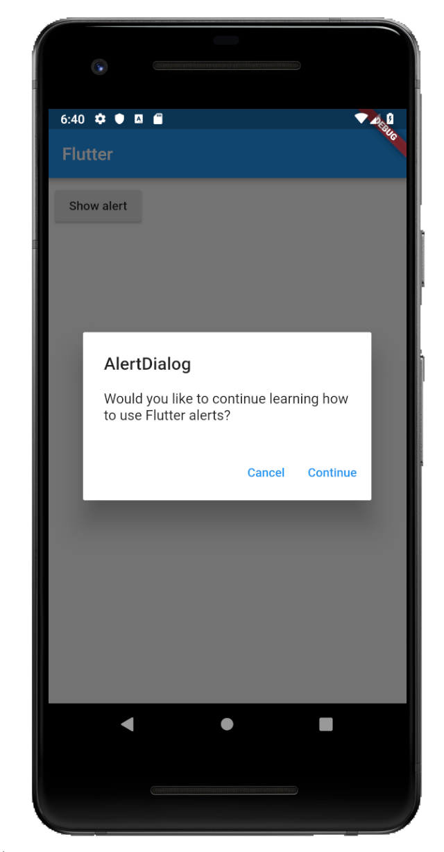
Two Buttons
showAlertDialog(BuildContext context) {

  // set up the buttons
  Widget cancelButton = TextButton(
    child: Text("Cancel"),
    onPressed:  () {},
  );
  Widget continueButton = TextButton(
    child: Text("Continue"),
    onPressed:  () {},
  );

  // set up the AlertDialog
  AlertDialog alert = AlertDialog(
    title: Text("AlertDialog"),
    content: Text("Would you like to continue learning how to use Flutter alerts?"),
    actions: [
      cancelButton,
      continueButton,
    ],
  );

  // show the dialog
  showDialog(
    context: context,
    builder: (BuildContext context) {
      return alert;
    },
  );
}
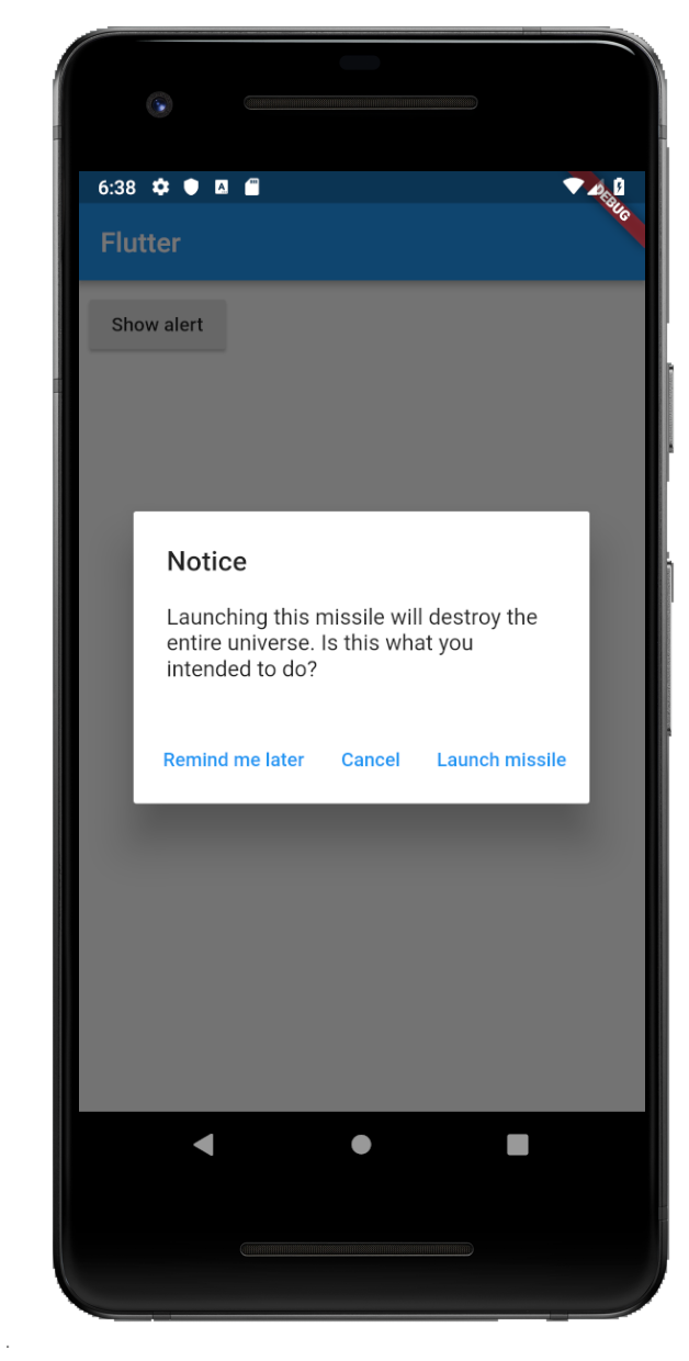
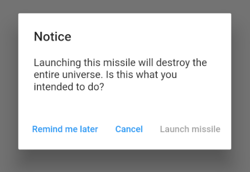
Three Buttons
showAlertDialog(BuildContext context) {

  // set up the buttons
  Widget remindButton = TextButton(
    child: Text("Remind me later"),
    onPressed:  () {},
  );
  Widget cancelButton = TextButton(
    child: Text("Cancel"),
    onPressed:  () {},
  );
  Widget launchButton = TextButton(
    child: Text("Launch missile"),
    onPressed:  () {},
  );

  // set up the AlertDialog
  AlertDialog alert = AlertDialog(
    title: Text("Notice"),
    content: Text("Launching this missile will destroy the entire universe. Is this what you intended to do?"),
    actions: [
      remindButton,
      cancelButton,
      launchButton,
    ],
  );

  // show the dialog
  showDialog(
    context: context,
    builder: (BuildContext context) {
      return alert;
    },
  );
}
Handling button presses
The onPressed callback for the buttons in the examples above were empty, but you could add something like this:
Widget launchButton = TextButton(
  child: Text("Launch missile"),
  onPressed:  () {
    Navigator.of(context).pop(); // dismiss dialog
    launchMissile();
  },
);
If you make the callback null, then the button will be disabled.
onPressed: null,
Supplemental code
Here is the code for main.dart in case you weren't getting the functions above to run.
import 'package:flutter/material.dart';

void main() => runApp(MyApp());

class MyApp extends StatelessWidget {
  @override
  Widget build(BuildContext context) {
    return MaterialApp(
      title: 'Flutter',
      home: Scaffold(
        appBar: AppBar(
          title: Text('Flutter'),
        ),
        body: MyLayout()),
    );
  }
}

class MyLayout extends StatelessWidget {
  @override
  Widget build(BuildContext context) {
    return Padding(
      padding: const EdgeInsets.all(8.0),
      child: ElevatedButton(
        child: Text('Show alert'),
        onPressed: () {
          showAlertDialog(context);
        },
      ),
    );
  }
}

// replace this function with the examples above
showAlertDialog(BuildContext context) { ... }
I used similar approach, but I wanted to
- Keep the Dialog code as a widget in a separated file so I can reuse it.
- Blurr the background when the dialog is shown.
Code:
1. alertDialog_widget.dart
import 'dart:ui';
import 'package:flutter/material.dart';


class BlurryDialog extends StatelessWidget {

  String title;
  String content;
  VoidCallback continueCallBack;

  BlurryDialog(this.title, this.content, this.continueCallBack);
  TextStyle textStyle = TextStyle (color: Colors.black);

  @override
  Widget build(BuildContext context) {
    return BackdropFilter(
      filter: ImageFilter.blur(sigmaX: 6, sigmaY: 6),
      child:  AlertDialog(
      title: new Text(title,style: textStyle,),
      content: new Text(content, style: textStyle,),
      actions: <Widget>[
        new FlatButton(
          child: new Text("Continue"),
           onPressed: () {
            continueCallBack();
          },
        ),
        new FlatButton(
          child: Text("Cancel"),
          onPressed: () {
            Navigator.of(context).pop();
          },
        ),
      ],
      ));
  }
}
You can call this in main (or wherever you want) by creating a new method like:
_showDialog(BuildContext context)
{
VoidCallback continueCallBack = () => {
Navigator.of(context).pop(),
// code on continue comes here
};
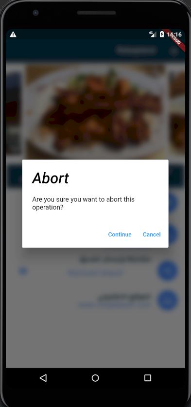
BlurryDialog alert = BlurryDialog("Abort","Are you sure you want to abort this operation?",continueCallBack);
showDialog(
context: context,
builder: (BuildContext context) {
return alert;
},
);
}
You can use this code snippet for creating a two buttoned Alert box,
import 'package:flutter/material.dart';

class BaseAlertDialog extends StatelessWidget {

  //When creating please recheck 'context' if there is an error!

  Color _color = Color.fromARGB(220, 117, 218 ,255);

  String _title;
  String _content;
  String _yes;
  String _no;
  Function _yesOnPressed;
  Function _noOnPressed;

  BaseAlertDialog({String title, String content, Function yesOnPressed, Function noOnPressed, String yes = "Yes", String no = "No"}){
    this._title = title;
    this._content = content;
    this._yesOnPressed = yesOnPressed;
    this._noOnPressed = noOnPressed;
    this._yes = yes;
    this._no = no;
  }

  @override
  Widget build(BuildContext context) {
    return AlertDialog(
      title: new Text(this._title),
      content: new Text(this._content),
      backgroundColor: this._color,
      shape:
          RoundedRectangleBorder(borderRadius: new BorderRadius.circular(15)),
      actions: <Widget>[
        new FlatButton(
          child: new Text(this._yes),
          textColor: Colors.greenAccent,
          onPressed: () {
            this._yesOnPressed();
          },
        ),
        new FlatButton(
          child: Text(this._no),
          textColor: Colors.redAccent,
          onPressed: () {
            this._noOnPressed();
          },
        ),
      ],
    );
  }
}
To show the dialog you can have a method that calls it NB after importing BaseAlertDialog class
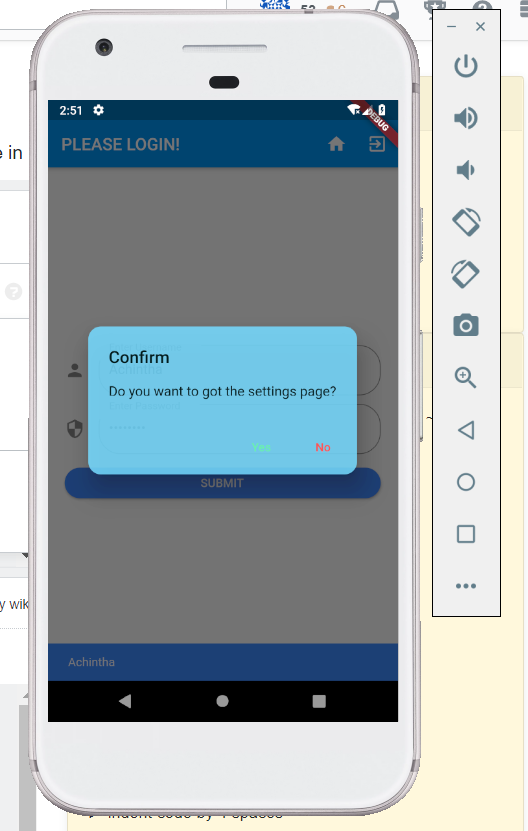
_confirmRegister() {
var baseDialog = BaseAlertDialog(
    title: "Confirm Registration",
    content: "I Agree that the information provided is correct",
    yesOnPressed: () {},
    noOnPressed: () {},
    yes: "Agree",
    no: "Cancel");
showDialog(context: context, builder: (BuildContext context) => baseDialog);
}
OUTPUT WILL BE LIKE THIS
Here is a shorter, but complete code.
If you need a dialog with only one button:
await showDialog(
      context: context,
      builder: (context) => new AlertDialog(
        title: new Text('Message'),
        content: Text(
                'Your file is saved.'),
        actions: <Widget>[
          new FlatButton(
            onPressed: () {
              Navigator.of(context, rootNavigator: true)
                  .pop(); // dismisses only the dialog and returns nothing
            },
            child: new Text('OK'),
          ),
        ],
      ),
    );
If you need a dialog with Yes/No buttons:
onPressed: () async {
bool result = await showDialog(
  context: context,
  builder: (context) {
    return AlertDialog(
      title: Text('Confirmation'),
      content: Text('Do you want to save?'),
      actions: <Widget>[
        new FlatButton(
          onPressed: () {
            Navigator.of(context, rootNavigator: true)
                .pop(false); // dismisses only the dialog and returns false
          },
          child: Text('No'),
        ),
        FlatButton(
          onPressed: () {
            Navigator.of(context, rootNavigator: true)
                .pop(true); // dismisses only the dialog and returns true
          },
          child: Text('Yes'),
        ),
      ],
    );
  },
);

if (result) {
  if (missingvalue) {
    Scaffold.of(context).showSnackBar(new SnackBar(
      content: new Text('Missing Value'),
    ));
  } else {
    saveObject();
    Navigator.of(context).pop(_myObject); // dismisses the entire widget
  }
} else {
  Navigator.of(context).pop(_myObject); // dismisses the entire widget
}
}
Simply used this custom dialog class which field you not needed to leave it or make it null so this customization you got easily.
import 'package:flutter/material.dart';

class CustomAlertDialog extends StatelessWidget {
  final Color bgColor;
  final String title;
  final String message;
  final String positiveBtnText;
  final String negativeBtnText;
  final Function onPostivePressed;
  final Function onNegativePressed;
  final double circularBorderRadius;

  CustomAlertDialog({
    this.title,
    this.message,
    this.circularBorderRadius = 15.0,
    this.bgColor = Colors.white,
    this.positiveBtnText,
    this.negativeBtnText,
    this.onPostivePressed,
    this.onNegativePressed,
  })  : assert(bgColor != null),
        assert(circularBorderRadius != null);

  @override
  Widget build(BuildContext context) {
    return AlertDialog(
      title: title != null ? Text(title) : null,
      content: message != null ? Text(message) : null,
      backgroundColor: bgColor,
      shape: RoundedRectangleBorder(
          borderRadius: BorderRadius.circular(circularBorderRadius)),
      actions: <Widget>[
        negativeBtnText != null
            ? FlatButton(
                child: Text(negativeBtnText),
                textColor: Theme.of(context).accentColor,
                onPressed: () {
                  Navigator.of(context).pop();
                  if (onNegativePressed != null) {
                    onNegativePressed();
                  }
                },
              )
            : null,
        positiveBtnText != null
            ? FlatButton(
                child: Text(positiveBtnText),
                textColor: Theme.of(context).accentColor,
                onPressed: () {
                  if (onPostivePressed != null) {
                    onPostivePressed();
                  }
                },
              )
            : null,
      ],
    );
  }
}
Usage:
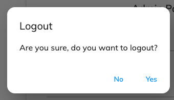
var dialog = CustomAlertDialog(
  title: "Logout",
  message: "Are you sure, do you want to logout?",
  onPostivePressed: () {},
  positiveBtnText: 'Yes',
  negativeBtnText: 'No');
showDialog(
  context: context,
  builder: (BuildContext context) => dialog);
Output: