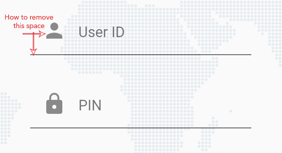
How do I remove content padding from TextField?
I am new to flutter and I am creating login form, for that I have used TextField and added prefix icon but I am getting some extra spaces in between textfields (user id and pin) and before the prefix icon. I have also tried InputDecorationTheme but it didn't work.
Please let me know how can I remove or reduce the space.??
Below is my code:
TextField(
  maxLength: 8,
  keyboardType: TextInputType.number,
  decoration: InputDecoration(
    hintText: hint,
    hintStyle: TextStyle(fontSize: 12.0),
    prefixIcon: Icon(icon),
    counterText: '',
  ),
)
Update (April 2021): still work in flutter 2.0.4
As of flutter 1.17.5 (and still the same in 1.2X) to completely remove or manipulate the padding manually, first you must set isDense: true and then you can adjust the contentPadding as you wanted or apply padding on the parent widget instead.
// using theme
ThemeData(
  inputDecorationTheme: InputDecorationTheme(
     isDense: true,// this will remove the default content padding
     // now you can customize it here or add padding widget
     contentPadding: EdgeInsets.symmetric(horizontal: 0, vertical: 0),
     ...
  ),
)

// per widget
TextField(
   decoration: InputDecoration(
   isDense: true,
   contentPadding: EdgeInsets.symmetric(horizontal: 0, vertical: 0),
   ...
 ),
)
As mentioned in the comment by Ataberk you can also use contentPadding: EdgeInsets.zero
TextField(
   decoration: InputDecoration(
   isDense: true,
   contentPadding: EdgeInsets.zero,
   ...
 ),
)
You can use contentPadding of InputDecoration.
Here is sample code
TextField(
   maxLines: 8,
   decoration: InputDecoration(
      contentPadding: EdgeInsets.symmetric(vertical: 5),
      labelText: 'Description',
      labelStyle: txtHintStyle,
   )
 )
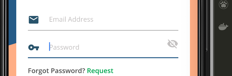
I was able to easily achieve that by adding prefix constraints to the prefixIcon and wrapping the prefixIcon with padding like this
      TextFormField(
         enabled: true,
         decoration: InputDecoration(
         prefixIconConstraints:BoxConstraints(minWidth: 23, maxHeight: 20),
         prefixIcon: Padding(
                       padding: const EdgeInsets.only(right: 20),
                       child: Icon(
                                Icons.email,
                                color: clockColor,
                               ),
                        ),
         hintText:"Email Address"
         hintStyle:TextStyle(color: hintColor, fontSize: 14),
       ),
    ),
heres the output,hope this helps
I come a bit late, but the only thing you have to do is to use negative padding :
TextField(
   decoration: InputDecoration(
      contentPadding: EdgeInsets.symmetric(vertical: -5),
      labelText: 'Description',
   )
 )
By applying minus padding by using
transform: Matrix4.translationValues(-10.0, 0.0, 0.0),
put above line inside the icon container
TextFormField(
          keyboardType: TextInputType.number,
          style: new TextStyle(color: Colors.white, fontSize: 17),
          decoration: new InputDecoration(
              prefixIcon: Container(
                transform: Matrix4.translationValues(-10.0, 0.0, 0.0),
                child: Icon(
                  Icons.vpn_key,
                  color: Colors.white,
                ),
              ),
              labelText: "Enter Password",
              labelStyle: new TextStyle(color: Colors.white)),
        ),