How can we change appbar background color in flutter
Solution 1:
Declare your Color:
const primaryColor = Color(0xFF151026);
In the MaterialApp level (will change the AppBar Color in the whole app ) change primaryColor
return MaterialApp(
  title: 'Flutter Demo',
  theme: ThemeData(
   primaryColor: primaryColor,
   ),
  home: MyApp(),
);
and if you want to change it on the Widget level modify the backgroundColor
  appBar: AppBar(
    backgroundColor: primaryColor,
  ),
Solution 2:
If you don't want to change the whole PrimaryColor you can also define AppBarTheme in your ThemeData:
MaterialApp(
  title: 'Flutter Demo',
  theme: ThemeData(
       appBarTheme: AppBarTheme(
     color: const Color(0xFF151026),
  )),
  home: myApp(),
)
Solution 3:
include backgroundColor: to appbar
   appBar: AppBar(
      title: const Text('Example'),
      backgroundColor: Colors.black,
    ),
Solution 4:
As of Flutter 2.5.0, to comply with "Material You", we should try to use ColorScheme whenever possible. The app bar color is controlled by:
-
If theme
brightnessislight, useprimarycolor. -
If theme
brightnessisdark, usesurfacecolor.
For examples:
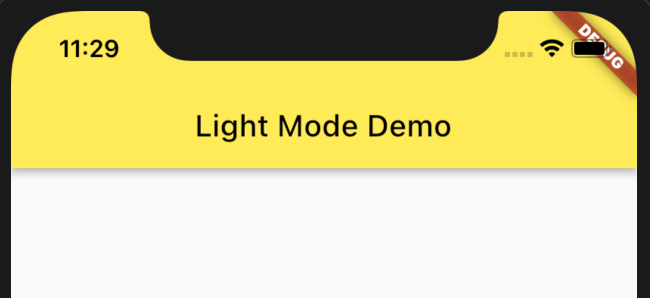
Light Mode
Set brightness to light, then set primary and onPrimary to yellow and black, and set all other colors to grey to showcase that they are not relevant to AppBar:
MaterialApp(
  theme: ThemeData(
    colorScheme: ColorScheme(
      brightness: Brightness.light,
      primary: Colors.yellow,
      onPrimary: Colors.black,
      // Colors that are not relevant to AppBar in LIGHT mode:
      primaryVariant: Colors.grey,
      secondary: Colors.grey,
      secondaryVariant: Colors.grey,
      onSecondary: Colors.grey,
      background: Colors.grey,
      onBackground: Colors.grey,
      surface: Colors.grey,
      onSurface: Colors.grey,
      error: Colors.grey,
      onError: Colors.grey,
    ),
  ),
  home: Scaffold(
    appBar: AppBar(title: Text("Light Mode Demo")),
  ),
)
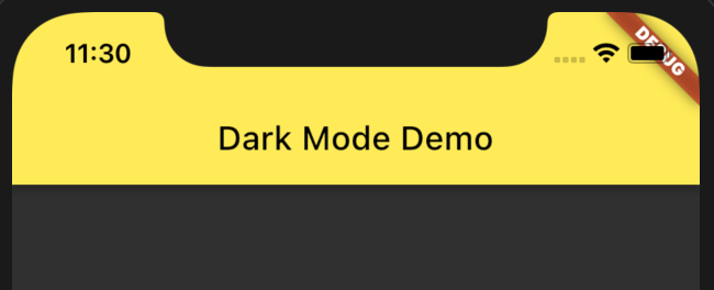
Dark Mode
Set brightness to dark, then set surface and onSurface to yellow and black, all others to grey to showcase that they are not relevant to AppBar.
MaterialApp(
  theme: ThemeData(
    colorScheme: ColorScheme(
      brightness: Brightness.dark,
      surface: Colors.yellow,
      onSurface: Colors.black,
      // Colors that are not relevant to AppBar in DARK mode:
      primary: Colors.grey,
      onPrimary: Colors.grey,
      primaryVariant: Colors.grey,
      secondary: Colors.grey,
      secondaryVariant: Colors.grey,
      onSecondary: Colors.grey,
      background: Colors.grey,
      onBackground: Colors.grey,
      error: Colors.grey,
      onError: Colors.grey,
    ),
  ),
  home: Scaffold(
    appBar: AppBar(title: Text("Dark Mode Demo")),
  ),
)
Solution 5:
According to AppBar description On Flutter 2.5, it uses ColorScheme.primary by default.
The default app bar [backgroundColor] is the overall theme's [ColorScheme.primary] if the overall theme's brightness is [Brightness.light]. Unfortunately this is the same as the default [ButtonStyle.foregroundColor] for [TextButton] for light themes. In this case a preferable text button foreground color is [ColorScheme.onPrimary], a color that contrasts nicely with [ColorScheme.primary]. to remedy the problem, override [TextButton.style]:
try using colorScheme
 MaterialApp(
      theme: ThemeData(
        colorScheme: ColorScheme.fromSwatch(
          primarySwatch: const Color(0xFF151026),
        ),
      ),
      home: MyApp(),
    ),
And to use somewhere else
Theme.of(context).colorScheme.primary,
Or you can just call backgroundColor on Appbar.
For more, visit ThemeData-class