Bootstrap - align button to the bottom of card
I was peeking at one of the Bootstrap examples that use the card-deck and card classes (Pricing example). I wondered how one can fix the button alignment if one of the lists has fewer items than the others.
I would like all buttons to be vertically aligned (at the bottom of each card) but I couldn't figure out a way of doing this. I tried setting the .align-bottom class as well as wrapping the button in <div class="align-text-bottom">. I also tried several suggestions from this question about adding space however still no success (also the spacing should be variable such that it fills up the remaining space from the list).
Wrapping in <div class="card-footer bg-white"> didn't yield the desired result either as it doesn't align the button at the bottom of the card and it creates some kind of border around it.
Does anyone have an idea?
Edit: Here is a jsfiddle that resembles the problem.
You can use the following Bootstrap 4 modifier classes:
- Add
d-flexto.card-body - Add
flex-columnto.card-body - Add
mt-autoto.btnnested in.card-body
fiddle
Refer to this page for a full list of flexbox modifying classes for Bootstrap 4.
A similar question has been answered here.
Just add the align-self-end class to item to align at the bottom.
https://www.codeply.com/go/Fiorqv1Iz6
     <div class="card-body d-flex flex-column">
            <h1 class="card-title pricing-card-title">$15 <small class="text-muted">/ mo</small></h1>
            <ul class="list-unstyled mt-3 mb-4">
              <li>20 users included</li>
              <li>10 GB of storage</li>
            </ul>
            <button type="button" class="align-self-end btn btn-lg btn-block btn-primary" style="margin-top: auto;">Get started</button>
     </div>
By default, the card is display:flex, but the card-body is not. Because of this you need to add d-flex flex-column to the card-body. This will make the flexbox alignment classes work.
Another option is to use mt-auto (auto top margin) on the button which will push it to the bottom of the Card.
Set the .card-body div to display:flex and flex-direction:column.
Then give the button margin-top:auto.
I imagine there are Bootstrap help classes for this.
.card-body {
  display: flex;
  flex-direction: column;
}

button.btn {
  margin-top: auto;
}
<link href="https://cdnjs.cloudflare.com/ajax/libs/twitter-bootstrap/4.0.0-beta.2/css/bootstrap.css" rel="stylesheet" />
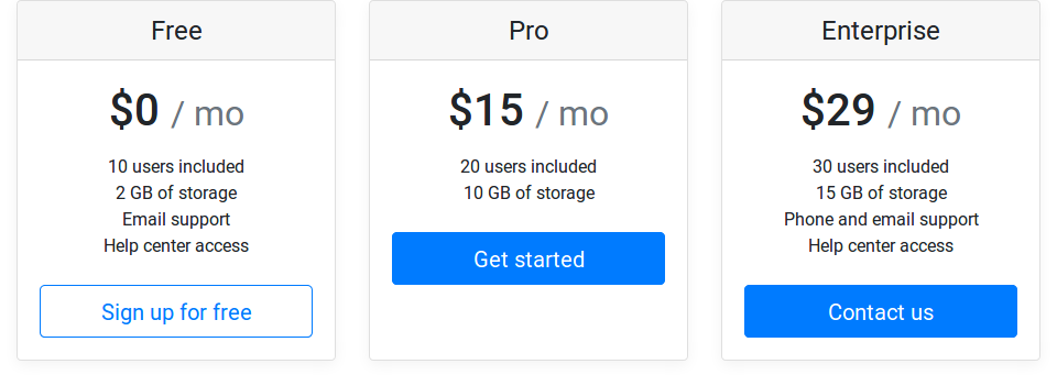
<div class="container">
<div class="card-deck mb-3 text-center">
<div class="card mb-4 box-shadow">
<div class="card-header">
<h4 class="my-0 font-weight-normal">Free</h4>
</div>
<div class="card-body">
<h1 class="card-title pricing-card-title">$0 <small class="text-muted">/ mo</small></h1>
<ul class="list-unstyled mt-3 mb-4">
<li>10 users included</li>
<li>2 GB of storage</li>
<li>Email support</li>
<li>Help center access</li>
<li>10 users included</li>
<li>2 GB of storage</li>
<li>Email support</li>
<li>Help center access</li>
</ul>
<button type="button" class="btn btn-lg btn-block btn-outline-primary">Sign up for free</button>
</div>
</div>
<div class="card mb-4 box-shadow">
<div class="card-header">
<h4 class="my-0 font-weight-normal">Enterprise</h4>
</div>
<div class="card-body">
<h1 class="card-title pricing-card-title">$29 <small class="text-muted">/ mo</small></h1>
<ul class="list-unstyled mt-3 mb-4">
<li>30 users included</li>
<li>15 GB of storage</li>
<li>Phone and email support</li>
<li>Help center access</li>
</ul>
<button type="button" class="btn btn-lg btn-block btn-primary">Contact us</button>
</div>
</div>
</div>Use the footer, it already has everything setup for you.
<div class="card-deck">
<div class="card">
   <div class="card-body">
      <h4 class="card-title">Title goes here</h4>
      <p class="card-text">Ut leo enim, fermentum fermentum tempor sit amet, vehicula in felis. Pellentesque a arcu augue. Nam eu malesuada lorem. Curabitur et molestie lacus.</p>
   </div>
   <div class="card-footer text-muted mx-auto">
      <button type="button" class="btn btn-sm btn-outline-secondary">Click me!</button>
   </div>
</div>
Then you can optionally style the card-footer element.
.card-footer {
  background: transparent;
  border-top: 0px;
}
demo: https://jsfiddle.net/rustynox/203zwyq6/
Add a Footer to the Card
You can set a footer for every card, like this:
<div class="card-footer">
   <button type="button" class="btn btn-primary btn-sm btn-block" onclick="location.href = '';">BUY NOW </button>
</div>