Set column width to content length in CSS Grid
I looked at the documentation but did not find such property. I want to fit all cells in one column to its content width using css grid.
For the first case I should apply this property for the container: grid-template-columns: auto auto;
But what should I do for the second case?
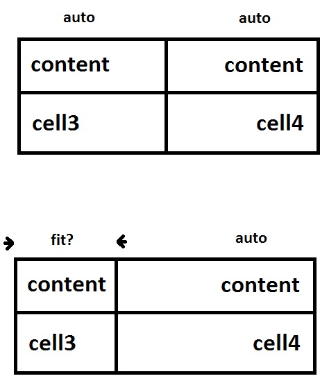
To make all columns "shrink-to-fit", use an inline-level grid container:
article {
  display: inline-grid;
  grid-template-columns: auto auto;
}

/* non-essential demo styles */
article { background-color: black; border: 1px solid black; }
section { background-color: white; border: 1px solid black; }
<article>
<section>content</section>
<section>content</section>
<section>cell3</section>
<section>cell4</section>
</article>To make one column "shrink-to-fit", use min-content:
article {
  display: grid;
  grid-template-columns: min-content auto;
}

/* non-essential demo styles */
article { background-color: black; border: 1px solid black; }
section { background-color: white; border: 1px solid black; }
<article>
<section>content</section>
<section>content</section>
<section>cell3</section>
<section>cell4</section>
</article>But auto with 1fr would also work because the fr would consume all free space on the line, collapsing the other column as much as possible:
article {
  display: grid;
  grid-template-columns: auto 1fr;
}

/* non-essential demo styles */
article { background-color: black; border: 1px solid black; }
section { background-color: white; border: 1px solid black; }
<article>
<section>content</section>
<section>content</section>
<section>cell3</section>
<section>cell4</section>
</article>More info in the spec:
- 7.2. Explicit Track Sizing: the
grid-template-rowsandgrid-template-columnsproperties
Set the following on the grid container:
grid-template-columns: auto 1fr;
This sets the width of the first column to equal the width of the widest item in that column, and the width of the second column to get the remaining width of the grid.
To right-align the content of the second column we can simply use text-align: right
span:nth-child(2n) {
  text-align: right;
}
div {
  display: grid;
  grid-template-columns: auto 1fr;
}
span {
  padding: 0.5em;
}
span:nth-child(2n) {
  text-align: right;
}
span:nth-child(1) {
  background-color: beige; /* colors for demo */
}
span:nth-child(2) {
  background-color: wheat;
}
span:nth-child(3) {
  background-color: lightgreen;
}
span:nth-child(4) {
  background-color: salmon;
}
<div>
<span>some content here</span>
<span>content</span>
<span>cell3</span>
<span>cell4</span>
</div>NB: Setting column widths with min-content is a little more aggressive :) and will set the width of the column to the width of the largest word in the column.
div {
  display: grid;
  grid-template-columns: min-content auto;
}
span {
  padding: 0.5em;
}
span:nth-child(2n) {
  text-align: right;
}
span:nth-child(1) {
  background-color: beige;
}
span:nth-child(2) {
  background-color: wheat;
}
span:nth-child(3) {
  background-color: lightgreen;
}
span:nth-child(4) {
  background-color: salmon;
}
<div>
<span>some content here</span>
<span>content</span>
<span>cell3</span>
<span>cell4</span>
</div>