How to force a fixed column width with a Bootstrap grid and keep the other ones fluid
I am using Bootstrap and I want to create the grid layout shown on the following image.
I would like to have a sidebar with a fixed with of 330px, no matter which screen sizes and keep everything inside #page-content re sizable depending on the resolution of my visitor's screen. 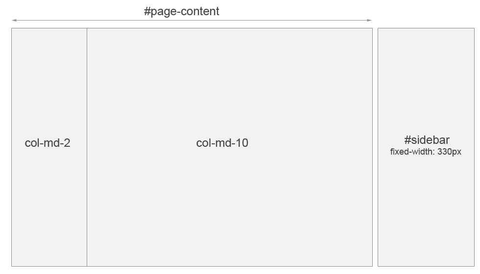
How can I achieve the layout shown on the image? If I do the following:
<div class="col-md-10" id="page-content">
   <div class="col-md-2">...</div>
   <div class="col-md-10">...</div>
</div>
<div class="col-md-2" id="sidebar">
   ...
</div>
and try to fix the width of #sidebar with width="330px"; for smaller screen sizes, the content will shift to the right, where it can't be seen. Since Bootstrap assigns width: 16.66666667%; to .col-md-2, it seems like I would have to get rid the grid system for the higher level divs, #page-content and #sidebar. But then, how can I make sure #page-content fills the remaining space at the left of #sidebar.
Solution 1:
Bootstrap 4.0 beta:
HTML:
<div class="container-fluid">
  <div class="row">
    <div class="col my-sidebar">
      <h2>LEFT</h2>
      <h6>(FIXED 230px COLUMN)</h6>
    </div>
    <div class="col text-center">
      <h1>CENTER (FLUID COLUMN)</h1>
    </div>
    <div class="col my-sidebar">
      <h2>RIGHT</h2>
      <h6>(FIXED 230px COLUMN)</h6>
    </div>
  </div>
</div>
CSS:
.my-sidebar {
    -ms-flex: 0 0 230px;
    flex: 0 0 230px;
    background-color: greenyellow;
}

@media (max-width: 690px) {
  .my-sidebar {
    display: none;
  }
}
Live example here: https://www.codeply.com/view/PHYTWFDFRU
In this example fixed columns will disappear if the browser window width becomes less than 690px. If you want them to be always visible remove the second css-block with @media entirely.
Solution 2:
Simply fix the width of the element you want fixed and don't add a measure to your bootstrap column (like col-8), by doing this it will take the remaining space automatically.
In my case I only had two elements on the row. Hope this helps.
.fixed{
    width: 300px;
}

<body>
    <div class="container">
        <div class="row">
            <div class="fixed">
                Fixed Width
            </div>
            <div class="col">
                Fluid
            </div>
        </div>
    </div>
</body>