Google Chrome text shadow rendering
Google Chrome has an extremely annoying defect in its implementation of CSS3 text-shadow. The sub-pixel antialiasing is turned off when text-shadow is applied. No amount of -webkit-font-smoothing will persuade it otherwise. The crude alpha-channel anti-alias leads to shadow intermixing with the letters and this along with the pixelated text ends up producing a very ugly look. This is even more evident if hand writing fonts are used such as Monotype Corsiva http://www.newfonts.net/index.php?pa=show_font&id=130
One of the places you can see this clearly is on Twitter - http://dev.twitter.com/pages/auth. The text-shadow is used for text outline there: view the page in Chrome, compare with FF or IE, you will see how bad it is.
The effect gets even worse with smaller text until it renders it completely unreadable. Technical discussion of the issue is available here: http://www.google.com/support/forum/p/Chrome/thread?fid=5d1c0f2082af0f21000483e9a516d36e&hl=en
There is a bug submitted in the Chromium project (issue 23440). This bug has been around more than a year and is still not assigned to anybody. Google devs saw it, decided it is not so important and left it to age. It turns out they only fix the "popular" bugs, a practice so lame that it looks impressive! I am very disappointed with Chrome! Web typography and CSS3 are used by more and more people every day to make the web much more beautiful place! It is a shame such issue exists to slow that down.
So, a public effort is needed to get this one fixed. Tell others about this, write in your blogs. You can go at http://code.google.com/p/chromium/issues/detail?id=23440 and vote for the issue. You can do that by clicking at the star located at top left page side (Some type of Google account required - gmail, etc).
To make things more clear - my question has two goals:
- Find a technical workaround.
- Make Google fix the issue in Chrome.
I will vote up every link posted to an article about the issue and mark as accepted the best one tech solution or public effort.
Solution 1:
@sebastian's fix may not work for old versions of Chrome.
Screenshot under Iron Browser (Chromium fork) v3.0.197.0:
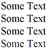
All the ones that have been assigned a shadow look the same and -webkit-font-smoothing has no effect as well as -webkit-text-stroke.
Instead, I've experimented until I've come up with this fix: http://jsbin.com/acalu4
tldr: add an innocuous 0 0 0 transparent, before your other shadow(s).
Known issues: some browsers can only handle 1 text-shadow. In order not to affect them (killing their only shadows) this should be applied via javascript only to Chrome.
Solution 2:
the first part (technical workaround): Giving the text a thin stroke.
try this css, you might have to tweak the values to get the desired effect.
-webkit-font-smoothing: subpixel-antialiased; /* or antialiased; */
-webkit-text-stroke: .10pt black; /* or 0.01em might be better */
only webkit browsers (Chrome, Safari) read it, so it won't affect FF or IE.
play with an example here: http://jsfiddle.net/SebastianPataneMasuelli/NfmU7/6/