WPF What is the correct way of using SVG files as icons in WPF
Can someone describe a recommended Step by Step procedure for doing this?
Step1. Convert SVG to XAML... thats easy
Step2. Now what?
Solution 1:
Your technique will depend on what XAML object your SVG to XAML converter produces. Does it produce a Drawing? An Image? A Grid? A Canvas? A Path? A Geometry? In each case your technique will be different.
In the examples below I will assume you are using your icon on a button, which is the most common scenario, but note that the same techniques will work for any ContentControl.
Using a Drawing as an icon
To use a Drawing, paint an approriately-sized rectangle with a DrawingBrush:
<Button>
  <Rectangle Width="100" Height="100">
    <Rectangle.Fill>
      <DrawingBrush>
        <DrawingBrush.Drawing>

          <Drawing ... /> <!-- Converted from SVG -->

        </DrawingBrush.Drawing>
      </DrawingBrush>
    </Rectangle.Fill>
  </Rectangle>
</Button>
Using an Image as an icon
An image can be used directly:
<Button>
  <Image ... />  <!-- Converted from SVG -->
</Button>
Using a Grid as an icon
A grid can be used directly:
<Button>
  <Grid ... />  <!-- Converted from SVG -->
</Button>
Or you can include it in a Viewbox if you need to control the size:
<Button>
  <Viewbox ...>
    <Grid ... />  <!-- Converted from SVG -->
  </Viewbox>
</Button>
Using a Canvas as an icon
This is like using an image or grid, but since a canvas has no fixed size you need to specify the height and width (unless these are already set by the SVG converter):
<Button>
  <Canvas Height="100" Width="100">  <!-- Converted from SVG, with additions -->
  </Canvas>
</Button>
Using a Path as an icon
You can use a Path, but you must set the stroke or fill explicitly:
<Button>
  <Path Stroke="Red" Data="..." /> <!-- Converted from SVG, with additions -->
</Button>
or
<Button>
  <Path Fill="Blue" Data="..." /> <!-- Converted from SVG, with additions -->
</Button>
Using a Geometry as an icon
You can use a Path to draw your geometry. If it should be stroked, set the Stroke:
<Button>
  <Path Stroke="Red" Width="100" Height="100">
    <Path.Data>
      <Geometry ... /> <!-- Converted from SVG -->
    </Path.Data>
  </Path>
</Button>
or if it should be filled, set the Fill:
<Button>
  <Path Fill="Blue" Width="100" Height="100">
    <Path.Data>
      <Geometry ... /> <!-- Converted from SVG -->
    </Path.Data>
  </Path>
</Button>
How to data bind
If you're doing the SVG -> XAML conversion in code and want the resulting XAML to appear using data binding, use one of the following:
Binding a Drawing:
<Button>
  <Rectangle Width="100" Height="100">
    <Rectangle.Fill>
      <DrawingBrush Drawing="{Binding Drawing, Source={StaticResource ...}}" />
    </Rectangle.Fill>
  </Rectangle>
</Button>
Binding an Image:
<Button Content="{Binding Image}" />
Binding a Grid:
<Button Content="{Binding Grid}" />
Binding a Grid in a Viewbox:
<Button>
  <Viewbox ...>
    <ContentPresenter Content="{Binding Grid}" />
  </Viewbox>
</Button>
Binding a Canvas:
<Button>
  <ContentPresenter Height="100" Width="100" Content="{Binding Canvas}" />
</Button>
Binding a Path:
<Button Content="{Binding Path}" /> <!-- Fill or stroke must be set in code unless set by the SVG converter -->
Binding a Geometry:
<Button>
  <Path Width="100" Height="100" Data="{Binding Geometry}" />
</Button>
Solution 2:
Install the SharpVectors library
Install-Package SharpVectors
Add the following in XAML
<UserControl xmlns:svgc="http://sharpvectors.codeplex.com/svgc">
    <svgc:SvgViewbox Source="/Icons/icon.svg"/>
</UserControl>
Solution 3:
Windows 10 build 15063 "Creators Update" natively supports SVG images (though with some gotchas) to UWP/UAP applications targeting Windows 10.
If your application is a WPF app rather than a UWP/UAP, you can still use this API (after jumping through quite a number of hoops): Windows 10 build 17763 "October 2018 Update" introduced the concept of XAML islands (as a "preview" technology but I believe allowed in the app store; in all cases, with Windows 10 build 18362 "May 2019 Update" XAML islands are no longer a preview feature and are fully supported) allowing you to use UWP APIs and controls in your WPF applications.
You need to first add the references to the WinRT APIs, and to use certain Windows 10 APIs that interact with user data or the system (e.g. loading images from disk in a Windows 10 UWP webview or using the toast notification API to show toasts), you also need to associate your WPF application with a package identity, as shown here (immensely easier in Visual Studio 2019). This shouldn't be necessary to use the Windows.UI.Xaml.Media.Imaging.SvgImageSource class, though.
Usage (if you're on UWP or you've followed the directions above and added XAML island support under WPF) is as simple as setting the Source for an <Image /> to the path to the SVG. That is equivalent to using SvgImageSource, as follows:
<Image>
    <Image.Source>
        <SvgImageSource UriSource="Assets/svg/icon.svg" />
    </Image.Source>
</Image>
However, SVG images loaded in this way (via XAML) may load jagged/aliased. One workaround is to specify a RasterizePixelHeight or RasterizePixelWidth value that is double+ your actual height/width:
<SvgImageSource RasterizePixelHeight="300" RasterizePixelWidth="300" UriSource="Assets/svg/icon.svg" /> <!-- presuming actual height or width is under 150 -->
This can be worked around dynamically by creating a new SvgImageSource in the ImageOpened event for the base image:
var svgSource = new SvgImageSource(new Uri("ms-appx://" + Icon));
PrayerIcon.ImageOpened += (s, e) =>
{
    var newSource = new SvgImageSource(svgSource.UriSource);
    newSource.RasterizePixelHeight = PrayerIcon.DesiredSize.Height * 2;
    newSource.RasterizePixelWidth = PrayerIcon.DesiredSize.Width * 2;
    PrayerIcon2.Source = newSource;
};
PrayerIcon.Source = svgSource;
The aliasing may be hard to see on non high-dpi screens, but here's an attempt to illustrate it.
This is the result of the code above: an Image that uses the initial SvgImageSource, and a second Image below it that uses the SvgImageSource created in the ImageOpened event:

This is a blown up view of the top image:
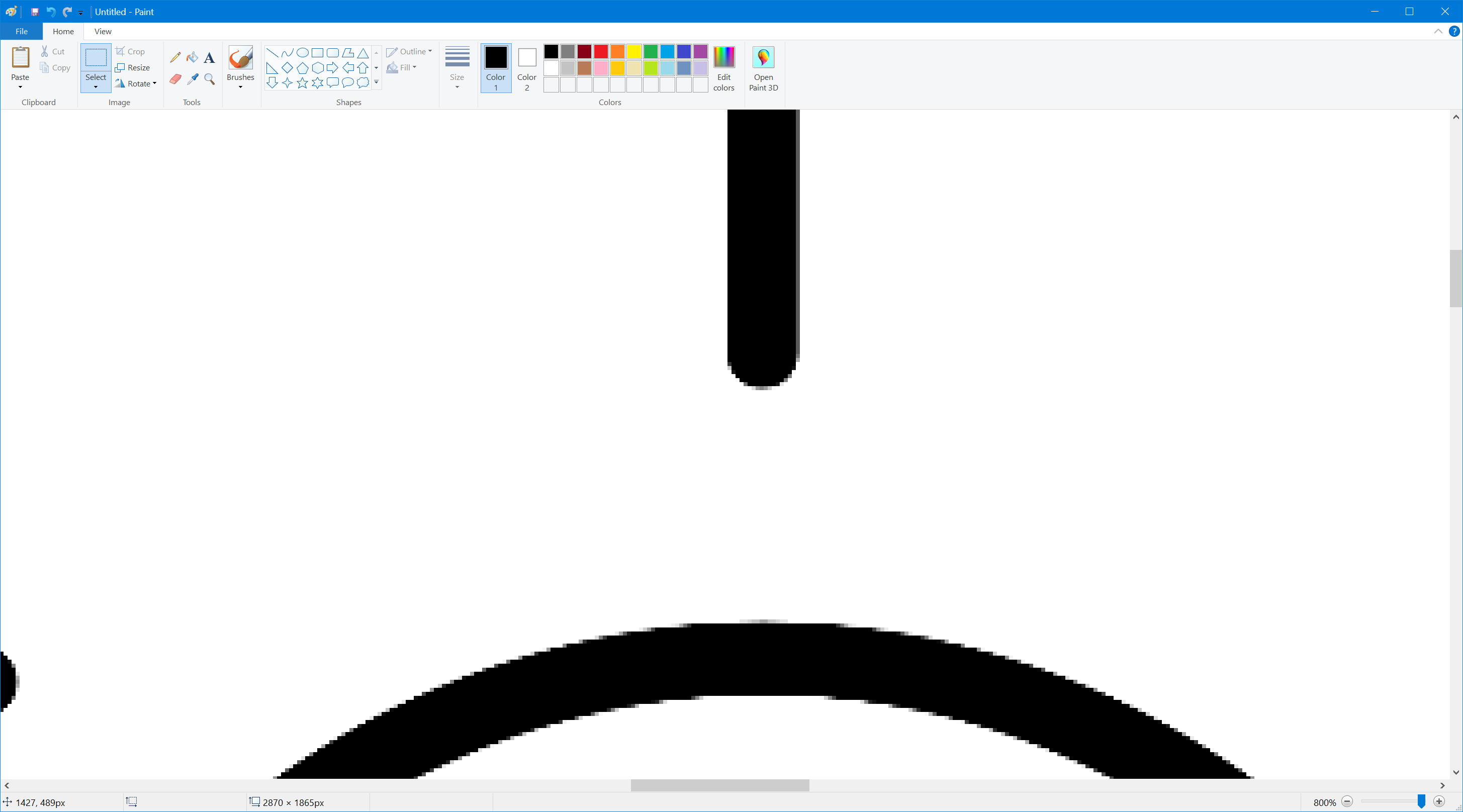
Whereas this is a blown-up view of the bottom (antialiased, correct) image:
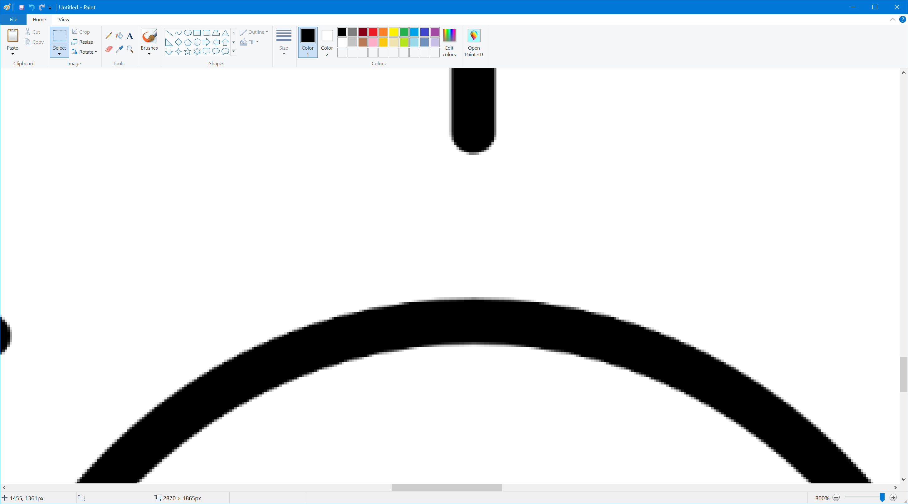
(you'll need to open the images in a new tab and view at full size to appreciate the difference)
Solution 4:
You can use the resulting xaml from the SVG as a drawing brush on a rectangle. Something like this:
<Rectangle>
   <Rectangle.Fill>
      --- insert the converted xaml's geometry here ---
   </Rectangle.Fill>
</Rectangle>
Solution 5:
Use the SvgImage or the SvgImageConverter extensions, the SvgImageConverter supports binding. See the following link for samples demonstrating both extensions.
https://github.com/ElinamLLC/SharpVectors/tree/master/TutorialSamples/ControlSamplesWpf