TabControl with Add New Tab Button (+)
What is the proper way of adding a '+' button tab at the end of all the tab items in the tab strip of a tab control in WPF?
- It should work correctly with multiple tab header rows.
- It should be at the end of all tab items
- Tab cycling should work correctly (Alt + Tab), that is, the
+tab should be skipped. - I shouldn't have to modify the source collection I am binding to. That is, the control should be reusable.
- The solution should work with MVVM
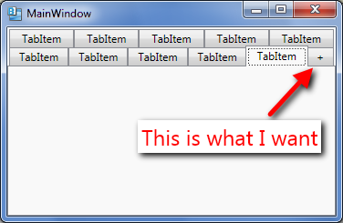
To be more precise, the button should appear exactly as an additional last tab and not as a separate button somewhere on the right of all tab strip rows.
I am just looking for the general approach to doing this.
Google throws many examples, but if you dig a little deep none of them satisfy all the above five points.
An almost complete solution using IEditableCollectionView:
ObservableCollection<ItemVM> _items;
public ObservableCollection<ItemVM> Items
{
    get
    {
        if (_items == null)
        {
            _items = new ObservableCollection<ItemVM>();
            var itemsView = (IEditableCollectionView)CollectionViewSource.GetDefaultView(_items);
            itemsView.NewItemPlaceholderPosition = NewItemPlaceholderPosition.AtEnd;
        }

        return _items;
    }
}

private DelegateCommand<object> _newCommand;
public DelegateCommand<object> NewCommand
{
    get
    {
        if (_newCommand == null)
        {
            _newCommand = new DelegateCommand<object>(New_Execute);
        }

        return _newCommand;
    }
}

private void New_Execute(object parameter)
{
    Items.Add(new ItemVM());
}
<DataTemplate x:Key="newTabButtonContentTemplate">
    <Grid/>
</DataTemplate>

<DataTemplate x:Key="newTabButtonHeaderTemplate">
    <Button Content="+"
        Command="{Binding ElementName=parentUserControl, Path=DataContext.NewCommand}"/>
</DataTemplate>

<DataTemplate x:Key="itemContentTemplate">
    <Grid/>
</DataTemplate>

<DataTemplate x:Key="itemHeaderTemplate">
    <TextBlock Text="TabItem_test"/>
</DataTemplate>

<vw:TemplateSelector x:Key="headerTemplateSelector"
                           NewButtonTemplate="{StaticResource newTabButtonHeaderTemplate}"
                           ItemTemplate="{StaticResource itemHeaderTemplate}"/>

<vw:TemplateSelector x:Key="contentTemplateSelector"
                            NewButtonTemplate="{StaticResource newTabButtonContentTemplate}"
                            ItemTemplate="{StaticResource itemContentTemplate}"/>

<TabControl ItemsSource="{Binding Items}"
        ItemTemplateSelector="{StaticResource headerTemplateSelector}"
        ContentTemplateSelector="{StaticResource contentTemplateSelector}"/>
public class TemplateSelector : DataTemplateSelector
{
    public DataTemplate ItemTemplate { get; set; }
    public DataTemplate NewButtonTemplate { get; set; }

    public override DataTemplate SelectTemplate(object item, DependencyObject container)
    {
        if (item == CollectionView.NewItemPlaceholder)
        {
            return NewButtonTemplate;
        }
        else
        {
            return ItemTemplate;
        }
    }
}

Enter code here
It's almost complete, because the tab cycle doesn't skip the '+' tab, and will show empty content (which is not exactly great, but I can live with it until a better solution come around...).
Existing answers were too complex for me and I am lazy. So, I tried to implement a very simple idea.
- Always add [+] tab to the last.
- When the last tab is selected, make it as a new tab, and add another last tab.
The idea was simple, but the damn WPF is verbose, so the code became a little bit long. But it probably is very simple to understand... because even I did.

Code behind.
public partial class MainWindow : Window
{
    int TabIndex = 1;
    ObservableCollection<TabVM> Tabs = new ObservableCollection<TabVM>();
    public MainWindow()
    {
        InitializeComponent();
        var tab1 = new TabVM()
        {
            Header = $"Tab {TabIndex}",
            Content = new ContentVM("First tab", 1)
        };
        Tabs.Add(tab1);
        AddNewPlusButton();

        MyTabControl.ItemsSource = Tabs;
        MyTabControl.SelectionChanged += MyTabControl_SelectionChanged;

    }

    private void MyTabControl_SelectionChanged(object sender, SelectionChangedEventArgs e)
    {
        if(e.Source is TabControl)
        {
            var pos = MyTabControl.SelectedIndex;
            if (pos!=0 && pos == Tabs.Count-1) //last tab
            {
                var tab = Tabs.Last();
                ConvertPlusToNewTab(tab);
                AddNewPlusButton();
            }
        }
    }

    void ConvertPlusToNewTab(TabVM tab)
    {
        //Do things to make it a new tab.
        TabIndex++;
        tab.Header = $"Tab {TabIndex}";
        tab.IsPlaceholder = false;
        tab.Content = new ContentVM("Tab content", TabIndex);
    }

    void AddNewPlusButton()
    {
        var plusTab = new TabVM()
        {
            Header = "+",
            IsPlaceholder = true
        };
        Tabs.Add(plusTab);
    }

    class TabVM:INotifyPropertyChanged
    {
        string _Header;
        public string Header
        {
            get => _Header;
            set
            {
                _Header = value;
                OnPropertyChanged();
            }
        }

        bool _IsPlaceholder = false;
        public bool IsPlaceholder
        {
            get => _IsPlaceholder;
            set
            {
                _IsPlaceholder = value;
                OnPropertyChanged();
            }
        }

        ContentVM _Content = null;
        public ContentVM Content
        {
            get => _Content;
            set
            {
                _Content = value;
                OnPropertyChanged();
            }
        }

        public event PropertyChangedEventHandler PropertyChanged;
        void OnPropertyChanged([CallerMemberName] string property = "")
        {
            PropertyChanged?.Invoke(this, new PropertyChangedEventArgs(property));
        }
    }

    class ContentVM
    {
        public ContentVM(string name, int index)
        {
            Name = name;
            Index = index;
        }
        public string Name { get; set; }
        public int Index { get; set; }
    }

    private void OnTabCloseClick(object sender, RoutedEventArgs e)
    {
        var tab = (sender as Button).DataContext as TabVM;
        if (Tabs.Count>2)
        {
            var index = Tabs.IndexOf(tab);
            if(index==Tabs.Count-2)//last tab before [+]
            {
                MyTabControl.SelectedIndex--;
            }
            Tabs.RemoveAt(index);
        }
    }
}
XAML
<TabControl Name="MyTabControl">
    <TabControl.ItemTemplate>
        <DataTemplate>
            <StackPanel Orientation="Horizontal">
                <TextBlock Text="{Binding Header, Mode=OneWay}" />
                <Button Click="OnTabCloseClick" Width="20" Padding="0" Margin="8 0 0 0" Content="X">
                    <Button.Style>
                        <Style TargetType="Button" x:Name="CloseButtonStyle">
                            <Setter Property="Visibility" Value="Visible"/>
                            <Style.Triggers>
                                <DataTrigger Binding="{Binding IsPlaceholder}" Value="True">
                                    <Setter Property="Visibility" Value="Collapsed"/>
                                </DataTrigger>
                            </Style.Triggers>
                        </Style>
                    </Button.Style>
                </Button>
            </StackPanel>
        </DataTemplate>
    </TabControl.ItemTemplate>

    <TabControl.ContentTemplate>
        <DataTemplate>
            <ContentControl>
                <ContentControl.Resources>
                    <ContentControl x:Key="TabContentTemplate">
                        <StackPanel DataContext="{Binding Content}" Orientation="Vertical">
                            <TextBlock Text="{Binding Path=Name}"/>
                            <TextBlock Text="{Binding Path=Index}"/>
                        </StackPanel>
                    </ContentControl>
                </ContentControl.Resources>
                <ContentControl.Style>
                    <Style TargetType="ContentControl">
                        <Style.Triggers>
                            <DataTrigger Binding="{Binding IsPlaceholder}" Value="True">
                                <Setter Property="Content"
                                        Value="{x:Null}"/>
                            </DataTrigger>
                            <DataTrigger Binding="{Binding IsPlaceholder}" Value="False">
                                <Setter Property="Content"
                                        Value="{StaticResource TabContentTemplate}"/>
                            </DataTrigger>
                        </Style.Triggers>
                    </Style>
                </ContentControl.Style>
            </ContentControl>
        </DataTemplate>
    </TabControl.ContentTemplate>
</TabControl>
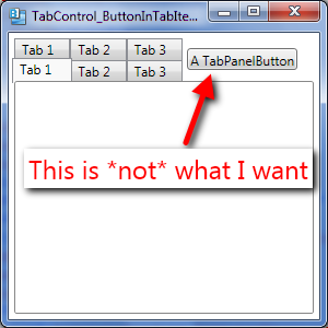
I used a modification of the tab control template and binding to the AddNewItemCommand command in my view model. XAML:
<TabControl x:Class="MyNamespace.MyTabView"
            xmlns="http://schemas.microsoft.com/winfx/2006/xaml/presentation"
            ItemsSource="{Binding MyItemSource}"
            SelectedIndex="{Binding LastSelectedIndex}"
            xmlns:x="http://schemas.microsoft.com/winfx/2006/xaml">
    <Control.Template>
        <ControlTemplate TargetType="{x:Type TabControl}">
            <Grid ClipToBounds="true"
                  SnapsToDevicePixels="true"
                  KeyboardNavigation.TabNavigation="Local">
                <Grid.ColumnDefinitions>
                    <ColumnDefinition x:Name="ColumnDefinition0" />
                    <ColumnDefinition x:Name="ColumnDefinition1"
                                      Width="0" />
                </Grid.ColumnDefinitions>
                <Grid.RowDefinitions>
                    <RowDefinition x:Name="RowDefinition0"
                                   Height="Auto" />
                    <RowDefinition x:Name="RowDefinition1"
                                   Height="*" />
                </Grid.RowDefinitions>
                <StackPanel Grid.Column="0"
                            Grid.Row="0"
                            Orientation="Horizontal"
                            x:Name="HeaderPanel">
                    <TabPanel x:Name="_HeaderPanel"
                              IsItemsHost="true"
                              Margin="2,2,2,0"
                              KeyboardNavigation.TabIndex="1"
                              Panel.ZIndex="1" />
                    <Button Content="+"
                            Command="{Binding AddNewItemCommand}" />
                </StackPanel>

                <Border x:Name="ContentPanel"
                        BorderBrush="{TemplateBinding BorderBrush}"
                        BorderThickness="{TemplateBinding BorderThickness}"
                        Background="{TemplateBinding Background}"
                        Grid.Column="0"
                        KeyboardNavigation.DirectionalNavigation="Contained"
                        Grid.Row="1"
                        KeyboardNavigation.TabIndex="2"
                        KeyboardNavigation.TabNavigation="Local">
                    <ContentPresenter x:Name="PART_SelectedContentHost"
                                      ContentSource="SelectedContent"
                                      Margin="{TemplateBinding Padding}"
                                      SnapsToDevicePixels="{TemplateBinding SnapsToDevicePixels}" />
                </Border>
            </Grid>
            <ControlTemplate.Triggers>
                <Trigger Property="TabStripPlacement"
                         Value="Bottom">
                    <Setter Property="Grid.Row"
                            TargetName="HeaderPanel"
                            Value="1" />
                    <Setter Property="Grid.Row"
                            TargetName="ContentPanel"
                            Value="0" />
                    <Setter Property="Height"
                            TargetName="RowDefinition0"
                            Value="*" />
                    <Setter Property="Height"
                            TargetName="RowDefinition1"
                            Value="Auto" />
                    <Setter Property="Margin"
                            TargetName="HeaderPanel"
                            Value="2,0,2,2" />
                </Trigger>
                <Trigger Property="TabStripPlacement"
                         Value="Left">
                    <Setter Property="Orientation"
                            TargetName="HeaderPanel"
                            Value="Vertical" />
                    <Setter Property="Grid.Row"
                            TargetName="HeaderPanel"
                            Value="0" />
                    <Setter Property="Grid.Row"
                            TargetName="ContentPanel"
                            Value="0" />
                    <Setter Property="Grid.Column"
                            TargetName="HeaderPanel"
                            Value="0" />
                    <Setter Property="Grid.Column"
                            TargetName="ContentPanel"
                            Value="1" />
                    <Setter Property="Width"
                            TargetName="ColumnDefinition0"
                            Value="Auto" />
                    <Setter Property="Width"
                            TargetName="ColumnDefinition1"
                            Value="*" />
                    <Setter Property="Height"
                            TargetName="RowDefinition0"
                            Value="*" />
                    <Setter Property="Height"
                            TargetName="RowDefinition1"
                            Value="0" />
                    <Setter Property="Margin"
                            TargetName="HeaderPanel"
                            Value="2,2,0,2" />
                </Trigger>
                <Trigger Property="TabStripPlacement"
                         Value="Right">
                    <Setter Property="Orientation"
                            TargetName="HeaderPanel"
                            Value="Vertical" />
                    <Setter Property="Grid.Row"
                            TargetName="HeaderPanel"
                            Value="0" />
                    <Setter Property="Grid.Row"
                            TargetName="ContentPanel"
                            Value="0" />
                    <Setter Property="Grid.Column"
                            TargetName="HeaderPanel"
                            Value="1" />
                    <Setter Property="Grid.Column"
                            TargetName="ContentPanel"
                            Value="0" />
                    <Setter Property="Width"
                            TargetName="ColumnDefinition0"
                            Value="*" />
                    <Setter Property="Width"
                            TargetName="ColumnDefinition1"
                            Value="Auto" />
                    <Setter Property="Height"
                            TargetName="RowDefinition0"
                            Value="*" />
                    <Setter Property="Height"
                            TargetName="RowDefinition1"
                            Value="0" />
                    <Setter Property="Margin"
                            TargetName="HeaderPanel"
                            Value="0,2,2,2" />
                </Trigger>
                <Trigger Property="IsEnabled"
                         Value="false">
                    <Setter Property="Foreground"
                            Value="{DynamicResource {x:Static SystemColors.GrayTextBrushKey}}" />
                </Trigger>
            </ControlTemplate.Triggers>
        </ControlTemplate>
    </Control.Template>
    <ItemsControl.ItemTemplate>
        <DataTemplate>
            <Grid>
                <Grid.ColumnDefinitions>
                    <ColumnDefinition Width="*" />
                    <ColumnDefinition Width="5" />
                    <ColumnDefinition Width="Auto" />
                </Grid.ColumnDefinitions>
                <TextBlock Text="{Binding Caption}" />
                <Button Content="x"
                        Grid.Column="2"
                        VerticalAlignment="Top"/>
            </Grid>
        </DataTemplate>
    </ItemsControl.ItemTemplate>
</TabControl>
Code in the relevant view model looks like this:
public ICommand AddNewItemCommand
{
    get
    {
        return new DelegateCommand((param) =>
        {
            MyItemSource.Add(CreateMyValueViewModel());
        },
        (param) => MyItemSource != null);
    }
}
Pay attention: I wrapped TabPanel by StackPanel to flip the "+" button together with TabPanel regarding to value of property "TabStripPlacement". Without inheritance and without code-behind in your view.