Scrollable div to stick to bottom, when outer div changes in size
Here is an example chat app ->
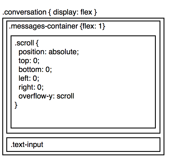
The idea here is to have the .messages-container take up as much of the screen as it can. Within .messages-container, .scroll holds the list of messages, and in case there are more messages then the size of the screen, scrolls.
Now, consider this case:
- The user scrolls to the bottom of the conversation
- The
.text-input, dynamically gets bigger
Now, instead of the user staying scrolled to the bottom of the conversation, the text-input increases, and they no longer see the bottom.
One way to fix it, if we are using react, calculate the height of text-input, and if anything changes, let .messages-container know
componentDidUpdate() {
  window.setTimeout(_ => {
    const newHeight = this.calcHeight();
    if (newHeight !== this._oldHeight) {
      this.props.onResize();
    }
    this._oldHeight = newHeight;
  });
}
But, this causes visible performance issues, and it's sad to be passing messages around like this.
Is there a better way? Could I use css in such a way, to express that when .text-input-increases, I want to essentially shift up all of .messages-container
Solution 1:
2:nd revision of this answer
Your friend here is flex-direction: column-reverse; which does all you ask while align the messages at the bottom of the message container, just like for example Skype and many other chat apps do.
.chat-window{
  display:flex;
  flex-direction:column;
  height:100%;
}
.chat-messages{
  flex: 1;
  height:100%;
  overflow: auto;
  display: flex;
  flex-direction: column-reverse;
}

.chat-input { border-top: 1px solid #999; padding: 20px 5px }
.chat-input-text { width: 60%; min-height: 40px; max-width: 60%; }
The downside with flex-direction: column-reverse; is a bug in IE/Edge/Firefox, where the scrollbar doesn't show, which your can read more about here: Flexbox column-reverse and overflow in Firefox/IE
The upside is you have ~ 90% browser support on mobile/tablets and ~ 65% for desktop, and counting as the bug gets fixed, ...and there is a workaround.
// scroll to bottom
function updateScroll(el){
  el.scrollTop = el.scrollHeight;
}
// only shift-up if at bottom
function scrollAtBottom(el){
  return (el.scrollTop + 5 >= (el.scrollHeight - el.offsetHeight));
}
In the below code snippet I've added the 2 functions from above, to make IE/Edge/Firefox behave in the same way flex-direction: column-reverse; does.
function addContent () {
  var msgdiv = document.getElementById('messages');
  var msgtxt = document.getElementById('inputs');
  var atbottom = scrollAtBottom(msgdiv);

  if (msgtxt.value.length > 0) {
    msgdiv.innerHTML += msgtxt.value + '<br/>';
    msgtxt.value = "";
  } else {
    msgdiv.innerHTML += 'Long long content ' + (tempCounter++) + '!<br/>';
  }

  /* if at bottom and is IE/Edge/Firefox */
  if (atbottom && (!isWebkit || isEdge)) {
    updateScroll(msgdiv);
  }
}

function resizeInput () {
  var msgdiv = document.getElementById('messages');
  var msgtxt = document.getElementById('inputs');
  var atbottom = scrollAtBottom(msgdiv);

  if (msgtxt.style.height == '120px') {
    msgtxt.style.height = 'auto';
  } else {
    msgtxt.style.height = '120px';
  }

  /* if at bottom and is IE/Edge/Firefox */
  if (atbottom && (!isWebkit || isEdge)) {
    updateScroll(msgdiv);
  }
}


/* fix for IE/Edge/Firefox */
var isWebkit = ('WebkitAppearance' in document.documentElement.style);
var isEdge = ('-ms-accelerator' in document.documentElement.style);
var tempCounter = 6;

function updateScroll(el){
  el.scrollTop = el.scrollHeight;
}
function scrollAtBottom(el){
  return (el.scrollTop + 5 >= (el.scrollHeight - el.offsetHeight));
}
html, body { height:100%; margin:0; padding:0; }
.chat-window{
display:flex;
flex-direction:column;
height:100%;
}
.chat-messages{
flex: 1;
height:100%;
overflow: auto;
display: flex;
flex-direction: column-reverse;
}
.chat-input { border-top: 1px solid #999; padding: 20px 5px }
.chat-input-text { width: 60%; min-height: 40px; max-width: 60%; }
/* temp. buttons for demo */
button { width: 12%; height: 44px; margin-left: 5%; vertical-align: top; }
/* begin - fix for hidden scrollbar in IE/Edge/Firefox */
.chat-messages-text{ overflow: auto; }
@media screen and (-webkit-min-device-pixel-ratio:0) {
.chat-messages-text{ overflow: visible; }
/* reset Edge as it identifies itself as webkit */
@supports (-ms-accelerator:true) { .chat-messages-text{ overflow: auto; } }
}
/* hide resize FF */
@-moz-document url-prefix() { .chat-input-text { resize: none } }
/* end - fix for hidden scrollbar in IE/Edge/Firefox */<div class="chat-window">
<div class="chat-messages">
<div class="chat-messages-text" id="messages">
Long long content 1!<br/>
Long long content 2!<br/>
Long long content 3!<br/>
Long long content 4!<br/>
Long long content 5!<br/>
</div>
</div>
<div class="chat-input">
<textarea class="chat-input-text" placeholder="Type your message here..." id="inputs"></textarea>
<button onclick="addContent();">Add msg</button>
<button onclick="resizeInput();">Resize input</button>
</div>
</div>Side note 1: The detection method is not fully tested, but it should work on newer browsers.
Side note 2: Attach a resize event handler for the chat-input might be more efficient then calling the updateScroll function.
Note: Credits to HaZardouS for reusing his html structure
Solution 2:
You just need one CSS rule set:
.messages-container, .scroll {transform: scale(1,-1);}
That's it, you're done!
How it works: First, it vertically flips the container element so that the top becomes the bottom (giving us the desired scroll orientation), then it flips the content element so that the messages won't be upside down.
This approach works in all modern browsers. It does have a strange side effect, though: when you use a mouse wheel in the message box, the scroll direction is reversed. This can be fixed with a few lines of JavaScript, as shown below.
Here's a demo and a fiddle to play with:
//Reverse wheel direction
document.querySelector('.messages-container').addEventListener('wheel', function(e) {
  if(e.deltaY) {
    e.preventDefault();
    e.currentTarget.scrollTop -= e.deltaY;
  }
});

//The rest of the JS just handles the test buttons and is not part of the solution
send = function() {
  var inp = document.querySelector('.text-input');
  document.querySelector('.scroll').insertAdjacentHTML('beforeend', '<p>' + inp.value);
  inp.value = '';
  inp.focus();
}
resize = function() {
  var inp = document.querySelector('.text-input');
  inp.style.height = inp.style.height === '50%' ? null : '50%';
}
html,body {height: 100%;margin: 0;}
.conversation {
display: flex;
flex-direction: column;
height: 100%;
}
.messages-container {
flex-shrink: 10;
height: 100%;
overflow: auto;
}
.messages-container, .scroll {transform: scale(1,-1);}
.text-input {resize: vertical;}<div class="conversation">
<div class="messages-container">
<div class="scroll">
<p>Message 1<p>Message 2<p>Message 3<p>Message 4<p>Message 5
<p>Message 6<p>Message 7<p>Message 8<p>Message 9<p>Message 10<p>Message 11<p>Message 12<p>Message 13<p>Message 14<p>Message 15<p>Message 16<p>Message 17<p>Message 18<p>Message 19<p>Message 20
</div>
</div>
<textarea class="text-input" autofocus>Your message</textarea>
<div>
<button id="send" onclick="send();">Send input</button>
<button id="resize" onclick="resize();">Resize input box</button>
</div>
</div>Edit: thanks to @SomeoneSpecial for suggesting a simplification to the scroll code!
Solution 3:
Please try the following fiddle - https://jsfiddle.net/Hazardous/bypxg25c/. Although the fiddle is currently using jQuery to grow/resize the text area, the crux is in the flex related styles used for the messages-container and input-container classes -
.messages-container{
  order:1;
  flex:0.9 1 auto;
  overflow-y:auto;
  display:flex;
  flex-direction:row;
  flex-wrap:nowrap;
  justify-content:flex-start;
  align-items:stretch;
  align-content:stretch;
}

.input-container{
  order:2;
  flex:0.1 0 auto;
}
The flex-shrink value is set to 1 for .messages-container and 0 for .input-container. This ensures that messages-container shrinks when there is a reallocation of size.