How do I create a teardrop in HTML?
Solution 1:
SVG approach:
You can achieve the double curve easily with an inline SVG and the <path/> element instead of the <polygon/> element which doesn't allow curved shapes.
The following example uses the <path/> element with:
- 2 quadratic bezier curve commands for the 2 top curves (lines beginning with
Q) - 1 arc command for the big bottom one (line beginning with
A)
<svg width="30%" viewbox="0 0 30 42">
  <path fill="transparent" stroke="#000" stroke-width="1.5"
        d="M15 3
           Q16.5 6.8 25 18
           A12.8 12.8 0 1 1 5 18
           Q13.5 6.8 15 3z" />
</svg>
SVG is a great tool to make this kind of shapes with double curves. You can check this post about double curves with an SVG/CSS comparison. Some of the advantages of using SVG in this case are:
- Curve control
- Fill control (opacity, color)
- Stroke control (width, opacity, color)
- Amount of code
- Time to build and maintain the shape
- Scalable
- No HTTP request (if used inline like in the example)
Browser support for inline SVG goes back to Internet Explorer 9. See canIuse for more information.
Solution 2:
Basic Border-Radius
You can do this within CSS relatively easily using border-radius' and transforms. Your CSS was just a little bit out.
.tear {
  width: 50px;
  height: 50px;
  border-radius: 0 50% 50% 50%;
  border: 3px solid black;
  transform: rotate(45deg);
  margin-top: 20px;
}
<div class="tear"></div>Advanced Border-Radius
This will be very similar to above but gives it a bit more shape.
.tear {
  width: 50px;
  height: 50px;
  border-radius: 80% 0 55% 50% / 55% 0 80% 50%;
  border: 3px solid black;
  transform: rotate(-45deg);
  margin-top: 20px;
}
<div class="tear"></div>Solution 3:
Your main issue with your CSS code was:
- You used a different height than width
- You haven't rotated the correct angle size
So, by 'fixing' these issues, you would generate:
.tear {
  display: inline-block;
  transform: rotate(-45deg);
  border: 5px solid green;
  width: 100px;
  height: 100px;
  border-top-left-radius: 50%;
  border-bottom-left-radius: 50%;
  border-bottom-right-radius: 50%;
}
/***for demo only***/

.tear {
  margin: 50px;
}
<div class="tear">
</div>Please also note to save on CSS length, you could re-write your border-radius properties to:
border-radius: 50% 0 50% 50%;
this could be enhanced with pseudo elements as shown in this fiddle
Alternatives
I found this by Vinay Challuru on codepen.
Please note that with the logic here, I was able to create the SVG to nearly any possible build shape/etc. For example, a quick output was:
<svg viewBox='0 0 400 400'>
  <path fill="none" stroke="#333" stroke-width="5" d="M200,40 C200,115 280,180 280,240 A80,80,0 0,1,120,240 C120,180 200,115 200,40" stroke-linejoin='miter'></path>
</svg>
It's using an SVG and allows you to alter the shape in multiple ways, having the ability to alter its shape to the desired result:
var SVG = function() {
  this.element = document.getElementsByTagName("svg")[0];
  this.namespace = "http://www.w3.org/2000/svg";
  this.width = 400;
  this.height = 400;
}

/****Let's initialise our SVG ready to draw our shape****/
var svg = new SVG();

/****This sets up the user interface - we've included the script for this as an external library for the codepen****/
var gui = new dat.GUI();

/****Here's where the code to create the shape begins!****/
var Teardrop = function() {
  this.x = svg.width * 0.5;
  this.y = svg.height * 0.1;
  this.width = svg.width * 0.4;
  this.triangleHeight = svg.height * 0.5;
  this.yCP1 = svg.height * 0.2;
  this.yCP2 = svg.height * 0.45;
  this.element = null;
  this.ctrlPoints = [];
  this.anchors = [];
  this.fill = "none";
  this.stroke = "#333";
  this.strokeWidth = 2;
  this.showCtrlPoints = true;
  this.init();
}

Teardrop.prototype.init = function() {
  this.element = document.createElementNS(svg.namespace, "path");
  svg.element.appendChild(this.element);
  this.element.setAttribute("fill", this.fill);
  this.element.setAttribute("stroke", this.stroke);
  this.element.setAttribute("stroke-width", this.strokeWidth);

  for (var i = 0; i < 3; i++) {
    this.ctrlPoints.push(document.createElementNS(svg.namespace, "circle"));
    svg.element.appendChild(this.ctrlPoints[i]);

    this.ctrlPoints[i].setAttribute("fill", this.fill);
    this.ctrlPoints[i].setAttribute("stroke", 'red');
    this.ctrlPoints[i].setAttribute("stroke-width", 1);


    this.anchors.push(document.createElementNS(svg.namespace, "line"));
    svg.element.appendChild(this.anchors[i]);

    this.anchors[i].setAttribute("stroke-width", 1);
    this.anchors[i].setAttribute("stroke", this.stroke);
    this.anchors[i].setAttribute("stroke-dasharray", "3,2");
  }

  this.draw();
}

Teardrop.prototype.draw = function() {
  this.radius = this.width / 2;
  path = [
    "M", this.x, ",", this.y,
    "C", this.x, ",", this.yCP1, " ", this.x + this.width / 2, ",", this.yCP2, " ", this.x + this.width / 2, ",", this.y + this.triangleHeight,
    "A", this.radius, ",", this.radius, ",", "0 0,1,", this.x - this.width / 2, ",", this.y + this.triangleHeight,
    "C", this.x - this.width / 2, ",", this.yCP2, " ", this.x, ",", this.yCP1, " ", this.x, ",", this.y
  ];
  this.element.setAttribute("d", path.join(""));

  cpCoords = [];
  cpCoords[0] = [this.x, this.yCP1];
  cpCoords[1] = [this.x - this.width / 2, this.yCP2];
  cpCoords[2] = [this.x + this.width / 2, this.yCP2];

  anchorCoords = [];
  anchorCoords[0] = [this.x, this.y];
  anchorCoords[1] = [this.x - this.width / 2, this.y + this.triangleHeight];
  anchorCoords[2] = [this.x + this.width / 2, this.y + this.triangleHeight];

  for (var i = 0; i < 3; i++) {
    this.ctrlPoints[i].setAttribute("cx", cpCoords[i][0]);
    this.ctrlPoints[i].setAttribute("cy", cpCoords[i][1]);

    this.anchors[i].setAttribute("x1", cpCoords[i][0]);
    this.anchors[i].setAttribute("x2", anchorCoords[i][0]);
    this.anchors[i].setAttribute("y1", cpCoords[i][1]);
    this.anchors[i].setAttribute("y2", anchorCoords[i][1]);

    if (this.showCtrlPoints) {
      this.ctrlPoints[i].setAttribute("r", 2);
      this.anchors[i].setAttribute("stroke-width", 1);
    } else {
      this.ctrlPoints[i].setAttribute("r", 0);
      this.anchors[i].setAttribute("stroke-width", 0);
    }
  }
}

var teardrop = new Teardrop();

gui.add(teardrop, 'triangleHeight', 0, svg.height * 0.75);
gui.add(teardrop, 'width', 0, 200);
gui.add(teardrop, 'yCP1', 0, svg.height);
gui.add(teardrop, 'yCP2', 0, svg.height);
gui.add(teardrop, 'showCtrlPoints', 0, svg.height);

for (var i in gui.__controllers) {
  gui.__controllers[i].onChange(function() {
    teardrop.draw();
  });
}
html,
body {
height: 100%;
}
svg {
display: block;
margin: 0 auto;
background: url('http://unitedshapes.com/images/graph-paper/graph-paper.png');
}<script src="//cdnjs.cloudflare.com/ajax/libs/dat-gui/0.5/dat.gui.min.js"></script>
<svg width='400px' height='400px'></svg>Disclaimer I did not write the above pen, only sourced it.
CSS Version
Although this is far from complete, you may also be able to generate this shape using CSS.
.tear{
    height:200px;
    width:200px;
    background: linear-gradient(to bottom, rgba(0,0,0,0) 0%,rgba(0,0,0,0) 29%,rgba(0,0,0,1) 30%,rgba(0,0,0,1) 100%);
    border-radius:50%;
    margin:120px;
    position:relative;
}
.tear:before{
    content:"";
    position:absolute;
    top:-70%;left:0%;
    height:100%;width:50%;
    background: radial-gradient(ellipse at -50% -50%, rgba(0,0,0,0) 0%,rgba(0,0,0,0) 75%,rgba(0,0,0,1) 76%,rgba(0,0,0,1) 100%);
}
.tear:after{
    content:"";
    position:absolute;
    top:-70%;left:50%;
    height:100%;width:50%;
    background: radial-gradient(ellipse at 150% -50%, rgba(0,0,0,0) 0%,rgba(0,0,0,0) 75%,rgba(0,0,0,1) 76%,rgba(0,0,0,1) 100%);
}
<div class="tear"></div>SVG Version
I should know that SVG should be at the top of this answer, however, I like a challenge and so here is an attempt with SVG.
svg {
  height: 300px;
}
svg path {
  fill: tomato;
}
<svg xmlns="http://www.w3.org/2000/svg" xmlns:xlink="http://www.w3.org/1999/xlink" version="1.1" viewBox="0 0 100 100">
<path d="M49.015,0.803
c-0.133-1.071-1.896-1.071-2.029,0
C42.57,36.344,20,43.666,20,68.367
C20,83.627,32.816,96,48,96
s28-12.373,28-27.633
C76,43.666,53.43,36.344,49.015,0.803z
M44.751,40.09
c-0.297,1.095-0.615,2.223-0.942,3.386
c-2.007,7.123-4.281,15.195-4.281,24.537
c0,5.055-2.988,6.854-5.784,6.854
c-3.189,0-5.782-2.616-5.782-5.831
c0-11.034,5.315-18.243,10.005-24.604
c1.469-1.991,2.855-3.873,3.983-5.749
c0.516-0.856,1.903-0.82,2.533,0.029
C44.781,39.116,44.879,39.619,44.751,40.09z"/>
</svg>Altering the path values, you would be able to alter the shape of your teardrop design.
Solution 4:
IMO this shape requires smooth curve-to beziers to ensure continuity of the curve.
The Drop in question :
For the drop in question,
- smooth curves can't be used, as control points wont be of same length. But we still need to make the control points lie exactly opposite (180 deg) to the previous control points, to ensure full continuity of curve The picture given below illustrates this point :
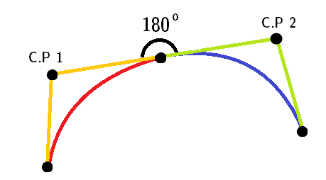
Note: Red and blue curves are two different quadratic curves.
stroke-linejoin="miter", for the pointed top part.AS this shape only uses successive
ccommands, we can omit it.
Here's the final snippet:
<svg height="300px" width="300px" viewBox="0 0 12 16">
  <path fill="#FFF" stroke="black" stroke-width="0.5" stroke-linejoin="miter"
        d="M 6 1 c -2 3 -5 5 -5 9
           0 7 10 7 10 0
           0 -4 -3 -6 -5 -9z" />
</svg>
TBH though, accepted answer's curves are not quite continuous.
For IE 5-8 (VML)
Only works in IE 5-8. VML uses different commands than SVG. Eg. it uses v for relative cubic beziers.
Note: This snippet won't run in IE 5-8 too. You need to create an html file and run it directly in the browser.
<!DOCTYPE HTML PUBLIC "-//W3C//DTD HTML 4.01 Transitional//EN">
<html xmlns:v="urn:schemas-microsoft-com:vml">
<head>
    <style> v\:* { behavior: url(#default#VML); }

    </style >
</head>
<body>
    <div style="width:240; height:320;">
        <v:shape coordorigin="0 0" coordsize="12 16" fillcolor="white" strokecolor="black" strokewidth="1"
            strokeweight="5" style="width:240; height:320"
            path="M 6 1 v -2 3 -5 5 -5 9
           0 7 10 7 10 0
           0 -4 -3 -6 -5 -9 x e">
        </v:shape>
    </div>
</body>
</html>