How to customize item background and item text color inside NavigationView?
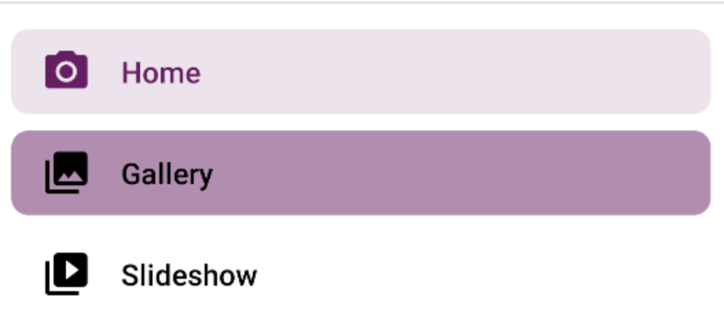
I wanna achieve something like this shown in the Material Design Docs.
colorControlHighlight is used for the Background on checked items.
I need to customize:
- background unchecked
- text color checked
- text color unchecked
itemBackground, itemIconTint and itemTextColor are simple xml-attributes that can be set, though you have to use a custom prefix instead of the android: one.
Example
<android.support.v4.widget.DrawerLayout xmlns:android="http://schemas.android.com/apk/res/android"
    xmlns:app="http://schemas.android.com/apk/res-auto"
    android:id="@+id/drawer_layout"
    android:layout_width="match_parent"
    android:layout_height="match_parent"
    android:fitsSystemWindows="true">

    <!-- Other layout views -->

    <android.support.design.widget.NavigationView
        android:id="@+id/nav_view"
        android:layout_width="wrap_content"
        android:layout_height="match_parent"
        android:layout_gravity="start"
        android:fitsSystemWindows="true"
        app:itemBackground="@drawable/my_ripple"
        app:itemIconTint="#2196f3"
        app:itemTextColor="#009688"
        app:headerLayout="@layout/nav_header"
        app:menu="@menu/drawer_view" />

</android.support.v4.widget.DrawerLayout>
Note: In this case the text color, icon tint and background are static. If you want to change the color of the text (e.g. pink when unchecked and teal when checked) you should use a ColorStateList.
Example
Create a new *.xml file in /res/color - let's name it state_list.xml - with the following content:
<selector xmlns:android="http://schemas.android.com/apk/res/android">
    <!-- This is used when the Navigation Item is checked -->
    <item android:color="#009688" android:state_checked="true" />
    <!-- This is the default text color -->
    <item android:color="#E91E63" />
</selector>
and then simply reference it like this: app:itemTextColor="@color/state_list"
The same goes for itemIconTint. itemBackground expects a resource id. See the docs as well.
NavigationDrawer(NavigationView) has three options for configuration of checked/selected items.
app:itemIconTint="@color/menu_text_color" //icon color
app:itemTextColor="@color/menu_text_color" //text color
app:itemBackground="@drawable/menu_background_color" //background
Icon and text color
First two options ( icon and text ) need color state list resource - https://developer.android.com/guide/topics/resources/color-list-resource.html.
Such menu_text_color resource needs to be created in res/color. This file content should look similar to:
<!-- res/color/menu_text_color.xml -->
<?xml version="1.0" encoding="utf-8"?>
<selector xmlns:android="http://schemas.android.com/apk/res/android">
  <item android:color="@color/colorWhite" android:state_checked="true" />
  <item android:color="@color/colorBlack" android:state_checked="false"/>
</selector>
-
@color/colorWhite- color resource used for checked item -
@color/colorBlack- color resource used for unchecked item
I have created one resource for both, but it is possible to create two separated files - one for text, one for icon.
Background (itemBackground)
Background option needs drawable resource instead of color, every try to set color will end by exception. Drawable resource need to be created in res/drawable and its content should look similar to:
<!-- res/drawable/menu_background_color.xml -->
<?xml version="1.0" encoding="utf-8"?>
<selector xmlns:android="http://schemas.android.com/apk/res/android">
  <item android:drawable="@android:color/transparent"  android:state_checked="false"/>
  <item android:drawable="@color/colorPrimary" android:state_checked="true"/>
</selector>
There is no need to created any drawables which simulates color ( in other solutions I saw such propositions - maybe for older sdk version ), color can be used in this file directly. In this example file I am using transparent color for not checked item and colorPrimary for checked item.
Troubleshooting and important notes
- In background resource always use state_checked="false" instead of default, with default color it will not work
- For dynamic/programmatically created menu remember to set items as checkable:
Code example ( dynamic menu item add ):
menu.add(group_id, item_id, Menu.NONE, item_name).setCheckable(true).setChecked(false);
If items will not be set as checkable then background will not work ( text and icon color surprising will work as expected ).
With the MaterialComponents Library you can use these attributes:
-
app:itemShapeFillColor: background item color -
app:itemIconTint: icon tint -
app:itemTextColor: text color
In the layout:
<com.google.android.material.navigation.NavigationView
    app:itemShapeFillColor="@color/shape_selector"
    app:itemIconTint="@color/icon_tint_selector"
    app:itemTextColor="@color/text_color_selector"
    ../>
In a custom style:
<style name="..." parent="Widget.MaterialComponents.NavigationView" >
   <item name="itemShapeFillColor">@color/shape_selector</item>
   <item name="itemIconTint">@color/icon_tint_selector</item>
   <item name="itemTextColor">@color/text_color_selector</item>
</style>
For the itemIconTint and itemTextColor you can use a selector like this:
<selector xmlns:android="http://schemas.android.com/apk/res/android">
  <item android:color="?attr/colorPrimary" android:state_checked="true"/>
  <item android:alpha="0.38" android:color="?attr/colorOnSurface" android:state_enabled="false"/>
  <item android:color="?attr/colorOnSurface"/>
</selector>
For the itemShapeFillColor you can use a selector like:
<selector xmlns:android="http://schemas.android.com/apk/res/android">
  <item android:alpha="0.12" android:color="?attr/colorPrimary" android:state_activated="true"/>
  <item android:alpha="0.12" android:color="?attr/colorPrimary" android:state_checked="true"/>
  <item android:color="@android:color/transparent"/>
</selector>
Just a final note.
Pay attention to use to the itemBackground.
It is set to @null to use a shaped background programmatically generated by NavigationView when itemShapeAppearance and/or itemShapeAppearanceOverlay is set (default behaviour).
This background is styled using the itemShape* attributes.
Setting itemBackground will overwrite the programmatic background and cause values set in the itemShape* attributes to be ignored.
Using colorControlHighlight is a good solution to me. Be aware that with the latest support library, you can define a theme (not just the style) for every widget; for example you can define the colorControlHighlight into the NavigationView theme and this will not be applied to the rest of widgets.