Can you style an html radio button to look like a checkbox?
Three years after this question is posted and this is almost within reach. In fact, it's completely achievable in Firefox 1+, Chrome 1+, Safari 3+ and Opera 15+ using the CSS3 appearance property.
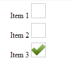
The result is radio elements that look like checkboxes:
input[type="radio"] {
  -webkit-appearance: checkbox; /* Chrome, Safari, Opera */
  -moz-appearance: checkbox;    /* Firefox */
  -ms-appearance: checkbox;     /* not currently supported */
}
<label><input type="radio" name="radio"> Checkbox 1</label>
<label><input type="radio" name="radio"> Checkbox 2</label>Note: this was eventually dropped from the CSS3 specification due to a lack of support and conformance from vendors. I'd recommend against implementing it unless you only need to support Webkit or Gecko based browsers.
This is my solution using only CSS (Jsfiddle: http://jsfiddle.net/xykPT/).
div.options > label > input {
	visibility: hidden;
}

div.options > label {
	display: block;
	margin: 0 0 0 -10px;
	padding: 0 0 20px 0;
	height: 20px;
	width: 150px;
}

div.options > label > img {
	display: inline-block;
	padding: 0px;
	height:30px;
	width:30px;
	background: none;
}

div.options > label > input:checked +img {
	background: url(http://cdn1.iconfinder.com/data/icons/onebit/PNG/onebit_34.png);
	background-repeat: no-repeat;
	background-position:center center;
	background-size:30px 30px;
}
<div class="options">
<label title="item1">
<input type="radio" name="foo" value="0" />
Item 1
<img />
</label>
<label title="item2">
<input type="radio" name="foo" value="1" />
Item 2
<img />
</label>
<label title="item3">
<input type="radio" name="foo" value="2" />
Item 3
<img />
</label>
</div>In CSS3:
input[type=radio] {content:url(mycheckbox.png)}
input[type=radio]:checked {content:url(mycheckbox-checked.png)}
In reality:
<span class=fakecheckbox><input type=radio><img src="checkbox.png" alt=""></span>

@media screen {.fakecheckbox img {display:none}}
@media print {.fakecheckbox input {display:none;}}
and you'll need Javascript to keep <img> and radios in sync (and ideally insert them there in a first place).
I've used <img>, because browsers are usually configured not to print background-image. It's better to use image than another control, because image is non-interactive and less likely to cause problems.
Yes it can be done using this css, i've hidden the default radio button and made a custom radio button that looks like a checkbox. Working Perfect in 2022.
.css-prp
{
  color: #17CBF2;
  font-family: arial;
}


.con1 {
  display: block;
  position: relative;
  padding-left: 25px;
  margin-bottom: 12px;
  cursor: pointer;
  font-size: 15px;
  -webkit-user-select: none;
  -moz-user-select: none;
  -ms-user-select: none;
  user-select: none;
}

/* Hide the browser's default radio button */
.con1 input {
  position: absolute;
  opacity: 0;
  cursor: pointer;
}

/* Create a custom radio button */
.checkmark {
  position: absolute;
  top: 0;
  left: 0;
  height: 18px;
  width: 18px;
  background-color: lightgrey;
  border-radius: 10%;
}

/* When the radio button is checked, add a blue background */
.con1 input:checked ~ .checkmark {
  background-color: #17CBF2;
}
<label class="con1"><span>Yes</span>
<input type="radio" name="radio1" checked>
<span class="checkmark"></span>
</label>
<label class="con1"><span>No</span>
<input type="radio" name="radio1">
<span class="checkmark"></span>
</label>