IE crossing out pseudo element CSS?
I've been trying to get a few pseudo elements to work on IE, but it just doesn't let me.
It crosses out the CSS and acts like it's not there, which kinda aggrevates me.
Would anyone know what I'm doing wrong?
.newbutton {
  border-radius: 50%;
  width: 74px;
  height: 74px;
  position: relative;
  background-color: black;
  margin: 60px 0px 25px 17px;
  overflow: visible;
}

.newbutton:before {
  content: "f";
  width: 80px;
  height: 80px;
  position: absolute;
  border-radius: 50%;
  z-index: -1;
  top: 37px;
  left: 37px;
  -webkit-transform: translate(-50%, -50%);
  transform: translate(-50%, -50%);
  -webkit-animation-name: fadecolor;
  -webkit-animation-duration: 5s;
  -webkit-animation-iteration-count: infinite;
  animation-name: fadecolor;
  animation-duration: 5s;
  animation-iteration-count: infinite;
}

.newbutton:after {
  content: "";
  width: 80px;
  height: 80px;
  position: absolute;
  border-radius: 50%;
  z-index: -2;
  top: -3px;
  left: -3px;
  background: -webkit-gradient(linear, 0% 0%, 0% 100%, from(#01BAE8), to(#0183D5));
}
<div class="starttour">
<div class="newbutton headerbutton">
<span class="iconhead icon-02-arrow-icon"></span>
</div>
<p>START TOUR</p>
</div>Screenshot of what happens:
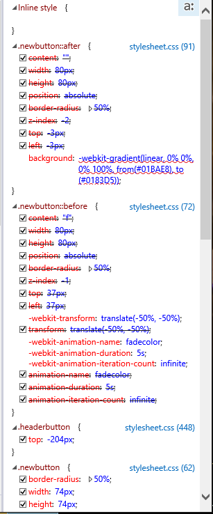
This is a known issue, but the styles are in fact being applied. The developer tools thinks the pseudo-element styles are being overridden by the parent-elements corresponding styles. This is easily demonstrated by inspecting the Computed style of the parent-element and looking at (what the F12 tools believe to be) competing styles:
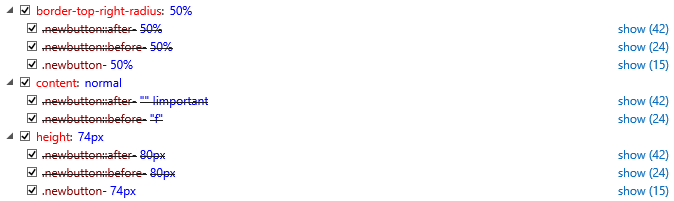
Again, however, these styles are in fact being applied to the correct elements - regardless what the developer tools believe or suggest. You can confirm this by running over the parent-element and the two pseudo-elements and logging their computed height:
(function () {

    var el = document.querySelector( ".newbutton" );

    [ "", "::before", "::after" ].forEach(function ( e ) {
        // Output: 74px, 80px, 80px
        console.log( window.getComputedStyle( el, e ).height );
    });

}());
I'll check to see if we already have an internal issue tracking this bug, and add this question to it. Generally speaking, we try to give issues like this the amount of attention proportional to the amount of grief the issue is causing in the real world. So having your question as a new addition on the ticket may help us move a fix forward :)
I had this exact same issue! You must give your :before and :after pseudo elements a display property.
Add the following to the :before and :after.
display: block;
This should fix your issue. :)
To add onto the answer above. I tried display: block but my issue was that the background image was coming out warped. Instead I used below:
display: inline-block;
This fixed my issue with warped images within my :before :after
As I had the same problem with Material Font and IE11 and could not solve it with the above solutions, I looked further:
The documentation of the material design icons mentions to use
<i class="material-icons"></i>
for browsers not supporting ligatures. The codepoints for each item are listed here: https://github.com/google/material-design-icons/blob/master/iconfont/codepoints
The problem with :after elements is that HTML in the content-Tag is rendered as plain text showing the &#x.. so you have to use the \ escape as following:
content: "\e5c5";