Wave (or shape?) with border on CSS3
I need to implement a wave shape with CSS3, I tried to implement with CSS3 Shapes, but I has not reached the desired result.
* {
  margin: 0;
  padding: 0;
}
body {
  background: #007FC1;
}
.container,
.panel {
  border-bottom: 4px solid #B4CAD8;
}
.container {
  background-color: #fff;
}
.container > .text {
  padding: 0.5em;
}
.panel {
  position: relative;
  float: right;
  width: 200px;
  height: 40px;
  margin-top: -4px;
  background-color: #fff;
  line-height: 42px;
  text-align: center;
}
.panel:before {
  content: '';
  position: absolute;
  left: -44px;
  width: 0;
  height: 0;
  border-top: 44px solid #B4CAD8;
  border-left: 44px solid transparent;
}
<div class="container">
<div class="text">
<p>Lorem ipsum dolor sit amet, consectetur adipisicing elit. Voluptates nam fuga eligendi ipsum sed ducimus quia adipisci unde atque enim quasi quidem perspiciatis totam soluta tempora hic voluptatem optio perferendis.</p>
</div>
</div>
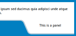
<div class="panel">this is a panel</div>It is impossible to implement border and set background color on the wave shape. I need to achieve this result:

Solution 1:
You could use svg instead of .panel(div) and float it to the right.
body {
  background: #007FC1;
}
.container {
  border-bottom: 4px solid #B4CAD8;
}
.container {
  background-color: #fff;
  z-index: -1;
}
.container > .text {
  padding: 0.5em;
}
.panel {
  position: relative;
  float: right;
  margin-top: -4px;
}
<div class="container">
<div class="text">
<p>Lorem ipsum dolor sit amet, consectetur adipisicing elit. Voluptates nam fuga eligendi ipsum sed ducimus quia adipisci unde atque enim quasi quidem perspiciatis totam soluta tempora hic voluptatem optio perferendis.</p>
</div>
</div>
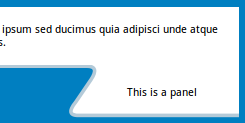
<svg class="panel" width="200" height="54">
<path d="M0,0 h7 q9,3 12.5,10 l13,30 q3.2,10 13,10 h157 v-50z" fill="white" />
<path transform="translate(0, -0.5)" d="M0,2 h7 q10,2 13,10 l13,30 q3,9 13,10 h157" fill="none" stroke="#B4CAD8" stroke-width="4" />
<text x="110.5" y="25" text-anchor="middle">This is a panel</text>
</svg>You could also get a shape other way around.
body {
  background: #007FC1;
}
.container {
  border-bottom: 4px solid #B4CAD8;
}
.container {
  background-color: #fff;
  z-index: -1;
}
.container > .text {
  padding: 0.5em;
}
.panel {
  position: relative;
  float: right;
  margin-top: -4px;
}
<div class="container">
<div class="text">
<p>Lorem ipsum dolor sit amet, consectetur adipisicing elit. Voluptates nam fuga eligendi ipsum sed ducimus quia adipisci unde atque enim quasi quidem perspiciatis totam soluta tempora hic voluptatem optio perferendis.</p>
</div>
</div>
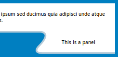
<svg class="panel" width="200" height="59">
<path d="M0,0 h30 q15,0 5,15 l-17,20 q-13,16 5,15 h200 v-58" fill="white" />
<path transform="translate(0, -0.5)" d="M0,2 h30 q15,0 5,15 l-17,20 q-13,16 5,15 h200" fill="none" stroke="#B4CAD8" stroke-width="4" />
<text x="115" y="30" text-anchor="middle">This is a panel</text>
</svg>A bit more curvy.
body {
  background: #007FC1;
}
.container {
  border-bottom: 4px solid #B4CAD8;
}
.container {
  background-color: #fff;
  z-index: -1;
}
.container > .text {
  padding: 0.5em;
}
.panel {
  position: relative;
  float: right;
  margin-top: -4px;
}
<div class="container">
<div class="text">
<p>Lorem ipsum dolor sit amet, consectetur adipisicing elit. Voluptates nam fuga eligendi ipsum sed ducimus quia adipisci unde atque enim quasi quidem perspiciatis totam soluta tempora hic voluptatem optio perferendis.</p>
</div>
</div>
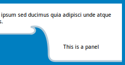
<svg class="panel" width="200" height="54">
<path d="M0,0 h7 q55,-5 15,35 q-13,16 15,15 h200 v-54" fill="white" />
<path transform="translate(0, -0.5)" d="M0,2 h7 q55,-5 15,35 q-13,16 15,15 h200" fill="none" stroke="#B4CAD8" stroke-width="4" />
<text x="115" y="30" text-anchor="middle">This is a panel</text>
</svg>How about a real wave shape?
body {
  background: #007FC1;
}
.container {
  border-bottom: 4px solid #B4CAD8;
}
.container {
  background-color: #fff;
  z-index: -1;
}
.container > .text {
  padding: 0.5em;
}
.panel {
  position: relative;
  float: right;
  margin-top: -24px;
}
<div class="container">
<div class="text">
<p>Lorem ipsum dolor sit amet, consectetur adipisicing elit. Voluptates nam fuga eligendi ipsum sed ducimus quia adipisci unde atque enim quasi quidem perspiciatis totam soluta tempora hic voluptatem optio perferendis.</p>
</div>
</div>
<svg class="panel" width="200" height="85">
<path d="M0,24 a10,7.5 1 1,0 0,-15 q20,-11 40,26" fill="#007FC1" />
<path d="M0,22 m0,-15 q40,-10 40,60 q0,15 15,15 h146 v-65" fill="white" />
<path d="M0,22 a10,7.5 1 1,0 0,-15 q40,-10 40,60 q0,15 15,15 h146" fill="none" stroke="#B4CAD8" stroke-width="4" />
<text x="110.5" y="55" text-anchor="middle">This is a panel</text>
</svg>Solution 2:
Here is a method to achieve the wave shape using CSS. (This is only an illustration on how to achieve it with CSS but SVG is still the recommended tool to use.)
- The base is a
divwhich is the white rectangular box. In the box, the bottom 50px has transparent color, the 3px after that has lightblue color and the rest has white color. This makes it look like the top half is a white rectangle with a lightblue border. The transparent 50px part at the bottom helps to make the cut out area look as though it is not a part of the container. - Pseudo-elements are skewed and positioned at the bottom right of the parent container to produce the curved effect. They also have some box-shadows added to produce the border.
- The content is added using a separate
divand is again positioned at the bottom right corner of the parent.
.content {
  position: relative;
  height: 150px;
  padding: 10px;
  background: linear-gradient(270deg, transparent 200px, lightblue 200px) no-repeat, linear-gradient(0deg, transparent 50px, white 50px);
  background-position: 100% 117px, 100% 100%;
  background-size: 100% 3px, 100% 100%;
  overflow: hidden;
}
.content:before {
  position: absolute;
  content: '';
  height: 25px;
  width: 50px;
  bottom: 25px;
  right: 170px;
  background: transparent;
  border-top-right-radius: 18px;
  box-shadow: 4px -3px 0px lightblue, 4px 0px 0px lightblue, 20px 0px 0px white;
  transform: skew(30deg);
  z-index: 2;
}
.content:after {
  position: absolute;
  content: '';
  right: 0px;
  bottom: 0px;
  height: 50px;
  width: 177px;
  background: white;
  border-bottom-left-radius: 18px;
  box-shadow: inset 4px -3px 0px lightblue;
  transform-origin: right top;
  transform: skew(30deg);
}
.panel {
  position: absolute;
  bottom: 3px;
  right: 0px;
  height: 50px;
  width: 135px;
  line-height: 50px;
  z-index: 3;
}


/* just for demo */
body {
  background: linear-gradient(90deg, crimson, indianred, purple);
  font-family: Calibri;
}
<script src="https://cdnjs.cloudflare.com/ajax/libs/prefixfree/1.0.7/prefixfree.min.js"></script>
<div class='content'>Lorem ipsum dolor sit amet, consectetur adipisicing elit. Voluptates nam fuga eligendi ipsum sed ducimus quia adipisci unde atque enim quasi quidem perspiciatis totam soluta tempora hic voluptatem optio perferendis
<div class='panel'>This is a panel</div>
</div>
Here is a version with a transparent background for the container (instead of white).

Older version using Rotate Transform:
- The base is a
divwhich is the white rectangular box with a white background and aninsetlight blue color shadow . - A small portion is created for the right side (which has the "This is Panel" text) using a pseudo-element and is positioned absolutely towards the right corner of the parent
div. The content of this pseudo-element is set using thedata-contentattribute. The curved corner on the bottom-left of this box is achieved usingborder-radius. - The curved area flowing from the bottom of the parent
divto the bottom of the panel pseudo-element is another pseudo-element which is created and positioned absolutely as required. It also uses abox-shadowto produce the light blue line while its background merges with the background of the body. This pseudo-element is rotated usingtransformsto achieve a slanted effect.
body {
  background: #007FC1;
  font-family: Calibri;
}
div {
  position: relative;
  height: 100px;
  width: auto;
  padding-top: 10px;
  padding-left: 10px;
  background: white;
  box-shadow: inset 0px -3px 0px lightblue;
}
div:after {
  position: absolute;
  content: attr(data-content);
  right: 0px;
  padding-left: 20px;
  bottom: -47px;
  height: 50px;
  width: 145px;
  line-height: 40px;
  background: white;
  border-bottom-left-radius: 7px;
  box-shadow: inset 1px -3px 0px lightblue;
}
div:before {
  content: '';
  position: absolute;
  right: 179.5px;
  bottom: -48px;
  height: 57px;
  width: 7px;
  background: transparent;
  border-top-right-radius: 6px;
  box-shadow: inset -3px 2px 1px lightblue, 16px -10px 0px 11px white;
  transform: rotateZ(-36deg);
  z-index: 2;
}
<script src="https://cdnjs.cloudflare.com/ajax/libs/prefixfree/1.0.7/prefixfree.min.js"></script>
<div data-content="This is a panel">Lorem ipsum dolor sit amet, consectetur adipisicing elit. Voluptates nam fuga eligendi ipsum sed ducimus quia adipisci unde atque enim quasi quidem perspiciatis totam soluta tempora hic voluptatem optio perferendis</div>Sample using Skew Transform:
Credit to web-tiki for this idea. The same as above can be done using skew transformation also instead of rotate like in the below sample.
body {
  background: #007FC1;
  font-family: Calibri;
}
div {
  position: relative;
  height: 100px;
  width: auto;
  padding-top: 10px;
  padding-left: 10px;
  background: white;
  box-shadow: inset 0px -3px 0px lightblue;
}
div:after {
  position: absolute;
  content: attr(data-content);
  right: 0px;
  padding-left: 15px;
  bottom: -47px;
  height: 50px;
  width: 150px;
  line-height: 40px;
  background: white;
  border-bottom-left-radius: 10px;
  box-shadow: inset 2px -3px 1px lightblue, 2px 1px 2px #007FC1;
}
div:before {
  position: absolute;
  content: '';
  right: 174px;
  bottom: -44px;
  height: 47px;
  width: 15px;
  background: transparent;
  border-top-right-radius: 4px;
  box-shadow: inset -4px 3px 1px lightblue, 20px -10px 0px 6px white;
  z-index: 2;
  transform: skew(33deg);
}
<script src="https://cdnjs.cloudflare.com/ajax/libs/prefixfree/1.0.7/prefixfree.min.js"></script>
<div data-content="This is a panel">Lorem ipsum dolor sit amet, consectetur adipisicing elit. Voluptates nam fuga eligendi ipsum sed ducimus quia adipisci unde atque enim quasi quidem perspiciatis totam soluta tempora hic voluptatem optio perferendis</div>Solution 3:
CSS only solution
I have made only the shape, as you asked for it. Adding it to the page is very simple using positioning. For tasks like these, its not very practical to use CSS. I wasted about 15-20 mins in making a simple shape! SVG is much more preferable in such cases. But as it could be done, it must be done. Here :
body{
    margin:0;
    padding:0;
}
#one{
    position:absolute;
    top:30px;
    left:-30px;
    height:10px;
    width:10px;
}
#one > span{
    position:relative;
    top:-215px;
    left:300px;
    text-align:center;
    width:300px;
    height:80px;
    display:block;
    line-height:80px;
    z-index:4;
}
.one{
    position: relative;
    height: 90px;
    width: 300px;
    background-color: #007FC1;
    border-radius: 25px;
    -webkit-transform: skew(30deg);
    transform: skew(30deg);
    z-index:2;
}
.obefore {
    height:35px;
    width:60px;
    position:relative;
    top:-35px;
    left:290px;
    background-color: #007FC1;
    -webkit-transform: skew(30deg);
    transform: skew(30deg);
    z-index:1;
}
.oafter{
    position: relative;
    top: -135px;
    left:310px;
    height: 90px;
    width: 300px;
    background-color: white;
    border-bottom-left-radius: 25px;
    -webkit-transform: skew(30deg);
    transform: skew(30deg);
    z-index:3;
}
#two{
    position:absolute;
    top:20px;
    left:-20px;
}
.two{
    position: relative;
    height: 90px;
    width: 300px;
    background-color: #B4CAD8;
    border-radius: 25px;
    -webkit-transform: skew(30deg);
    transform: skew(30deg);
    z-index:0;
}
.tafter{
    position: relative;
    top: -80px;
    left:290px;
    height: 90px;
    width: 300px;
    background-color: #B4CAD8;
    border-top-left-radius: 45px;
    border-bottom-left-radius: 25px;
    -webkit-transform: skew(30deg);
    transform: skew(30deg);
    z-index:2;
}
<div id="one">
<div class="one"></div>
<div class="obefore"></div>
<div class="oafter"></div>
<span>This is a Panel.</span>
</div>
<div id="two">
<div class="two"></div>
<div class="tbefore"></div>
<div class="tafter"></div>
</div>Please don't ridicule over my mark-up. I have used pseudo-pseudo-elements (ie normal elements.). Z-index has some limitations for pseudo-elements, so I used div's instead.
Solution 4:
Using two elements to create the wave:
html,body{background:black;}

.wave{
height:40px;
  width:100%;
   transform:skewX(30deg);
  background:blue;
  border-top:5px solid lightblue;
  border-right:5px solid lightblue;
  margin-left:-20%;
  position:relative;
  border-radius:5px;
}

.wave:before{
  position:absolute;
  content:"";
  height:100%;
  width:20%;
  background:transparent;
  right:-20%;
  top:-5px;
  border-radius:5px;
  border-bottom:5px solid lightblue;
}

.wave:after{
  position:absolute;
  content:"";
  height:5px;
  width:5px;
  background:black;
  right:-1.65%;
  bottom:4px;
  border-radius:50%;
}
<div class="wave"></div>In this case, I've used two elements nesting in a wrapper element to achieve this:
.wrap {
  position: relative;
  height: 400px;
  width: 100%;
  margin: 0 auto;
  max-width: 1024px;
}
.shape {
  position: absolute;
  top: 0;
  left: 0;
  height: 100%;
  width: 50%;
  overflow: hidden;
  z-index: 10;
}
.shape:after {
  content: "";
  position: absolute;
  top: 10%;
  left: 0;
  width: 100%;
  height: 90%;
  border-radius: 0 50% 0 0;
  box-shadow: 0 0 0 999px lightgray;
}
.shape2 {
  position: absolute;
  top: 0;
  left: 50%;
  height: 100%;
  width: 50%;
  background: lightgray;
  border-radius: 0 0 0 50%;
  z-index: 10;
}
/*demo only*/

html,
body {
  margin: 0;
  padding: 0;
  height: 100%;
  vertical-align: top;
  overflow: hidden;
  background: rgb(79, 79, 79);
  background: -moz-radial-gradient(center, ellipse cover, rgba(79, 79, 79, 1) 0%, rgba(34, 34, 34, 1) 100%);
  background: -webkit-gradient(radial, center center, 0px, center center, 100%, color-stop(0%, rgba(79, 79, 79, 1)), color-stop(100%, rgba(34, 34, 34, 1)));
  background: -webkit-radial-gradient(center, ellipse cover, rgba(79, 79, 79, 1) 0%, rgba(34, 34, 34, 1) 100%);
  background: -o-radial-gradient(center, ellipse cover, rgba(79, 79, 79, 1) 0%, rgba(34, 34, 34, 1) 100%);
  background: -ms-radial-gradient(center, ellipse cover, rgba(79, 79, 79, 1) 0%, rgba(34, 34, 34, 1) 100%);
  background: radial-gradient(ellipse at center, rgba(79, 79, 79, 1) 0%, rgba(34, 34, 34, 1) 100%);
  filter: progid: DXImageTransform.Microsoft.gradient(startColorstr='#4f4f4f', endColorstr='#222222', GradientType=1);
}
<div class="wrap">
<div class="shape"></div>
<div class="shape2"></div>
</div>Made with a single element
This can in fact be made with a single element, and I've created a snippet to show such below:
div {
  height: 50px;
  width: 100%;
  background: lightgray;
  position: relative;
  border-bottom: 5px solid tomato;
}
div:before {
  content: "";
  position: absolute;
  bottom: -30px;
  right: 0;
  width: 40%;
  height: 20px;
  background: lightgray;
  border: 5px solid transparent;
  border-left-color: tomato;
  border-bottom: inherit;
  border-radius: 0 0 0 20px;
}
div:after {
  content: "";
  position: absolute;
  top: 100%;
  right: calc(40% + 5px);
  height: 20px;
  width: 20px;
  border: 5px solid transparent;
  border-top-color: tomato;
  border-radius: 50%;
  transform: rotate(45deg);
  box-shadow: 0px -30px 0 4px lightgray;
}

/*For Demo only*/

html, body {
    margin:0;
    padding:0;height:100%;
    vertical-align:top;overflow:hidden;
    background: rgb(79, 79, 79);
    background: -moz-radial-gradient(center, ellipse cover, rgba(79, 79, 79, 1) 0%, rgba(34, 34, 34, 1) 100%);
    background: -webkit-gradient(radial, center center, 0px, center center, 100%, color-stop(0%, rgba(79, 79, 79, 1)), color-stop(100%, rgba(34, 34, 34, 1)));
    background: -webkit-radial-gradient(center, ellipse cover, rgba(79, 79, 79, 1) 0%, rgba(34, 34, 34, 1) 100%);
    background: -o-radial-gradient(center, ellipse cover, rgba(79, 79, 79, 1) 0%, rgba(34, 34, 34, 1) 100%);
    background: -ms-radial-gradient(center, ellipse cover, rgba(79, 79, 79, 1) 0%, rgba(34, 34, 34, 1) 100%);
    background: radial-gradient(ellipse at center, rgba(79, 79, 79, 1) 0%, rgba(34, 34, 34, 1) 100%);
    filter: progid:DXImageTransform.Microsoft.gradient(startColorstr='#4f4f4f', endColorstr='#222222', GradientType=1);
}<div></div>Solution 5:
Shape for post How to get this shape in CSS not in SVG:
#shape {
  width:210px;
}
#left {
  border-bottom: 5px solid black;
  border-right: 5px solid black;
  border-bottom-right-radius: 70px;
  background-color: white;
  width: 40px;
  height: 80px;
  float: left;
  margin-top: 65px;
  z-index: 1;
  position: relative;
}
#right {
  border-left:5px solid black;
  border-top:5px solid black;
  border-top-left-radius:70px;
  margin-left: -5px;
  width:30px;
  height:100px;
  float:left;
  background-color:yellow;
  width: 165px;
}
#bottom {
  width:205px;
  height:50px;
  background-color:yellow;
  border-left:5px solid black;
  clear:both;
}
#middle {
  height: 45px;
  width: 205px;
  background-color: yellow;
  top: 105px;
  position: relative;
  z-index: 0;
  border-left: 5px solid black;
}
<div id="shape">
<div id="left"></div>
<div id="right"></div>
<div id="middle"></div>
<div id="bottom"></div>
</div>