How to Make A Chevron Arrow Using CSS?
You can use the before or after pseudo-element and apply some CSS to it. There are various ways. You can add both before and after, and rotate and position each of them to form one of the bars. An easier solution is adding two borders to just the before element and rotate it using transform: rotate.
Scroll down for a different solution that uses an actual element instead of the pseuso elements
In this case, I've added the arrows as bullets in a list and used em sizes to make them size properly with the font of the list.
ul {
    list-style: none;
}

ul.big {
    list-style: none;
    font-size: 300%
}

li::before {
    position: relative;
    /* top: 3pt; Uncomment this to lower the icons as requested in comments*/
    content: "";
    display: inline-block;
    /* By using an em scale, the arrows will size with the font */
    width: 0.4em;
    height: 0.4em;
    border-right: 0.2em solid black;
    border-top: 0.2em solid black;
    transform: rotate(45deg);
    margin-right: 0.5em;
}

/* Change color */
li:hover {
  color: red; /* For the text */
}
li:hover::before {
  border-color: red; /* For the arrow (which is a border) */
}
<ul>
<li>Item1</li>
<li>Item2</li>
<li>Item3</li>
<li>Item4</li>
</ul>
<ul class="big">
<li>Item1</li>
<li>Item2</li>
<li>Item3</li>
<li>Item4</li>
</ul>Of course you don't need to use before or after, you can apply the same trick to a normal element as well. For the list above it is convenient, because you don't need additional markup. But sometimes you may want (or need) the markup anyway. You can use a div or span for that, and I've even seen people even recycle the i element for 'icons'. So that markup could look like below. Whether using <i> for this is right is debatable, but you can use span for this as well to be on the safe side.
/* Default icon formatting */
i {
  display: inline-block;
  font-style: normal;
  position: relative;
}

/* Additional formatting for arrow icon */
i.arrow {
    /* top: 2pt; Uncomment this to lower the icons as requested in comments*/
    width: 0.4em;
    height: 0.4em;
    border-right: 0.2em solid black;
    border-top: 0.2em solid black;
    transform: rotate(45deg);
}
And so you can have an <i class="arrow" title="arrow icon"></i> in your text.
This arrow is <i class="arrow" title="arrow icon"></i> used to be deliberately lowered slightly on request.
I removed that for the general public <i class="arrow" title="arrow icon"></i> but you can uncomment the line with 'top' <i class="arrow" title="arrow icon"></i> to restore that effect.If you seek more inspiration, make sure to check out this awesome library of pure CSS icons by Nicolas Gallagher. :)
This can be solved much easier than the other suggestions.
Simply draw a square and apply a border property to just 2 joining sides.
Then rotate the square according to the direction you want the arrow to point, for exaple: transform: rotate(<your degree here>)
.triangle {
border-right: 10px solid;
border-bottom: 10px solid;
height: 30px;
width: 30px;
transform: rotate(-45deg);
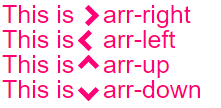
}<div class="triangle"></div>Responsive Chevrons / arrows
they resize automatically with your text and are colored the same color. Plug and play :)
jsBin demo playground
body{
  font-size: 25px; /* Change font and  see the magic! */
  color: #f07;     /* Change color and see the magic! */
}

/* RESPONSIVE ARROWS */
[class^=arr-]{
  border:       solid currentColor;
  border-width: 0 .2em .2em 0;
  display:      inline-block;
  padding:      .20em;
}
.arr-right {transform:rotate(-45deg);}
.arr-left  {transform:rotate(135deg);}
.arr-up    {transform:rotate(-135deg);}
.arr-down  {transform:rotate(45deg);}
This is <i class="arr-right"></i> .arr-right<br>
This is <i class="arr-left"></i> .arr-left<br>
This is <i class="arr-up"></i> .arr-up<br>
This is <i class="arr-down"></i> .arr-downHere's a different approach:
1) Use the multiplication character: × ×
2) Hide half of it with overflow:hidden
3) Then add a triangle as a pseudo element for the tip.
The advantage here is that no transforms are necessary. (It will work in IE8+)
FIDDLE
.arrow {
  position: relative;
}
.arrow:before {
  content: '×';
  display: inline-block;
  position: absolute;
  font-size: 240px;
  font-weight: bold;
  font-family: verdana;
  width: 103px;
  height: 151px;
  overflow: hidden;
  line-height: 117px;
}
.arrow:after {
  content: '';
  display: inline-block;
  position: absolute;
  left: 101px;
  top: 51px;
  width: 0;
  height: 0;
  border-style: solid;
  border-width: 25px 0 25px 24px;
  border-color: transparent transparent transparent black;
}
<div class="arrow"></div>