Aligning two divs side-by-side [duplicate]
I have a small problem. I am trying to align two divs side by side using CSS, however, I would like the center div to be positioned horizontally central in the page, I achieved this by using:
#page-wrap { margin 0 auto; }
That's worked fine. The second div I would like positioned to the left side of the central page wrap but I can't manage to do this using floats although I'm sure it is possible.
I would like to push the red div up alongside the white div.
Here is my current CSS concerning these two divs, sidebar being the red div and page-wrap being the white div:
#sidebar {
    width: 200px;
    height: 400px;
    background: red;
    float: left;
}

#page-wrap {
    margin: 0 auto;
    width: 600px;
    background: #ffffff;
    height: 400px;
}
Solution 1:
If you wrapped your divs, like this:
<div id="main">
  <div id="sidebar"></div>
  <div id="page-wrap"></div>
</div>
You could use this styling:
#main {
    width: 800px;
    margin: 0 auto;
}
#sidebar    {
    width: 200px;
    height: 400px;
    background: red;
    float: left;
}

#page-wrap  {
    width: 600px;
    background: #ffffff;
    height: 400px;
    margin-left: 200px;
}
This is a slightly different look though, so I'm not sure it's what you're after. This would center all 800px as a unit, not the 600px centered with the 200px on the left side. The basic approach is your sidebar floats left, but inside the main div, and the #page-wrap has the width of your sidebar as it's left margin to move that far over.
Update based on comments: For this off-centered look, you can do this:
<div id="page-wrap">
  <div id="sidebar"></div>
</div>
With this styling:
#sidebar    {
    position: absolute;
    left: -200px;
    width: 200px;
    height: 400px;
    background: red;
}

#page-wrap  {
    position: relative;
    width: 600px;
    background: #ffffff;
    height: 400px;
    margin: 0 auto;
}
Solution 2:
I don't understand why Nick is using margin-left: 200px; instead off floating the other div to the left or right, I've just tweaked his markup, you can use float for both elements instead of using margin-left.
Demo
#main {
    margin: auto;
    width: 400px;
}

#sidebar    {
    width: 100px;
    min-height: 400px;
    background: red;
    float: left;
}

#page-wrap  {
    width: 300px;
    background: #0f0;
    min-height: 400px;
    float: left;
}

.clear:after {
    clear: both;
    display: table;
    content: "";
}
Also, I've used .clear:after which am calling on the parent element, just to self clear the parent.
Solution 3:
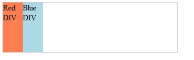
This Can be Done by Style Property.
<!DOCTYPE html>
<html>
<head>
<style>
#main {

  display: flex;
}

#main div {
  flex-grow: 0;
  flex-shrink: 0;
  flex-basis: 40px;
}
</style>
</head>
<body>

<div id="main">
  <div style="background-color:coral;">Red DIV</div>
  <div style="background-color:lightblue;" id="myBlueDiv">Blue DIV</div>
</div>

</body>
</html>
Its Result will be :
Enjoy... Please Note: This works in Higher version of CSS (>3.0).