Android L - Material design on SwipeRefreshLayout color scheme
I´m starting to implement the Material Theme on my newest project, preparing it for the launch of the new L version.
I´ve been reading the Material design guidelines and found this.
UI Color Application
Choose your palette
Limit your choice of colors by choosing three color hues in the primary and one accent color in the secondary palette. The accent color may or may not need fall back options
More or less it explains how to implement those hues on the app, including the accent color but when using the main color on my app with the SwipeRefreshLayout progress bar, it doesn't feel right.
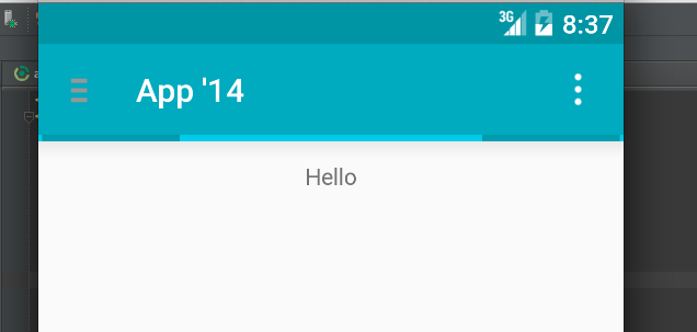
Should it be a mix between the accent color and the android:colorPrimary?
Any thoughts about this? Is there any explanation about implementing progress bars on the Material design guideline that I´ve missed?
Thanks in advance
The Material design spec has been updated with the new guidelines for the swipe to refresh pattern.
As of revision 21 of the support library, SwipeRefreshLayout now displays a circular indicator.
When you start swiping down, the indicator has an arrow (which suggests refreshing). When you release it, it loses the arrow and starts spinning.

Now we can still set a color scheme and the progress bar will cycle between the colors.
So which colors should we use?
Let's take a look at the Google I/O source code:
mSwipeRefreshLayout.setColorSchemeResources(
                R.color.refresh_progress_1,
                R.color.refresh_progress_2,
                R.color.refresh_progress_3);
And here are the colors:
<color name="refresh_progress_1">@color/theme_accent_2</color>
<color name="refresh_progress_2">@color/theme_accent_1</color>
<color name="refresh_progress_3">@color/theme_primary</color>
So yes, it is a mix between the primary and the accent colors.