Suggestions for debugging print stylesheets?
I've recently been working on a print stylesheet for a website, and I realized that I was at a loss for effective ways to tweak it. It's one thing to have a reload cycle for working on the on-screen layout:
- change code
- command-tab
- reload
but that whole process gets much more arduous when you're trying to print:
- change code
- command-tab
- reload
- squint at print-preview image
- open PDF in Preview for further inspection
Are there tools I'm missing out on here? Does WebKit's inspector have a "pretend this is paged media" checkbox? Is there some magic that Firebug (shudder) can do?
There is an option for that in Chrome's inspector.
- Open the DevTools inspector (mac: Cmd + Shift + C , windows: Ctrl + Shift + C)
- Click on the Toggle device mode icon
 , located on the upper left corner of the DevTools panel. (windows: Ctrl+Shift+M, mac: Cmd+Shift+M).
 - Click on the More overrides
 icon in the top right corner of the browser viewport to open the devtools drawer.
 -
Then, select Media in the emulation drawer, and check the CSS media checkbox.
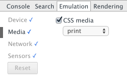
This should do the trick.
Update: The menus have changed in DevTools. It can now be found by clicking on the "three-dots" menu in the top right corner > More Tools > Rendering Settings > Emulate media > print.
Source: Google DevTools page*
I'm assuming you want as much control of the printed window as possible without using a HTML to PDF approach... Use @media screen to debug - @media print for final css
Modern browsers can give you a quick visual for what's going to happen at print time using inches and pts in a @media query.
@media screen and (max-width:8.5in) { /* resize your window until the event is triggered */
    html { width:8.5in; }
    body { font: 9pt/1.5 Arial, sans-serif; } /* Roughly 12px font */
 ...
}
Once your browser is displaying "inches" you'll have a better idea of what to expect. This approach should all but end the print preview method. All printers will work with pt and in units, and using the @media technique will allow you to quickly see what's going to happen and adjust accordingly. Firebug (or equivalent) will absolutely expedite that process. When you've added your changes to @media, you've got all the code you need for a linked CSS file using media = "print" attribute - just copy/paste the @media screen rules to the referenced file.
Good luck. The web wasn't built for print. Creating a solution that delivers all of your content, styles equal to what's seen in the browser can be impossible at times. For instance, a fluid layout for a predominantly 1280 x 1024 audience doesn't always translate easily to a nice and neat 8.5 x 11 laser print.
W3C reference for purusal: http://www.w3.org/TR/css3-mediaqueries/