Why do bell curves appear everywhere?
Solution 1:
Why do most probability graphs show a bell curve?
As you suspect, there is a natural tendency for distributions to be bell-shaped.
There are some distributions that are not bell-shaped at all. For example, the outcome of a roll of one fair die is a discrete uniform distribution:
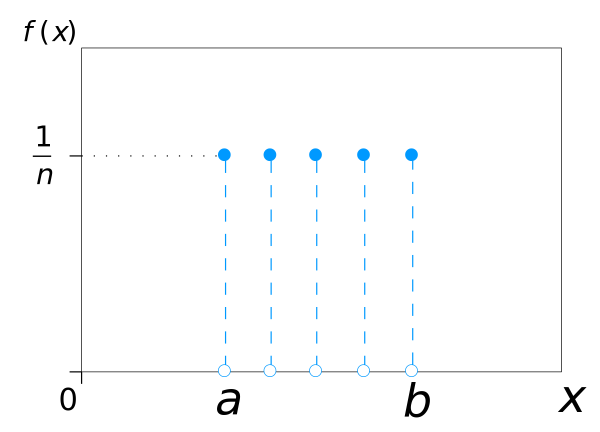
By IkamusumeFan - Own work
This drawing was created with LibreOffice Draw, CC BY-SA 3.0, Link
The roll of one die is a pretty simple process. What about the sum of two dice? The Wizard of Odds illustrates:

Starting to look a little like a bell, right? What about the totals of three, or four dice? Wolfram MathWorld provides a nice illustration:

You can see where this is headed. Nature is full of complex processes. How tall are you? Well, it depends on genetics, nutrition, exercise, injuries, bone loss, and so many more things. The central limit theorem shows (see symplectomorphic's comment below) that when adding the sum of a large number of things together, the resulting distribution is not just any bell-looking curve, but specifically the normal distribution. Or for things with multiplicative combination, the log-normal distribution.
Why does this happen? mathreadler's answer hints it has to do with convolving distributions. The probability density function of a single die is a rectangular function (technically discrete, but let's pretend it's continuous). The sum of two rolls together is then the convolution of two rectangular functions.
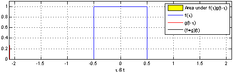
By Convolution_of_box_signal_with_itself.gif: Brian Amberg
derivative work: Tinos (talk) - Convolution_of_box_signal_with_itself.gif, CC BY-SA 3.0, Link
Notice how the result (the black triangle) looks like the case of two dice above. If then convolve this triangle with another rectangle, you get three dice. The more times you do this, the closer the result gets to a normal distribution.
The probability density function of the normal distribution is a Gaussian function, which have some elegant properties:
- A Gaussian convolved with a Gaussian is another Gaussian.
- The product of two Gaussians is a Gaussian.
- The Fourier transform of a Gaussian is a Gaussian.
From this you might intuitively see as things converge towards normal distributions, they "want" to stay as normal distributions since their "Gaussianess" is preserved under many operations.
Of course not everything is so simple as a single die roll, nor as complex as the determination of the height of a human. So there are a large number of distributions that look like a bell, but on careful examination aren't the normal distribution. Some of them exist in nature, and some find application as mathematical tools for some purpose. Looking through Wikipedia's list of probability distributions you can see bell-like shapes are quite common, even if they aren't exactly the normal distribution.
But if you combine these two things:
- The central limit theorem means the normal distribution is common, and
- many distributions look like bells but aren't the normal distribution,
you might conclude most probability graphs show a bell curve.
Solution 2:
The convolution of two functions is at least as nice as the nicest of the two (often even nicer), and the sum of two independent distributions has a density which is the convolution of their density functions. So as they convolve more and more when we add them up they become nicer and the gaussian function is the nicest in the world!