Why do absolute elements stack up on each other instead of stacking one after the other?
How can get both #row1 and #row2 in the following code to be visible, one after the other vertically, as if there wasn't any absolute/relative positioning involved?
<body>
  <div class="container">
    <div id="row1" class="row">
      <div class="col1">Hello</div>
      <div class="col2">World</div>
    </div>
    <div id="row2" class="row">
      <div class="col1">Salut</div>
      <div class="col2">le monde</div>
    </div>
  </div>
body {position:relative;}
.container {position:absolute;}
.row {position:relative;}
.col1, .col2 {position: absolute;}
http://jsfiddle.net/wjrNQ/
Update
I need the elements to have the positioning provided in the CSS rules, for reasons excluded here. So my question is if it's possible to achieve what I'm looking for without removing the above CSS? I.e. having the two .row divto appear as "normal" block elements.
Update 2
If enough height is specified in px, the result have the expected look. But the content is programmitacally dynamic so I don't know the height on beforehand :(
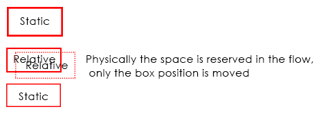
Well you have some weird wishes here so let me explain you what those positions really mean in CSS and how they work, using position: relative; is just like using static position, the difference is making an element position: relative;, you will be able to use top, right, bottom and left properties, though the element will move, but physically it will be in the document flow..
Coming to position: absolute;, when you make any element position: absolute;, it gets out of the document flow, hence, it has nothing to do with any other element, so in your example
you have .col1, .col2 {position: absolute;} which are positioned absolute and since both are out of the document flow, they will overlap... Because they are already nested under position: absolute; parent i.e .container and since no width is assigned, it will take the minimal width and hence, your elements overlap, if you cannot change your CSS(which according to me doesn't make any sense why you can't change) still if you want, than you can do is this..
Demo (Without removing any of your position property) And this is really dirty
For the s characters, it will be at the top as your container element is out of the flow, and hence, no height will be considered in the document flow, unless and until you wrap that s in some element, and bring it down with, margin padding or CSS Positioning.
CSS Positions Explained
As I commented, here are few examples of how CSS Positioning actually works, to start with, there are 4 values for position property i.e static which is the default one, relative, absolute and fixed, so starting with static, nothing to learn much here, elements just stackup one below the other unless they are floated or made display: inline-block. With static positioning, top, right, bottom and left won't work.
Demo
Coming to position: relative; I've already explained you in general, it's nothing but same as static, it stacks up on other element, it is in the document flow, but you can tweak the elements position using top, right, bottom and left, physically, the element stays in the flow, only position of the element is changed.
Demo 2
Now comes absolute which generally many fails to understand, when making an element absolute it gets out of the document flow, and hence it stays independent, it has nothing to do with other elements positioning unless it's overlapped by other position: absolute element which can be fixed using z-index to change the stack level. The main thing to remember here is to have a position: relative; container so that your absolute positioned element is relative to that relative positioned element, else your element will fly out in the wild.
It's worth noting that position: absolute; element when positioned absolute; inside an absolute positioned parent element, than it is relative to that element and not relative to the grand parent element which may be positioned relative
Demo 3 (Without position: relative; container)
Demo 4 (With position: relative; container)
Last is position fixed, this is same as absolute but it flows along when you scroll, it's out of the document flow, but it scrolls, also, position: fixed; element cannot be relative to any container element having any type of position, not even relative, position fixed element is always relative to the viewport, so designers use position: absolute; when they want to have a fixed position behavior but relative to parent and tweak the top property onScroll.
Demo 5
What you want, is not possible without modifying the CSS position property. However, what you can do without touching the existing CSS, is overriding it with a more specific selector
.row .col1, .row .col2 {
    position: relative;
}
See JSFiddle
when position:relative is used, the page layout will occur normally before being offset by top, left values, however position:absolute will ignore the document flow. The relative ones will work with no changes but absolute must be changed
.col1, .col2 {display:inline-block;}
http://jsfiddle.net/C4bQN/
EDIT: Depending on your circumstances, maybe you can wrap your table in an absolute positioned div then use normal document flow within the table?
<div class="absolute-wrap">
    <div class="row">
        <div class="col"> </div>
    </div>
</div>