My Footer Floats
Solution 1:
you could try positioning the element as { /other css attribs you want to set...;/ position: absolute; bottom:0; width:100%; height: 20px;} or whatever height you want. This will give you an always on footer. Hope it helps.
Solution 2:
Here's your solution.
After my initial post, I figured why not slap together one of those handy JS Fiddles, so here you go: http://jsfiddle.net/8uHF6/
Forget all that frustrating business of trying to use wrappers and set other elements to 100% height to squeeze the extra vertical space out of the layout, and so on. You just end up in a situation where you poke over here, and something squirts out over there, so you poke over there, and something squirts out somewhere else. Ugh.
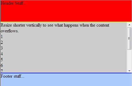
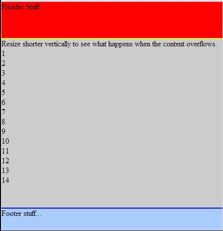
Use absolute positioning for your main layout elements. Basically, you nail the elements down exactly where you want them by specifying their top and/or bottom values, including your main content element, which will automatically scale to fit the available space as your window changes size vertically.
Tell your main content element to use automatic overflow, so the content will appear to slide under the footer, out of sight. A scrollbar will appear automatically if it's needed. Float the main content elements if you want a floated layout inside of them (otherwise, don't bother). You can use a fluid or elastic grid layout inside of something like this, and so on.
Also, note that there is no overall "site-wrapper" or "page" div, which is kind of nice since the real goal of the semantic web is that your HTML contains content, and only content (HTML is data, not layout). Adding things like wrappers to your HTML to control layout is unfortunate. If possible, every last bit of layout logic should be in your CSS.
Good luck!
<html>
    <head>
        <style>
            html {
                height: 100%;
                min-height: 100%;
                font-size: 100%;
            }

            body {
                margin: 0;
                height: 100%;
                min-height: 100%;
            }

            header {
                background-color: #FF0000;
                float: left; /* if you want a layout with floated descendants... */
                position: absolute;
                width: 100%;
                top: 0;
                overflow: hidden;
                height: 4.6em;
                border-bottom: 0.15em solid yellow;
            }

            article {
                background-color: #CCCCCC;
                float: left;
                position: absolute;
                width: 100%;
                top: 4.75em;
                bottom: 2.75em;
                overflow: auto;
            }

            footer {
                background-color: #AACCFF;
                float: left;
                position: absolute;
                width: 100%;
                height: 2.75em;
                bottom: 0;
                border-top: 0.15em solid blue;
            }
        </style>
    </head>
    <body>
        <header>
            Header Stuff...
        </header>
        <article>
            Resize shorter vertically to see what happens when the content overflows.<br/>
            1<br/>
            2<br/>
            3<br/>
            4<br/>
            5<br/>
            6<br/>
            7<br/>
            8<br/>
            9<br/>
            10<br/>
            11<br/>
            12<br/>
            13<br/>
            14<br/>
        </article>
        <footer>
            Footer stuff...
        </footer>
    </body>
</html>