How can I make Bootstrap columns all the same height?
Solution 1:
LATEST SOLUTION (2022)
Solution 4 using Bootstrap 4 or 5
Bootstrap 4 and 5 use Flexbox by default, so there is no need for extra CSS.
Demo
<div class="container">
    <div class="row ">
        <div class="col-md-4" style="background-color: red">
          some content
        </div>
        <div class="col-md-4" style="background-color: yellow">
          catz
          <img width="100" height="100" src="https://placekitten.com/100/100/">
        </div>
        <div class="col-md-4" style="background-color: green">
          some more content
        </div>
    </div>
</div>
Solution 1 using negative margins (doesn't break responsiveness)
Demo
.row{
    overflow: hidden;
}

[class*="col-"]{
    margin-bottom: -99999px;
    padding-bottom: 99999px;
}
Solution 2 using table
Demo
.row {
    display: table;
}

[class*="col-"] {
    float: none;
    display: table-cell;
    vertical-align: top;
}
Solution 3 using flex added August 2015. Comments posted before this don't apply to this solution.
Demo
.row {
  display: -webkit-box;
  display: -webkit-flex;
  display: -ms-flexbox;
  display:         flex;
  flex-wrap: wrap;
}
.row > [class*='col-'] {
  display: flex;
  flex-direction: column;
}
Solution 2:
Update 2021
Bootstrap 4 + 5
Flexbox is now used by default in Bootstrap 4 (and Bootstrap 5) so there is no need for the extra CSS to make equal height columns: https://www.codeply.com/go/IJYRI4LPwU
Example:
<div class="container">
    <div class="row">
        <div class="col-md-6"></div>
        <div class="col-md-6"></div>
    </div>
</div>
Bootstrap 3
Best approach for Bootstap 3.x — using CSS flexbox (and requires minimal CSS)…
.equal {
  display: flex;
  display: -webkit-flex;
  flex-wrap: wrap;
}
Bootstrap same height flexbox example
To only apply the same height flexbox at specific breakpoints (responsive), use a media query. For example, here is sm (768px) and up:
@media (min-width: 768px) {
  .row.equal {
    display: flex;
    flex-wrap: wrap;
  }
}
This solution also works well for multiple rows (column wrapping): https://www.codeply.com/go/bp/gCEXzPMehZ
Other workarounds
These options will be recommended by others, but are not a good idea for responsive design. These only work for simple single row layouts w/o column wrapping.
-
Using huge negative margins & padding
-
Using
display:table-cell(this solution also affects the responsive grid, so a@mediaquery can be used to only applytabledisplay on wider screens before the columns stack vertically)
Solution 3:
No JavaScript needed. Just add the class .row-eq-height to your existing .row just like this:
<div class="row row-eq-height">
  <div class="col-xs-12 col-sm-4 panel" style="background-color: red">
    some content
  </div>
  <div class="col-xs-6 col-sm-4 panel" style="background-color: yellow">
    kittenz
  <img src="http://placekitten.com/100/100">
  </div>
  <div class="col-xs-6 col-sm-4 panel" style="background-color: blue">
    some more content
  </div>
</div>
Tip: if you have more than 12 columns in your row, the bootstrap grid will fail to wrap it. So add a new div.row.row-eq-height each 12 columns.
Tip: you may need to add
<link rel="stylesheet" href="http://getbootstrap.com.vn/examples/equal-height-columns/equal-height-columns.css" />
to your html
Solution 4:
To answer your question this is all you need see full responsive demo with prefixed css:
/* Using col-xs media query breakpoint but you can change 481 to 768 to only apply to col-sm and above if you'd like*/

@media only screen and (min-width : 481px) {
    .flex-row {
        display: flex;
        flex-wrap: wrap;
    }
    .flex-row > [class*='col-'] {
        display: flex;
        flex-direction: column;
    }
    .flex-row.row:after,
    .flex-row.row:before {
        display: flex;
    }
}
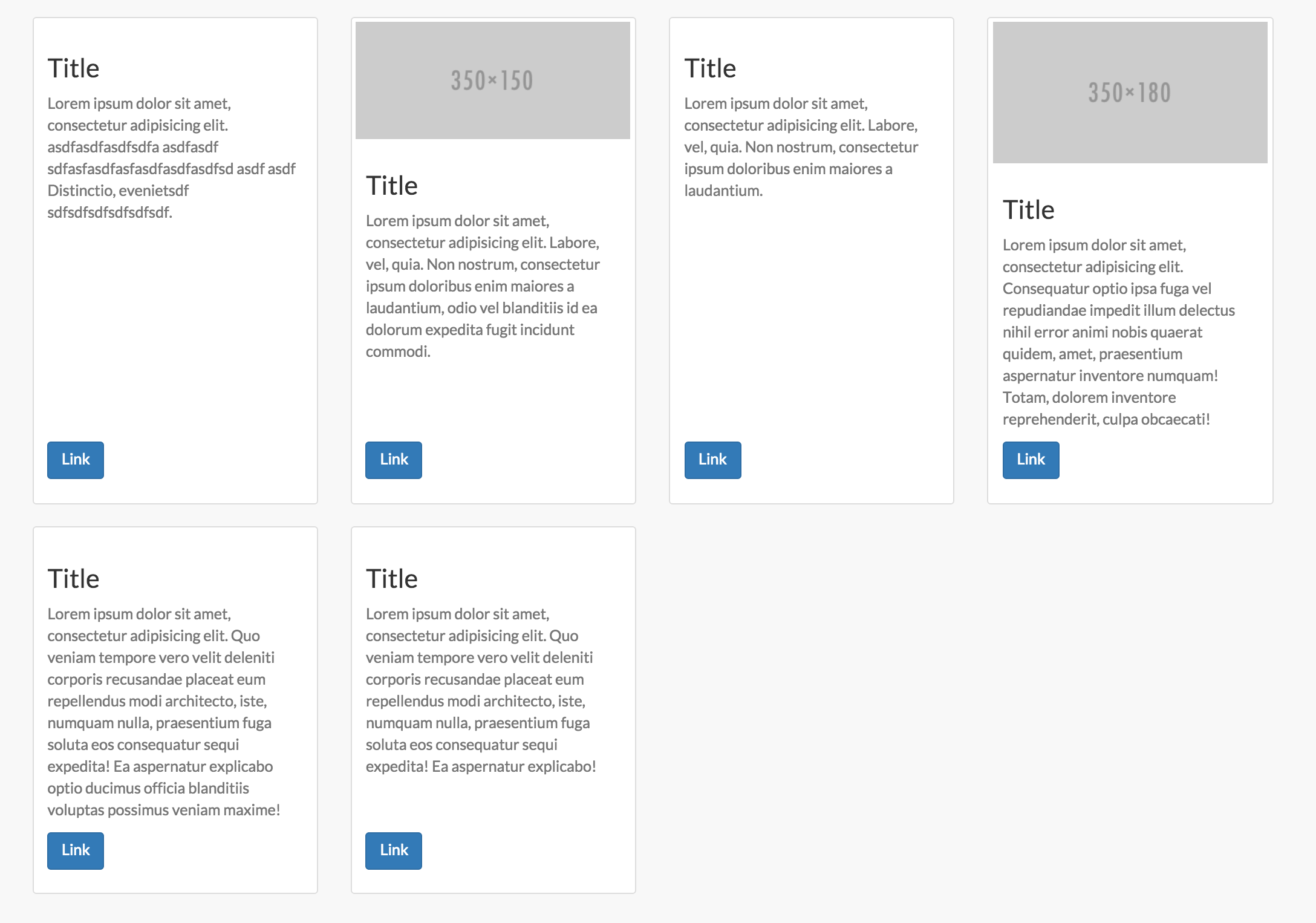
To add support for thumbnail content flex within flex columns like the screenshot above also add this... Note you could do this with panels as well:
.flex-row .thumbnail,
.flex-row .caption {
    display: flex;
    flex: 1 0 auto;
    flex-direction: column;
}
.flex-text {
    flex-grow: 1;
}
.flex-row img {
    width: 100%;
}
While flexbox doesn't work in IE9 and below you can use the demo with a fallback using conditional tags with something like javascript grids as a polyfill:
<!--[if lte IE 9]>

<![endif]-->
As for the other two examples in the accepted answer... The table demo is a decent idea but is being implemented wrong. Applying that CSS on bootstrap column classes specifically will without a doubt break the grid framework entirely. You should be using a custom selector for one and two the tables styles should not be applied to [class*='col-'] that have defined widths. This method should ONLY be used if you want equal height AND equal width columns. It is not meant for any other layouts and is NOT responsive. We can make it fallback however on mobile displays...
<div class="table-row-equal">
<div class="thumbnail">
    Content...
</div>
<div class="thumbnail">
    Content...
</div>
</div>
@media only screen and (min-width : 480px){
    .table-row-equal {
        display: table;
        width: 100%;
        table-layout: fixed;
        border-spacing: 30px 0px;
        word-wrap: break-word;
    }
    .table-row-equal .thumbnail {
        float: none;
        display: table-cell;
        vertical-align: top;
        width: 1%;
    }
}
Lastly, the first demo in the accepted answer which implements a version of the one true layout is a good choice for some situations, but not suitable for bootstrap columns. The reason for this is that all the columns expand to the container height. So this will also break responsiveness since the columns are not expanding to the elements next to them, but the entire container. This method will also not allow you to apply bottom margins to rows any longer and will also cause other issues along the way like scrolling to anchor tags.
For the complete code see the Codepen which automatically prefixes the flexbox code.