Hexagon shape with a border/outline
Solution 1:
It is not directly possible to achieve this, as hexagons are created by borders through pseudo elements. An alternative would be to overlay hexagons within hexagons, thus achieving the same desired results.
Here is an example of what can be achieved:


LIVE EXAMPLE HERE
HTML - pretty basic, continue the same pattern for more borders.
<div class="hex">
    <div class="hex inner">
        <div class="hex inner2"></div>
    </div>
</div>
CSS (three layers - two inner elements)
Start with the hexagon class, defining the shape/size/colors:
.hex {
    margin-top: 70px;
    width: 208px;
    height: 120px;
    background: #6C6;
    position: relative;
}
.hex:before, .hex:after {
    content:"";
    border-left: 104px solid transparent;
    border-right: 104px solid transparent;
    position: absolute;
}
.hex:before {
    top: -59px;
    border-bottom: 60px solid #6C6;
}
.hex:after {
    bottom: -59px;
    border-top: 60px solid #6C6;
}
Style the inner class and use transform: scale() to proportionally decrease the dimensions of the inner elements. In this example, a scale of scale(.8, .8) is used. If you want thicker borders, decrease the numbers; conversely, if you want thinner borders, increase the numbers.
Specify and overwrite the colors, also increase the z-index value to bring the element forward.
.hex.inner {
    background-color:blue;
    -webkit-transform: scale(.8, .8);
    -moz-transform: scale(.8, .8);
    transform: scale(.8, .8);
    z-index:1;
}
.hex.inner:before {
    border-bottom: 60px solid blue;
}
.hex.inner:after {
    border-top: 60px solid blue;
}
Style the second nested element, essentially following the same steps as last time. It's worth nothing that the same scale value is used, because it is within an already scaled element. Of course, you can use whatever you want; this is just a basic example.
.hex.inner2 {
    background-color:red;
    -webkit-transform: scale(.8, .8);
    -moz-transform: scale(.8, .8);
    transform: scale(.8, .8);
    z-index:2;
}
.hex.inner2:before {
    border-bottom: 60px solid red;
}
.hex.inner2:after {
    border-top: 60px solid red;
}
Again, live example here
Solution 2:
Here is another method to create hexagons with border (or outline) using the clip-path feature. In this method, we use a container element and a pseudo-element which has smaller dimensions (both height and width) than the container. When the same clip-path is applied to both the elements, the background-color of the container element is seen behind the pseudo-element only at the edges and makes it look like a border/outline to the shape.
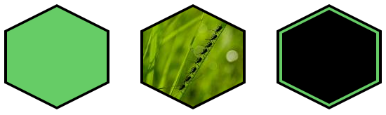
Advantages:
- Hexagons can also have gradients or images (basically non-solid color) as
background. - Shape is responsive and can automatically adapt to any change in the container dimensions.
.hexagon {
  position: relative;
  height: 150px;
  width: 150px;
  background: black;
}
.hexagon:before, .double:after {
  position: absolute;
  content: '';
}
.hexagon:before {
  top: 4px;  /* border width */
  left: 4px;  /* border width */
  height: calc(100% - 8px);  /* 100% - (2 * border width) */
  width: calc(100% - 8px);  /* 100% - (2 * border width) */
  background: #6c6;
}
.hexagon, .hexagon:before, .double:after {
  -webkit-clip-path: polygon(50% 0%, 100% 25%, 100% 75%, 50% 100%, 0% 75%, 0% 25%);
  clip-path: polygon(50% 0%, 100% 25%, 100% 75%, 50% 100%, 0% 75%, 0% 25%);
}
.image:before {
  background: url(http://lorempixel.com/150/150/nature/1);
}
.double:after {
  top: 8px;
  left: 8px;
  height: calc(100% - 16px);
  width: calc(100% - 16px);
  background: black;
}

/* Just for demo */

.hexagon {
  display: inline-block;
  margin: 20px;
}
<div class="hexagon"></div>
<div class="hexagon image"></div>
<div class="hexagon double"></div>The major disadvantage is the poor browser support at present. CSS clip-path do not work in IE and FF currently. The problem with FF can be fixed by using a SVG (inline or external) for the clip-path (like in the below snippet):
.hexagon {
position: relative;
height: 150px;
width: 150px;
background: black;
}
.hexagon:before, .double:after {
position: absolute;
content: '';
}
.hexagon, .hexagon:before, .double:after {
-webkit-clip-path: url(#hexagon-clip);
clip-path: url(#hexagon-clip);
}
.hexagon:before {
top: 4px; /* border width */
left: 4px; /* border width */
height: calc(100% - 8px); /* 100% - (2 * border width) */
width: calc(100% - 8px); /* 100% - (2 * border width) */
background: #6c6;
}
.image:before {
background: url(http://lorempixel.com/200/200);
}
.double:after {
top: 8px;
left: 8px;
height: calc(100% - 16px);
width: calc(100% - 16px);
background: black;
}
/* Just for demo */
.hexagon {
display: inline-block;
margin: 20px;
}<svg width="0" height="0">
<defs>
<clipPath id="hexagon-clip" clipPathUnits="objectBoundingBox">
<path d="M0.5 0, 1 0.25, 1 0.75, 0.5 1, 0 0.75, 0, 0.25z" />
</clipPath>
</defs>
</svg>
<div class="hexagon"></div>
<div class="hexagon image"></div>
<div class="hexagon double"></div>Solution 3:
Done with placing the hexagonal shape on top of another. where black Hexagon at the bottom and white at the top.
Here is the result
jsFiddle here
Only will be like a border