How to create a inset box-shadow only on one side?
This is what you are looking for. It has examples for each side you want with a shadow.
.top-box
{
    box-shadow: inset 0 7px 9px -7px rgba(0,0,0,0.4);
}
.left-box
{
    box-shadow: inset 7px 0 9px -7px rgba(0,0,0,0.4);
}
.right-box
{
    box-shadow: inset -7px 0 9px -7px rgba(0,0,0,0.4);
}
.bottom-box
{
    box-shadow: inset 0 -7px 9px -7px rgba(0,0,0,0.4);
}
See the snippet for more examples:
body {
    background-color:#0074D9;
}
div {
    background-color:#ffffff;
    padding:20px;
    margin-top:10px;
}
.top-box {
    box-shadow: inset 0 7px 9px -7px rgba(0,0,0,0.7);
}
.left-box {
    box-shadow: inset 7px 0 9px -7px rgba(0,0,0,0.7);
}
.right-box {
    box-shadow: inset -7px 0 9px -7px rgba(0,0,0,0.7);
}
.bottom-box {
    box-shadow: inset 0 -7px 9px -7px rgba(0,0,0,0.7);
}
.top-gradient-box {
    background: linear-gradient(to bottom, #999 0, #ffffff 7px, #ffffff 100%);
}
.left-gradient-box {
    background: linear-gradient(to right, #999 0, #ffffff 7px, #ffffff 100%);
}
.right-gradient-box {
    background: linear-gradient(to left, #999 0, #ffffff 7px, #ffffff 100%);
}
.bottom-gradient-box {
    background: linear-gradient(to top, #999 0, #ffffff 7px, #ffffff 100%);
}
<div class="top-box">
This area has a top shadow using box-shadow
</div>
<div class="left-box">
This area has a left shadow using box-shadow
</div>
<div class="right-box">
This area has a right shadow using box-shadow
</div>
<div class="bottom-box">
This area has a bottom shadow using box-shadow
</div>
<div class="top-gradient-box">
This area has a top shadow using gradients
</div>
<div class="left-gradient-box">
This area has a left shadow using gradients
</div>
<div class="right-gradient-box">
This area has a right shadow using gradients
</div>
<div class="bottom-gradient-box">
This area has a bottom shadow using gradients
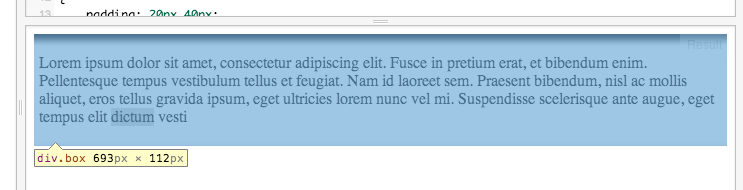
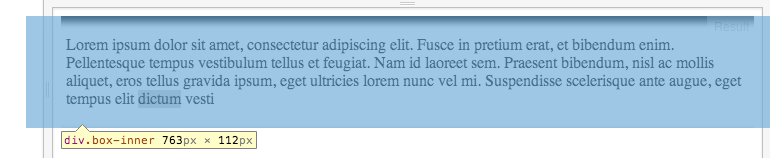
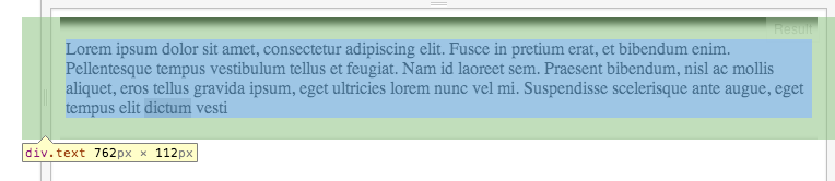
</div>The trick is a second .box-inner inside, which is larger in width than the original .box, and the box-shadow is applied to that.
Then, added more padding to the .text to make up for the added width.
This is how the logic looks:
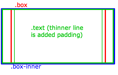
And here's how it's done in CSS:
Use max width for .inner-box to not cause .box to get wider, and overflow to make sure the remaining is clipped:
.box {
    max-width: 100% !important;
    overflow: hidden;
}
110% is wider than the parent which is 100% in a child's context (should be the same when the parent .box has a fixed width, for example).
Negative margins make up for the width and cause the element to be centered (instead of only the right part hiding):
.box-inner {
    width: 110%;
    margin-left:-5%;
    margin-right: -5%;
    -webkit-box-shadow: inset 0px 5px 10px 1px #000000;
    box-shadow: inset 0px 5px 10px 1px #000000;
}
And add some padding on the X axis to make up for the wider .inner-box:
.text {
    padding: 20px 40px;
}
Here's a working Fiddle.
If you inspect the Fiddle, you'll see: